Component SDK (course)
Essential knowledge
Author:
Fluent Commerce
Changed on:
1 Nov 2024
Overview
[Warning: empty required content area]Key points
[Warning: empty required content area]Introduction to the Fluent OMX: Extend - Component SDK
Lesson Overview
In this lesson, you will learn about the Component SDK and core concepts, specifically:✓ What is the Component SDK?✓ What can be extended by Component SDK?✓ Why use Component SDK?Let's begin!..What is the Component SDK?
The Component SDK provides a development kit for extending the UX Framework Component Library. It provides modern developer-friendly tools for building OMX-ready custom components for use in Fluent Web Apps.The SDK is based on React and TypeScript. While it is not a requirement to use these technologies, the SDK provides fully typed interfaces to all types via TypeScript, and delivers Fluent specific React-based Hooks for integrating with the Fluent Platform.What can be extended?
Developers can create various types of components to extend the standard component library, including brand new:- Content components: used to display information, such as data on cards and lists, or even more graphical and visual information such as images, maps, and charts.
- Layout / Page components: layout and page components facilitate screen layout.
- Interaction components: used to capture user input, such as buttons or card-based user action forms.
- Form field components: used to capture data in a form as part of a workflow-driven user action or mutation.
- Template helpers: utility functions for template strings in the manifest document, for transforming data in different ways, such as formatting, styling, and calculating.
Why use the Component SDK?
As part of our OMX Platform, the Component SDK provides developers with an industry best practice toolkit for extending the UX Component Library. While our aim is to provide as many reusable components as standard, we understand that our Clients may need more........and that's why we've built an SDK that makes building new Components as quick and simple as writing a small React Component, with all of the scaffolding built-in. This means developers do not need to worry about how to make their components configurable via the manifest, handle authorisation, data access, localisation, or workflow interaction and adaption, as this is all taken care of by the framework itself! Additionally, the framework uses the Fluent OMX Design System, based on Material-UI making it easy to deliver industry tested User Experience for all your custom components as standard.By the end of this lesson, you should have a good understanding of what the Component SDK is, what you can use it for, and how to get started.Let's get started!SDK Features
Custom Components
The Component SDK lets you build new content (or view) components, field components, and template functions for use within the OMX Web Apps.Fluent-specific custom components include:- Custom View Component: A component that you can simply drop onto a page.
- Custom Field Component: A component that you can hook up to a workflow user action to accept new input types, mutations, or list filters.
Hooks
Custom components can easily interact with OMX functionality via the provided hooks.Hooks are a React feature and are basically an easy way to add functionality to your components (such as making an API call and automatically showing the updates when it finishes) without having to implement it yourself.Some examples of React hooks include:- useState hook handles all of the state management of an object for you
- useEffect hook for handling side effects and managing the component lifecycle
- useAuth hook provides access to the currently logged in user context
- useI18n hook provides access to the Fluent localisation capability
- useQuery hook lets you interact with the Fluent GraphQL API
Utility Components
Some utility components are provided to make building custom components easier and more consistent.The UX Framework provides some "component primitives" that can be used as base components to build more complex components on top. The advantage of this is that these utility components:✓ provide a consistent look and feel✓ update according to theme options✓ enable mobile responsivenessExamples of utility components include:- Card
- Children
- DynamicValue
- Loading
- Drawers, Modals, and Toasts
Registries
Before a custom component can be used in an OMX web app, it must be registered with one of the three registries:- Component Registry - for standard in-page components
- Field Registry - for interactive form field components
- Template Registry - for adding new template helpers
Want to learn more?
Learn more about registering SDK componentsDownload & Setup the Component SDK
In this lesson, you will perform the steps to download the Component SDK, and set up a new Component plugin project.Complete the steps below:
- Download the Component SDK file
- Save the Component SDK zip file to your computer, and extract the zip file in a suitable location for development
Extracting ZIP Folders
This video explains how to extract the ZIP folder- Open a terminal (command line) window, and change the directory into the
`omx-component-sdk`folder. - Next, run
`yarn install`— this will download all the required dependencies by the SDK. - Now open the
`omx-component-sdk`folder in Visual Studio Code — You will notice that the project contains some sample components. - Open the
`Hello.tsx`file, and make sure that you don't see any errors or red underlines on the Hello component file. - While in development mode, you can run the project locally, and reference it in your Fluent Web Apps manifest — You will configure this later in the course. However, in the meantime, switch back to the terminal window, and start the project using
`yarn start`
Installing Yarn
This video explains how to install Yarn`fc.mystique.manifest.store` setting and add the plugin reference as shown in the video below.`{`` "type": "url",`` "src":"http://localhost:3001/"``}`Updating the Manifest
This video explains how to update the manifestClient Scenario: Product availability lookup and stock reservation at a close by location
Client Scenario
Our Client would like to provide their staff with a visual view of the product availability in nearby locations. Following on from the UX Framework course, they would like to add a Map view to the page in the Fluent Store app. The map should show the locations closest to the current store with stock information for the currently viewed product.The Map should:- Be added to the Product Availability details screen/interface.
- Display pins corresponding to the 10 closest locations that currently stock for the specific shoe variant requested.
- Display store details upon clicking each pin to display:
- Location Name
- Product Reference
- Available Stock on hand
- Be configurable through the manifest and unit tested.
Hands on Lab:
In this lab, the scenario is that a Customer walks into a store, finds a pair of shoes they really like, but cannot find their size. They ask the Store Associate if they have the shoe in their size. The Store Assistant says they don't have any of that size left in the store, but will do a lookup to find out if the correct size is in a nearby location.Should you get stuck and require assistance, first review the relevant lessons in the Configuration - UX Framework course. Thereafter, if you still require further assistance please message us via this platform or send us an email and we will connect you with an instructor.Make sure you successfully complete the following tasks before moving to the next lesson:Configure the Product Lookup:
- Add a new Page to the Fluent Store Web App as a top level menu item.
- Use a List Component and configure it to show variant products
- Configure the List Filter
- Hyperlink the product reference using the following format:
`#/products/{{node.catalogue.ref}}/{{node.ref}}`
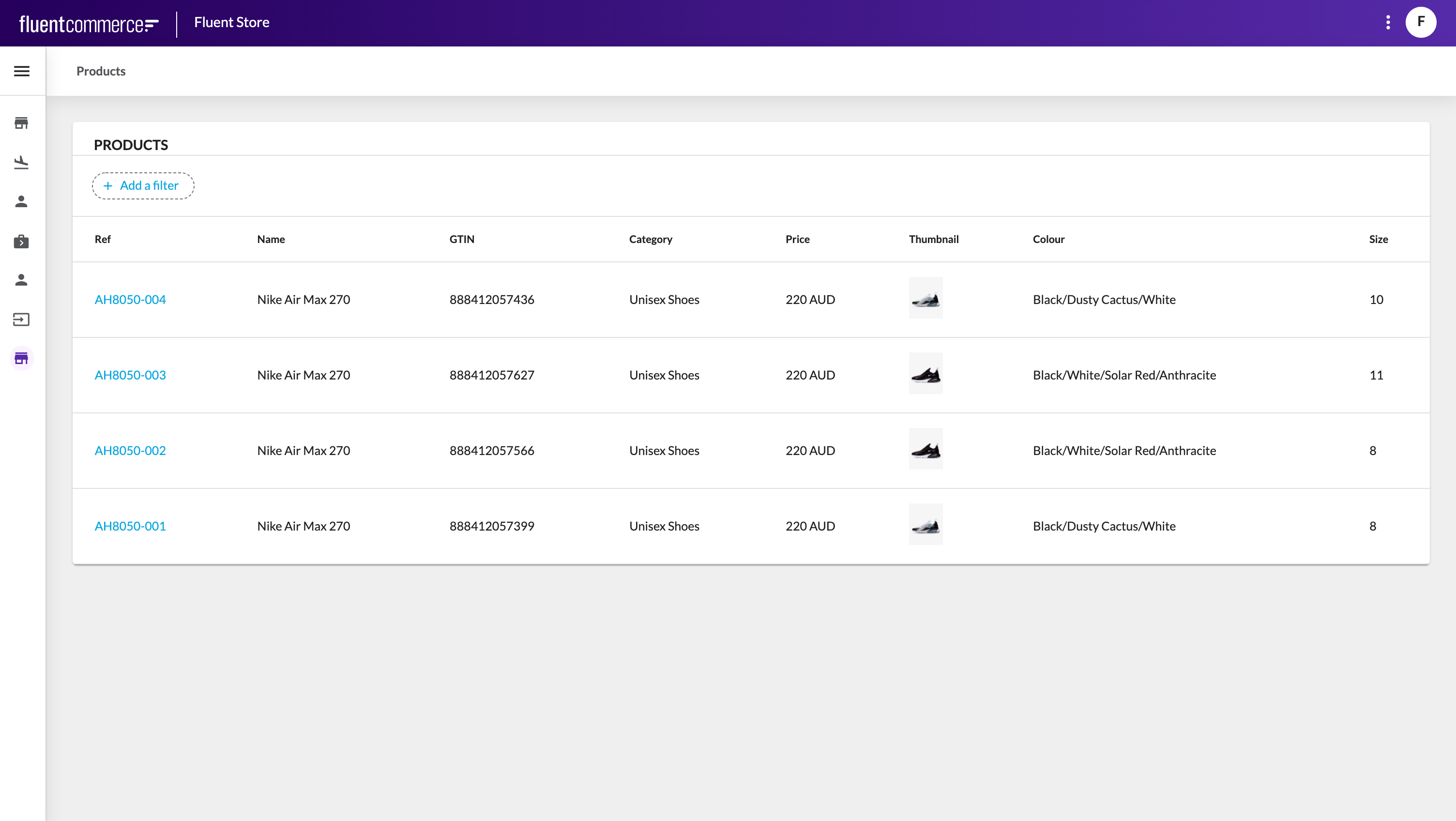
Configure the Detail Availability Page:
- Add a new page
- Update the Product Lookup page to link the product ref to the Detail Availability Page
- Add a card component for product details
- Add a card component to show the product image
- Add a list component and configure it to show data from the searchVirtualInventory query
 Through this course, we will continue to build out this Client Scenario, and build some new custom components to enhance the capability of the Product Availability lookup screen in the Fluent Store app.
Building your first Custom Content Component (Hello World)
First, let's begin by creating a custom component and registering it within the Component Registry.Fluent Components are essentially just simple React`FunctionComponents` (`FC`).In this scenario, you will see how to create a new custom component implementing React `FC`, and making use of a Utility Component provided by the Component SDK called `Card`. To use your component in a web app, the component needs to be registered with the `ComponentRegistry`.Watch the video below for steps on how to create and register your custom component, in this case, a Utility component (
`MapCard), `and setting the title of the card to "Hello World". Once registered in the Component Registry it will be ready for configuration through the Mystique manifest in the next lesson.Hello Component
This video explains how to build a custom componentNeed help?
For further guidance, navigate to Registering SDK Components.Now, you are going to take your custom component (derived in the previous step) and add it to the Product Availability page on your Web App.Watch the video below for steps on how to edit the manifest document with your custom component:`{ “component” : “training.card.map” }`Using Custom Components
This video explains how to use a custom componentNeed help?
For further guidance on how to update the manifest, navigate to UX Framework - Configuration Guide > Web App Manifest Guide (section)Defining Properties for configuration via the Manifest
In this lesson, you will learn how to make your component configurable via the Manifest.Watch the video below for steps to declare the`MapCardProps` interface, and make your component receive these properties: `title: string;``width: CardWidth;`Finally, see how to configure these properties in the manifest and have your component use them.Configuring Properties in the Manifest
This video explains how to configure properties in the manifestUsing your first Hook
In this lesson, you will use the`useAuth` hook provided by the SDK, which provides details about the logged-in user. This includes details about their current roles/permissions, the location or retailer context they are in, as well as the ability to switch contexts.In location-context web apps (like Fluent Store), you can use this hook to retrieve information about the currently logged in store location, including longitude and latitude coordinates which will be useful for our map.Using Hooks
This video explains how to use a hook with the OMX UX FrameworkUsing a 3rd party library
In this lesson, you will use a third-party party component, in this case, a Google Maps React Component to display a map in your map card.When looking for third party or existing components for use with your Fluent Web Apps, also remember the following 2 practices:- Prefer React-based
- Prefer Material UI
`GoogleMapReact` component with Yarn.Alternatively, you can use the map in development mode without providing the API key, and it will display a message and a watermark. Dismissing the message will allow you to still interact with the map.
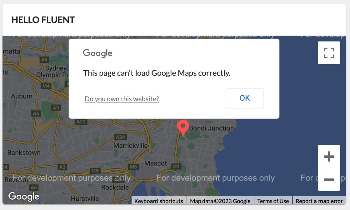
Using Third Party Libraries
This video explains how to use a third party libraryAdding Nested (Child) Components
Watch the video below to learn how to add pins onto the Google map that you've created in the previous lesson.Using Nested Components
This video explains how to add pin (nested/child components) to the map (parent component)Access Data from the Page Query
Our goal in this client scenario is to find other available locations that have this product in stock and then display these locations on the map. While it's possible to make GraphQL queries from within a component to fetch data, this can limit the re-use and customisability of a view component. In most cases we'd prefer to have the component use data from the page query, which can then be configured in the manifest.Watch the video below for how to access the data from the page query defined in the manifest document — this will return a list of all locations that stock the product.Mapping and Accessing Data
This video explains how to access the data from the page query defined in the manifest documentStyle & Theme your component
Black pins are great and all...but we can do better. Time to do some styling!In this video, you will be shown how to add colours to the map pins.Styling Custom Components
This video explains how to style and theme a custom componentMake Your Component Interactive
In the previous lesson, we added some styling elements to the pins. Now, let’s make these pins interactive!Managing state is one of the things React does really well. We'll make use of the React`useState` hook to keep track of the interactions on the map, such as clicking on different pins.Watch the video below for steps on how to apply an action to a pin (or pins) once it has been clicked.Creating Interactive Components
This video explains how to make a component interactiveConfigurability using Settings
In the previous steps, the API key for the Google Map component is hardcoded —this is not considered best practice, since it does not make the component configurable for other clients and environments.This could be turned into another component prop, but something like an API key might make more sense as a setting if it's used in other places (components, rules etc). Then if you need to update the key you can do it in one place rather than digging into manifests and workflows.The Component SDK provides a useful hook called
`useSettings` to easily interact with Fluent settings.Watch the video below for steps to load the key from the platform setting:Adding Configurability
This video explains how to make a component configurable for other clients and environmentsUsing Dynamic Attributes
Watch the video below to learn how to use`DynamicAttributes` within your components.`DynamicAttributes` mean that the information to be displayed in the component is configurable.For example, the `fc.card.attribute` component displays the fields specified in the manifest configuration for that instance of the card. Similarly, the `fc.list` component columns are dynamically configured from the manifest.For this scenario, a small `InfoBox` will 'pop up' when a location pin is clicked on the map. The information displayed in this `InfoBox` component will be fully configurable from the Manifest by using `DynamicAttributes`.Right click to download the code for the InfoBox.tsx file here.To learn more about Dynamic Attributes, see UX Configuration - Common Concepts > Dynamic Attributes sectionUsing DynamicAttributes Within Components
This video explains how to use`DynamicAttributes` within componentsIntro to Field Components
Form fields are the data capture elements in a Web App and are presented on forms for capturing user input. The UX Framework automatically generates forms based on the expected output of the form e.g. A form capturing data for a GraphQL mutation, or for a Workflow Framework User ActionDevelopers can extend several scenarios:
- Workflow user actions to match the data types expected by custom Rules.
- GraphQL mutations to improve the UX of previously purely auto-generated forms.
- List filters to extend the UIs available to select filter options, e.g. doing a customer lookup to provide a customer ID.
Let's continue with our client scenario:
In our client scenario, the store assistant needs to capture a stock reservation for another store.To do this, the user action expects an object containing a locationRef and a quantity field as a JSON attribute:`{`` "locationRef": "F_NSYD",`` "quantity": 1``}`A Workflow may be configured to name the type, such as "StockReservationDetails", and declare this in the user action attribute type definition.The UX Framework will look for field components registered as "StockReservationDetails", and render that to the form. This field component does not exist yet though...so let's move on to the next lesson to begin building a custom form field for this special complex type.Building your first Custom Field Component (Hello Field)
In this lesson, you will implement a new custom field component for a Stock Reservation user action.The Ruleset expects an Event Attribute named "
`stockReservation`" containing 2 fields: `locationRef` and `quantity. `It also expects a JSON value with a similar structure to the one below:`{`` "locationRef": "F_NSYD",`` "quantity": 1``}`You will build a field to produce this value for the "`stockReservation`" attribute on the posted Event.To start with, let's simply create a "Hello Field" example:
Before you begin creating your field, let's make sure the User Action button is working on the page. Since you are building upon the screen created in the UX Framework course, it is likely that this User Action is not yet configured to show in the Manifest.Modify the fragment manifest, and enable User Actions by adding the`actions` property to the `props` for the Product Availability Detail Page:`"props": {`` "title": "Product Availability",`` "actions": {`` "enabled": true`` }``}`Check that you now see a "RESERVE" button on the top right of the Availability Screen, as per the video below.
The video below shows how the initial user action is configured and the reservationDetails attribute is typed as "STRING".
- Create a new
`StockReservation.tsx`and define the interface for the outgoing payload. [0:50] - You now need to define the Field component by once again using the
`FC`(FunctionComponent) component from React as the base, and typing it to the UX Framework`FormFieldProps`— which in turn requires another generic for the output, in our case we will define it to be our payload structure`StockReservationPayload`. [1:43] - The FormFieldProps provides a number of useful properties — use the
`onChange`since this will allow us to capture the user input. [2:36]
- Before you go implement the full function of the component, let's make sure it renders to screen by simply returning a "Hello Form" div. [3:01]
- Register the field with the
`FieldRegistry`, and take note of the name. This will be used to configure the workflow later. [3:29] - Make sure the local references include a dot slash:
`'./fields/StockReservation';`[4:02] - Update the workflow user action definition to change the type from
`STRING`to`stockReservation`. [4:13]
 Once complete, open the user action form, and you should see the "Hello Form" text, indicating that the UX Framework has successfully mapped your custom field component to the attribute type defined in the workflow.
Hello Field
This video explains how to create a custom fieldUsing existing Field Components from the Registry
Now that you've created your custom field, it's time to give it some structure and style and add in the form controls for our complex payload object. To achieve this, you will need to perform the following steps:- Add some structure to your custom field
- Add some style to your custom field
- Add in the form controls
`const useStyles = makeStyles((theme) => ({`` locationWrapper: {`` display: 'flex',`` flexDirection: 'column',`` },`` radioWrapper: {`` marginRight: 0,`` '&:hover': {`` color: theme.palette.primary.main,`` },`` },`` locationLabelWrapper: {`` width: '100%',`` },`` splitColumns: {`` display: 'flex',`` flexDirection: 'row',`` justifyContent: 'space-between',`` },`` availableQty: {`` color: '#94d096',`` fontWeight: 'bold',`` },`` quantitySelectorContainer: {`` marginBottom: '20px',`` },`` quantityLabel: {`` marginBottom: '10px',`` color: '#909090',`` },``}));`Finally, let's build the field with some form controls — Refer to the video below to complete this step:- First is a control for the
`quantity`property of the`StockReservationPayload — `the value should be a positive integer. We have an existing control in the component library for this very purpose, so we can pull that component into use within our new field. - Add a new state variable to hold the
`quantity`value. [0:28] - Next, retrieve the
`QuantitySelector`field component from the`FieldRegistry`using its alias "number". [0:56] - Now add the
`QuantitySelector`component to the`div`with the`quantitySelectorContainer`class, and set the`name`,`label`,`value`, and`onChange`handler. [1:33] - When developing it's helpful to make use of the web console for debugging and confirming the output. This can be done using the
`useEffect`hook. [2:45]
Retrieving Existing Fields From the Registry
This video explains how to retrieve and use existing field components from the registryRetrieving Data using the useQuery Hook
To retrieve a list of locations with stock close by (using the SearchVirtualInventory query), you will need to perform the following steps:
- Define a structure for the SearchVirtualInventory query result nodes
- Define a structure for SearchVirtualInventory results
- Store the query in a string constant
- Use the
`useQuery`hook to pass in the parameters, and execute the query
`interface SVINode {`` location: { name: string; ref: string };`` virtualPositions: Array;``}`Next, define a structure for SearchVirtualInventory results:`interface SVIResult {`` searchVirtualInventory: Connection;``}`Store the query in a string constant:`const searchVirtualInventoryQuery = `query availability($productRef: String!, $locationRef: String!, $lat: Float!, $lng: Float!) {`` searchVirtualInventory(`` virtualCatalogue: { ref: "VC:ATS:CC:1" },`` productQuantities: [{ productRef: $productRef, quantity: 1 }],`` excludedLocationRefs: [$locationRef],`` orderByProximity: { longitude: $lng, latitude: $lat }`` ) {`` edges {`` node {`` location { ref name }`` virtualPositions { quantity }`` }`` }`` }``}`;`Refer to the video below to complete the remaining steps:- Add the entityContext property to your component props [0:33], and call the useAuth hook [0:39]. We will retrieve values from each of these later when setting the query parameter values.
- Use the
`useQuery`hook [0:52] to pass in the parameters [1:45] and execute the query.
- Retrieve the
`productRef`from the`entityContext`on`FormFieldProps`, which is the current Product we're performing the availability lookup on [2:22] - Retrieve the
`locationRef`,`lat`and`lng`from the currently logged-in user's context, using the`useAuth`hook. [3:08] - Since the query will be executed asynchronously, it is best practice to show a "Loading" component in the UI until the query results are returned and can be rendered. [4:37]
- Once the results are returned by the query, they can be rendered to screen. For now, we'll print out the JSON response. [5:01]
Fetching data in a component
This video explains how to fetch data from a component using a useQuery hook- Add a new state variable for the location [0:10]. This will be updated each time the user selects a different location.
- Loop through the results and render a radio button and label for each result [0:44] — for this, use the
`FormControlLabel`from the standard Material UI component library [1:06] - Set the checked radio property to the result that matches the state variable location [1:30]
- Add an
`onChange`handler to update the`location`state variable [1:54] - To confirm it works, add another console log to the
`useEffect`hook to print out the currently selected`location`state variable value [2:42]
Using Query Data
This video explains how to make use of query data obtained from the componentProduce a Custom Value
In this lesson, you will complete the custom form field component by producing the result from the field back to the form which will be posted on submit.A form field needs to produce a result so that it can be added to the post payload of a form submit action. Refer to the video below to complete the following steps:- First, you need to update the useEffect hook and call the onChange event defined on the FormFieldProps component.
- Since we typed the FormFieldProps to use the StockReservationPayload interface, this expects a locationRef and a quantity as part of the complex object value.
- Additionally, onChange should only be called if there is a valid value selected for the location state variable.
- Since this is a form for a User Action, you can view the event posted to the transition API in the Network tab of your browser developer tools.
- Finally, locate the reservationDetails event attribute to see the result.
Producing a Custom Value
This video explains how to reuse the result from the field back in the formBuilding a Custom Template Helper
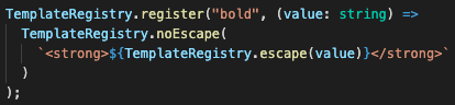
Another useful feature of the Component SDK is the ability to create custom helpers for the Manifest document. A number of these are provided by the UX Framework as standard, but you can also create and register your own.You can use them for various things such as:- Styling
- Formatting
- Calculations
Testing Components
The SDK comes pre-packaged with the Jest mocking framework and React's test renderer.Unit testing components involve mocking out external dependencies and asserting behaviour of the component. You will use Jest's snapshot feature, which allows the test framework to compare the output of the component against the snapshot.The steps are as follows:- Create static mock objects:
`useAuthResponse`- mock the response for the useAuth hook`data`- mock the data result from the page query`attributes`- mock the manifest configured dynamic attributes
- Arrange: The Arrange step sets up the mocks. In this case, we simply need to tell the useAuth hook to return our previously prepared mock auth response object
- Act: The Act step creates an instance of the TrainingMap component, taking in the mocked objects for page query response data and manifest configured dynamic attributes
- Assert: The Assert step compares the rendered output of the component to the previously snapshotted output
 Data mock:
`const data = {`` edges: [`` {`` node: {`` location: {`` name: "FC Fashion Westfield Bondi Junction",`` primaryAddress: {`` longitude: 151.24997359266263,`` latitude: -33.89138243611695,`` },`` },`` virtualPositions: [`` {`` quantity: 56,`` },`` ],`` },`` },`` {`` node: {`` location: {`` name: "FC Fashion North Sydney",`` primaryAddress: {`` longitude: 151.2054,`` latitude: -33.8396,`` },`` },`` virtualPositions: [`` {`` quantity: 100,`` },`` ],`` },`` },`` ],``};`Attributes mock:`const attributes = [`` {`` label: "Ref",`` value: "{{node.location.ref}}",`` },`` {`` label: "Quantity",`` value: "{{node.virtualPositions.0.quantity}}",`` },``];`Auth Response mock:`const useAuthResponse: MystiqueAuth.MystiqueAuth = {`` loggedIn: true,`` logout: () => {},`` user: {`` username: "F_syd@fcfashion.com.au",`` timezone: "Australia/Sydney",`` language: {`` label: "English",`` value: "en",`` },`` roles: [`` {`` role: {`` name: "DASHBOARD_VIEW",`` },`` contexts: [`` {`` contextType: "location",`` contextId: "4",`` },`` ],`` },`` {`` role: {`` name: "STORE_ASSISTANT",`` },`` contexts: [`` {`` contextType: "retailer",`` contextId: "1",`` },`` {`` contextType: "location",`` contextId: "4",`` },`` ],`` },`` ],`` },`` context: {`` level: "location",`` current: {`` contextType: "location",`` contextId: "4",`` label: "FC Fashion Sydney (F_SYD)",`` details: {`` ref: "F_SYD",`` primaryAddress: {`` latitude: -33.8845977,`` longitude: 151.2075861,`` },`` },`` },`` available: [`` {`` contextType: "location",`` contextId: "4",`` label: "FC Fashion Sydney (F_SYD)",`` details: {`` ref: "F_SYD",`` primaryAddress: {`` latitude: -33.8845977,`` longitude: 151.2075861,`` },`` },`` },`` ],`` set: () => {},`` roleCheck: () => ({ hasRole: true }),`` },``};`Want to learn more?To read more about unit testing components, go to Component SDK - Geting Started > Unit Testing Deploying a Custom Component Plugin
Unlike the OMX Workflow Framework where custom Rules plugins are required to be uploaded and activated within the Fluent platform, custom Component plugins are simple frontend javascript bundles that can be hosted on any web server, and referenced through the manifest document via URL.There are a few things you should do when preparing to deploy your production ready plugin to your web host:- Versioning
- Bundle
- Deploy
- Add your plugin reference to the Manifest document
`bundle.js` file is important to ensure that your changes are immediately reflected once deployed. This can be done using webpack `contenthash` feature. Once you've configured your package.json file with plugin versioning, you can use `yarn run bundle` to bundle your plugin. This will create a distribution folder called `dist`, which can be deployed to a web host of your choice.To see more about how to version your plugins, go to Component SDK > Plugin Versioning.