Learning - UX Framework Overview and Key Concepts
Essential knowledge
Changed on:
12 Nov 2024
Overview
[Warning: empty required content area]Key points
[Warning: empty required content area]Fluent's OMX UX Framework enables clients' UIs to react to change within the workflows and provide the best-in-class user experience and design.The OMX UX Framework delivers powerful capabilities for configuring fully tailored web apps that understand the Fluent Platform. It enables clients' user interfaces to react to change within the workflows and provides a best-in-class user experience and design. Together with the Workflow and Connect Frameworks, the OMX Platform unlocks the flexibility and adaptability of the Fluent OMS, by providing configuration-based solutions, keeping costs low, and time to market fast. Image: View of Order Management DashboardThe UX Framework includes 3 parts:
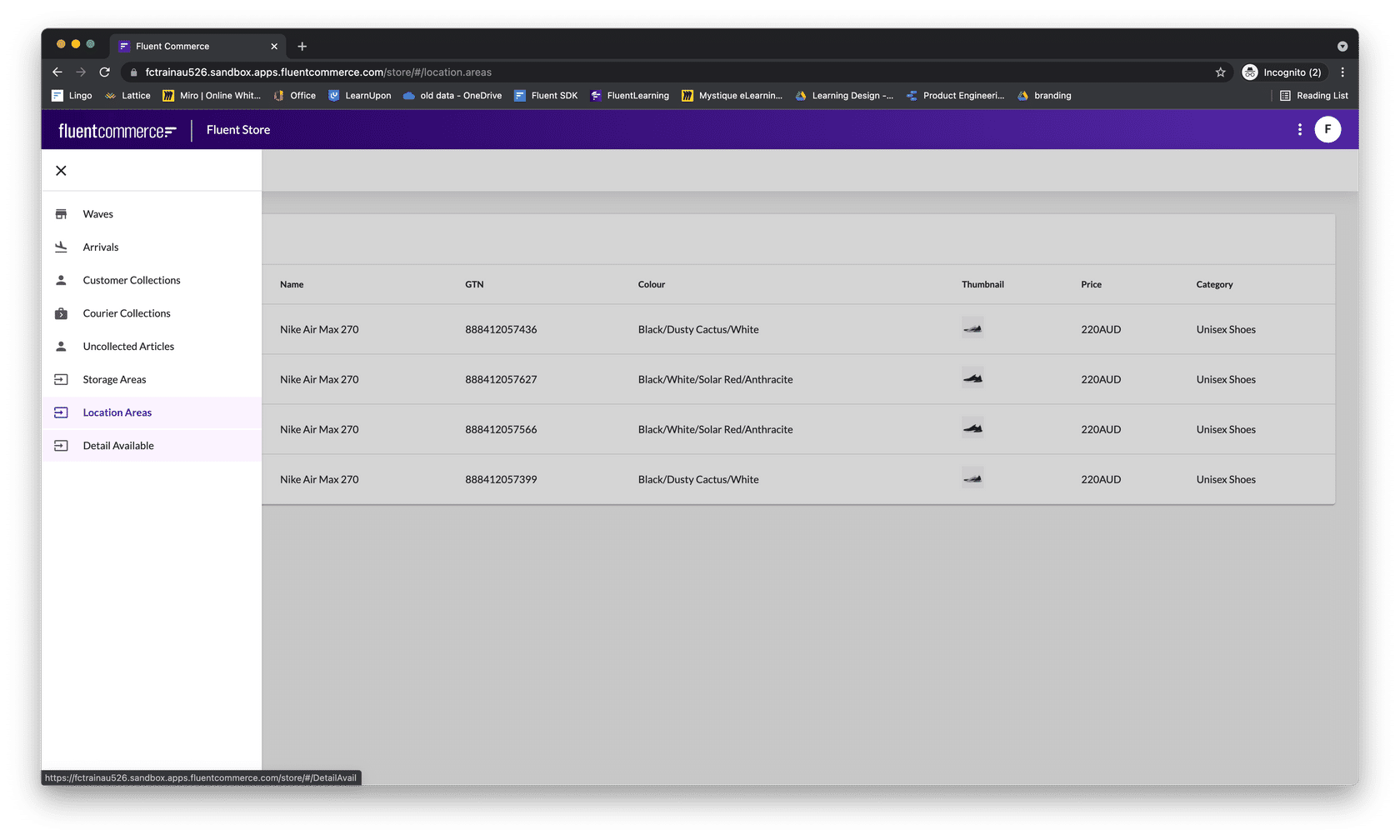
Manifest documents are used to configure Web apps, Manifest documents are JSON that defines: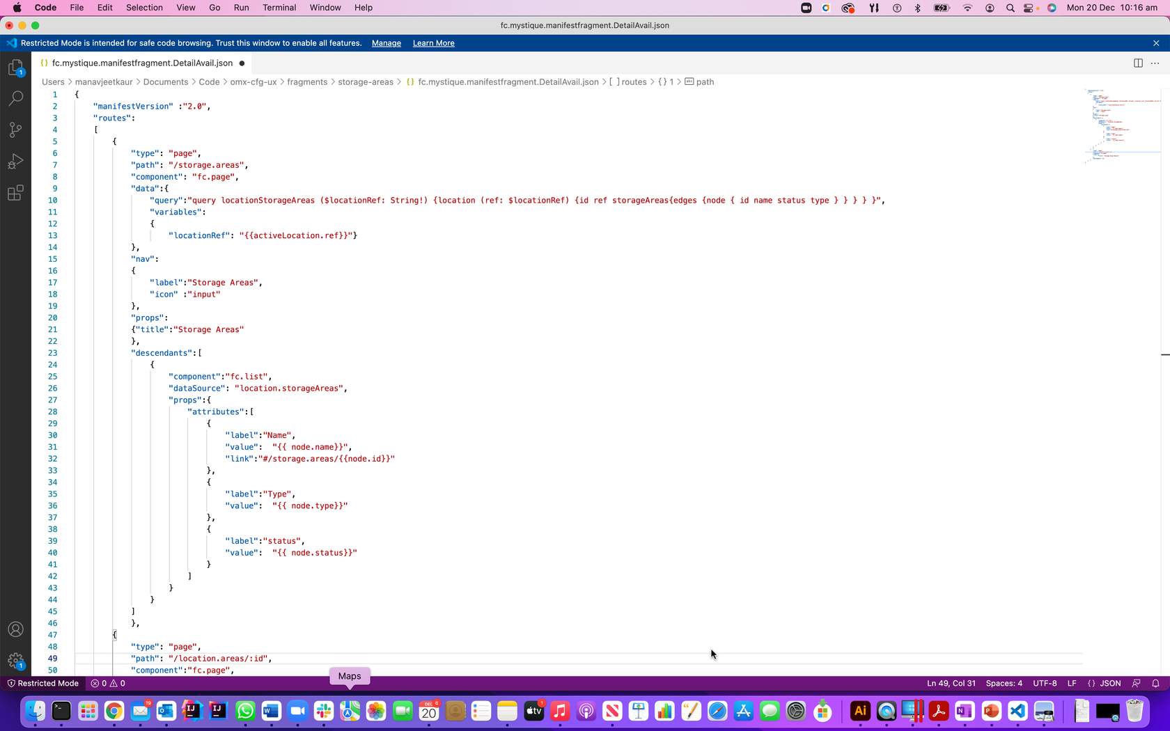
Component SDK areas of extension are shown in the diagram below.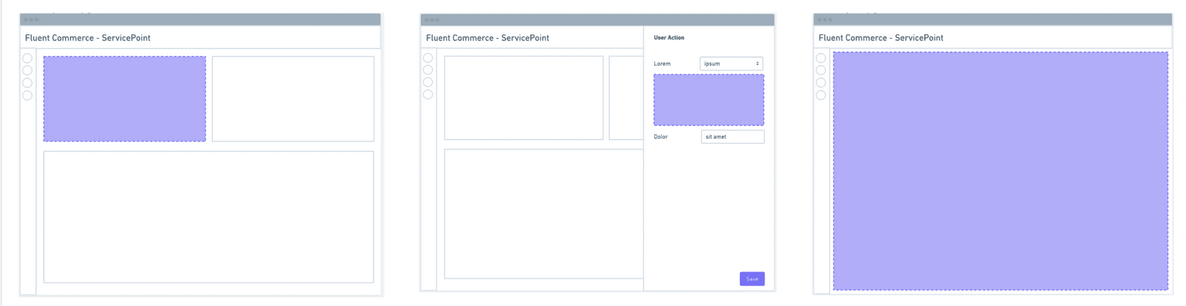
Image: View of Order Management DashboardThe UX Framework includes 3 parts:- A Component Library provides a library of configuration-ready components for use in Fluent Web Apps.
- A Component SDK for developers to create new custom components to extend the standard library.
- A Design System that provides research-based user experience (UX) advice and guidelines for the omnichannel retail space.
- Admin or Business Analyst - semi-technical users can customise the UI/UX of Fluent apps without needing developer input.
- Developers - can develop new components for places where customisation is not quite flexible enough.
- Retail Support and Store staff - provide the best user experience for retail staff to engage with Fluent order management.
| Component Library | The UX provides a rich Component Librarythat creates Apps that understand the Fluent platform. Clients, therefore, have the flexibility to tailor their UIs to their unique business processes and reduce development costs, |
| A design system | Best in class UI and effective UX design principles which provide flexible customisation and code-free configuration. |
| Component SDK | Component SDK allows clients and partners to develop new components to extend the functionality of the Fluent Web Apps. |
- Navigation
- Screen layouts
- Data sources
- User actions
| Manifest file | The manifest file, a JSON file to declare data source, components/screen layout & user actions |
| GraphQL query | Use GraphQL query to get the required data source for customisation. |
| Component library | You can use the built-in component library to create new UI components, like list and page is used in this example |
| Area of extension 1 – Left | New cards to display information from Fluent APIs or external sources |
| Area of Extension 2 | New form field types that work with rules to extend user action capability |
| Area of Extension 3 | create entirely new customised pages |
Component SDK features
Custom components are generic React components and the following features of SDK make it configurable via the manifest (which means no-code updates to apps) and also auto-adaptable to the workflows (generating new user action forms when the workflow changes).Hooks: Custom components can easily interact with OMX functionality via the provided hooks.Utility Components: Some utility components are provided to make building custom components easier and more consistent.Registries: Before a custom component can be used in an OMX web app, it must be registered with one of the three registries:- Component Registry - for standard in-page components
- Field Registry - for interactive form field components
- Template Registry - for adding new template helpers