OMX Design System Components
Essential knowledge
Author:
Fluent Commerce
Changed on:
17 July 2024
Overview
The Order Management Experience (OMX) Design System provides research-based guidelines for delivering a user experience tailored to the Omnichannel Retail space. This article will describe the Components which form the building blocks of the OMX Design System. The Component section describes the details of all the OMX specific components and recommended practices associated with them.Key points
- The Fluent OMX Design System is based on Material Design 2, this article covers the exceptions & elements not included in this documentation.
- Learn about Fluent OMX Component attributions, anatomies, types, usage examples, recommended practices, placements, states, and specs.
Components
Overview
There are two types of components within the OMX Design System; the first are based on Material Design 2 (MD2) with a Fluent Commerce theme, and the second are the unique Fluent Commerce OMX components. The latter is designed specifically for Fluent Order Management users to improve their overall experience.Where can I find the MD2 documentation for the components with a Fluent Commerce theme?
| Material Design 2 component with Fluent Commerce Theme | Material Design 2 Name & Docs |
| Button (Primary Filled, Primary Outline, Secondary Filled, Secondary Outline, Floating Action, Text Link Button - primary & secondary) | Buttons:https://m2.material.io/components/buttons |
| Dialog (Confirmation & Full-screen) | Dialogs: https://m2.material.io/components/dialogs |
| Dropdown | Desktop - Menus: https://m2.material.io/components/menusMobile - Bottom Drawer: https://m2.material.io/components/navigation-drawer#bottom-drawer |
| Filters | Chips: https://m2.material.io/components/chips |
| Sheets | Sheets Bottom: https://m2.material.io/components/menus |
| Snackbar | Snackbars: https://m2.material.io/components/snackbars |
| Tabs | Tabs: https://m2.material.io/components/tabs |
| Text Fields | Text Fields: https://m2.material.io/components/text-fields |
Button
A clickable component representing an option or providing the user with an available action to take. All buttons are based on Material Design 2 with a Fluent theme.Button Types
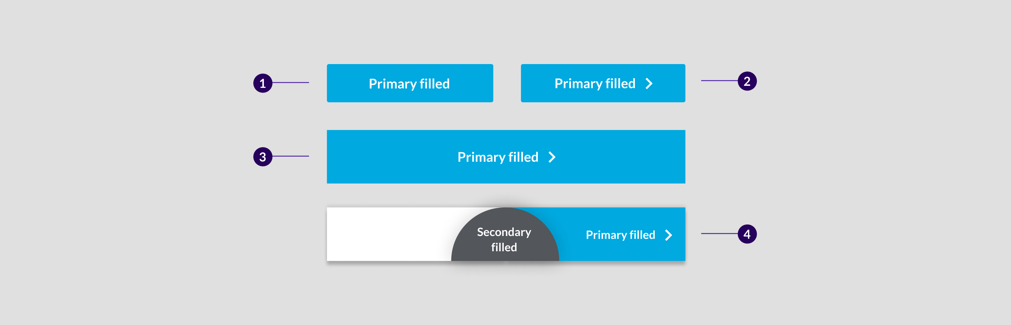
 All Button Types:1. Primary filled, 2. Primary Outline, 3. Secondary filled, 4. Secondary Outline, 5. Primary Text, 6. Secondary text
Button emphasis chart
 Above: Buttons are listed in order of highest to lowest impact
- Highest emphasis: Use for the most important action on a page.
- Medium emphasis: Used for occasional actions.
- Low emphasis: Use for minor actions.
Primary Filled Button
Primary filled buttons are the highest emphasis buttons. These buttons are associated with the most important actions on a page. For more information about button emphasis, see the Buttom Emphasis Chart above.Component attribution is based on Material Design 2 with the Fluent theme. Progress footer is a Fluent component.Anatomy

- Text label
- Container
Types
- Primary button
- Primary filled with arrow
- Primary with arrow full width
- Primary filled button with arrow is part of the progress footer component.
- For more information on the progress footer, see this link.
Usage Examples
- To trigger an action For example, Create wave
- To enter user data. For example, Save to save the address of a customer.
- To move from one step to the next across a user flow. For example, Pick Item ---> Pack Items ---> Book Carrier.
Recommended Practices
- Keep button styling consistent. For example, if the Print button is dark grey on one page, it should be the same on subsequent pages.
- Don't use more than 2 primary buttons per context. When there are too many primary buttons on one page it can make the hierarchy unclear. Also, the user does not know which actions are important.
- Don't make the primary buttons narrower than 85 pixels.
 Above: Don't use more than 2 primary buttons per context
Placement
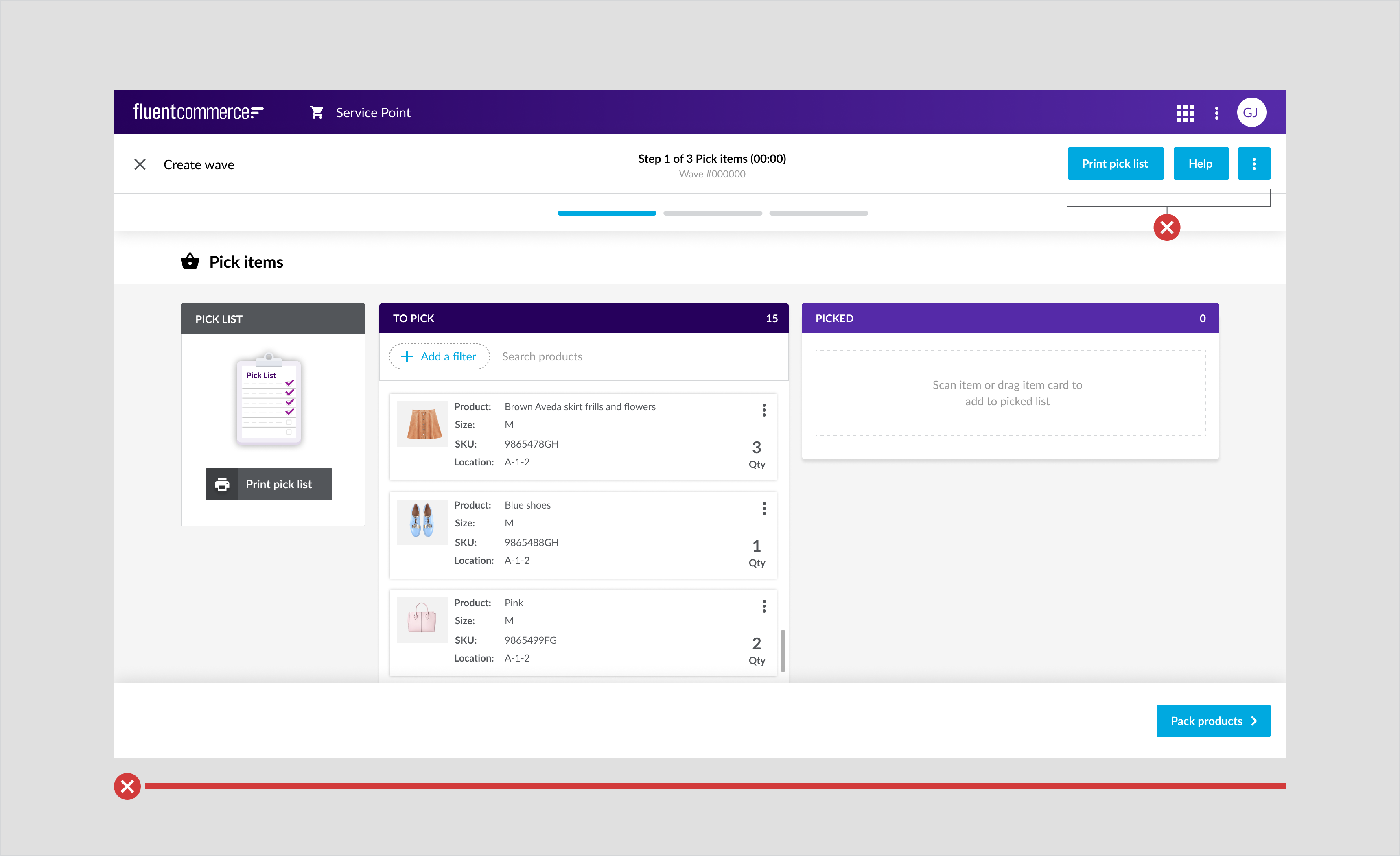
Primary filled buttons are styled differently on mobile and tablet. On mobile buttons must be optimized for fingers as opposed to a mouse. Such buttons include a wide button width and large click zones.Mobile
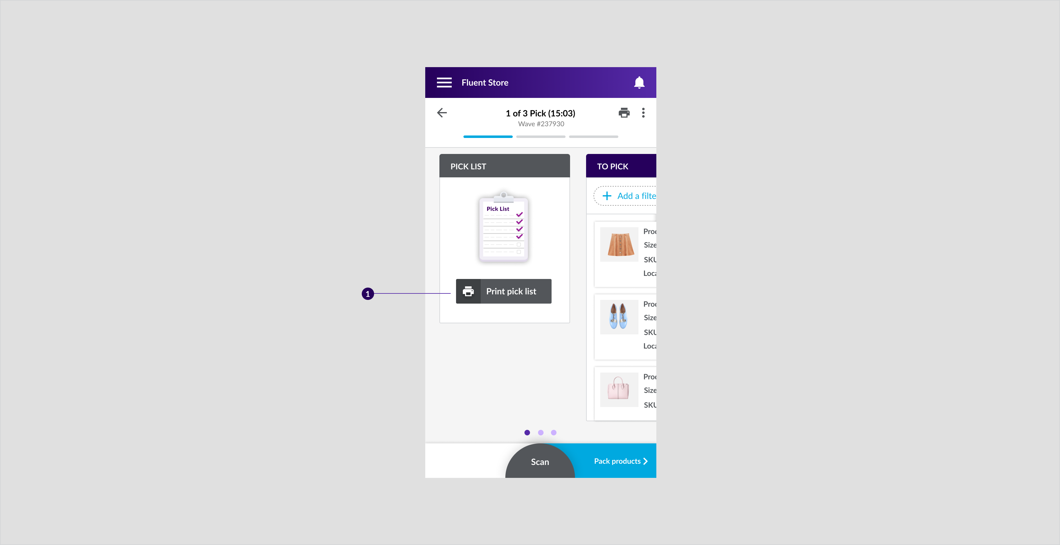
 Above: Primary filled button on carrier booking step in pick, pack ship wizard for mobile, the button is full width which makes it easier to tap.
Tablet
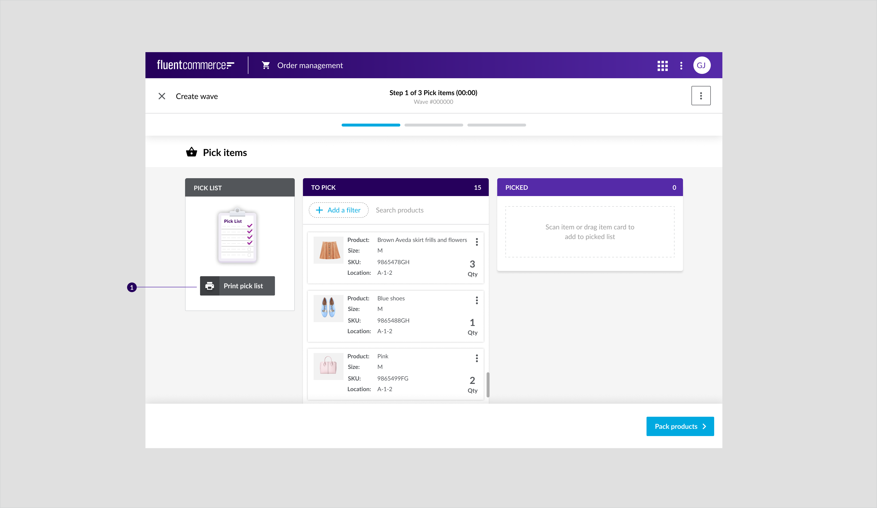
 Above: Primary filled button on pick step in pick, pack ship wizard for tablet, the primary filled button with an arrow is also part of the progress footer component.
Desktop
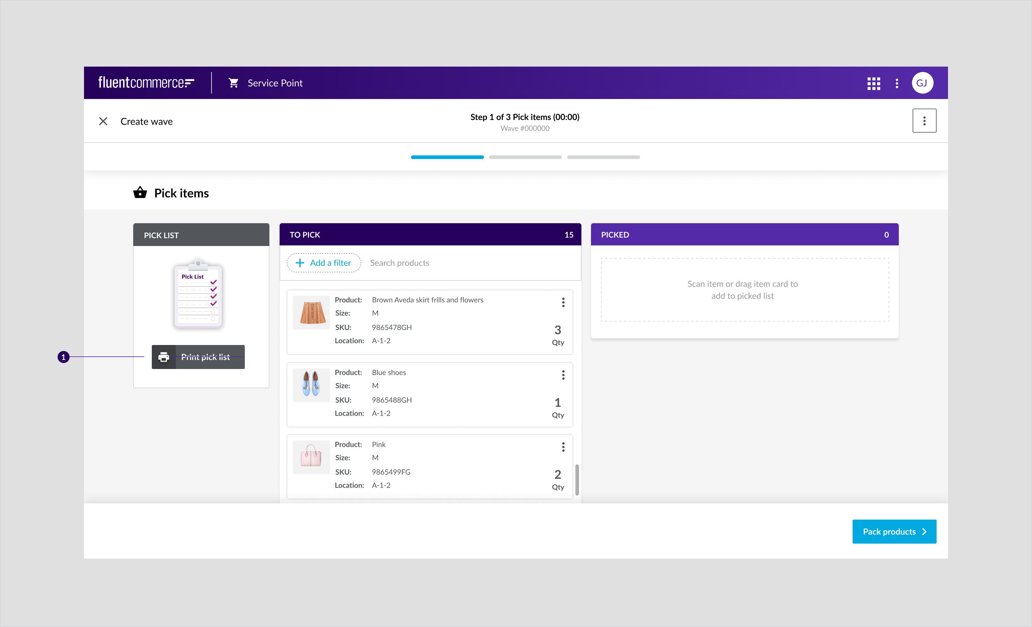
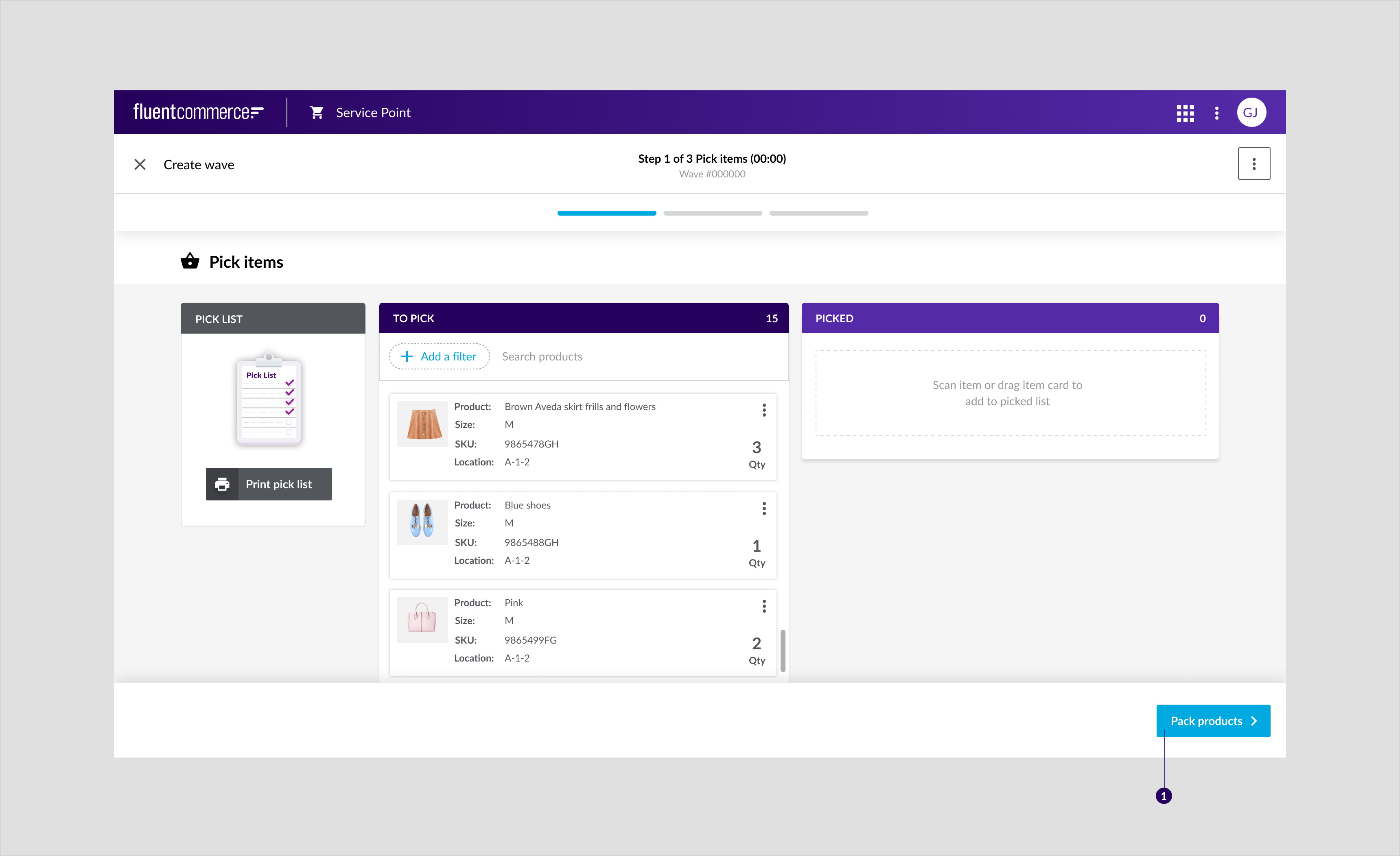 Above: Primary filled button on pick step in pick, pack ship wizard for desktop
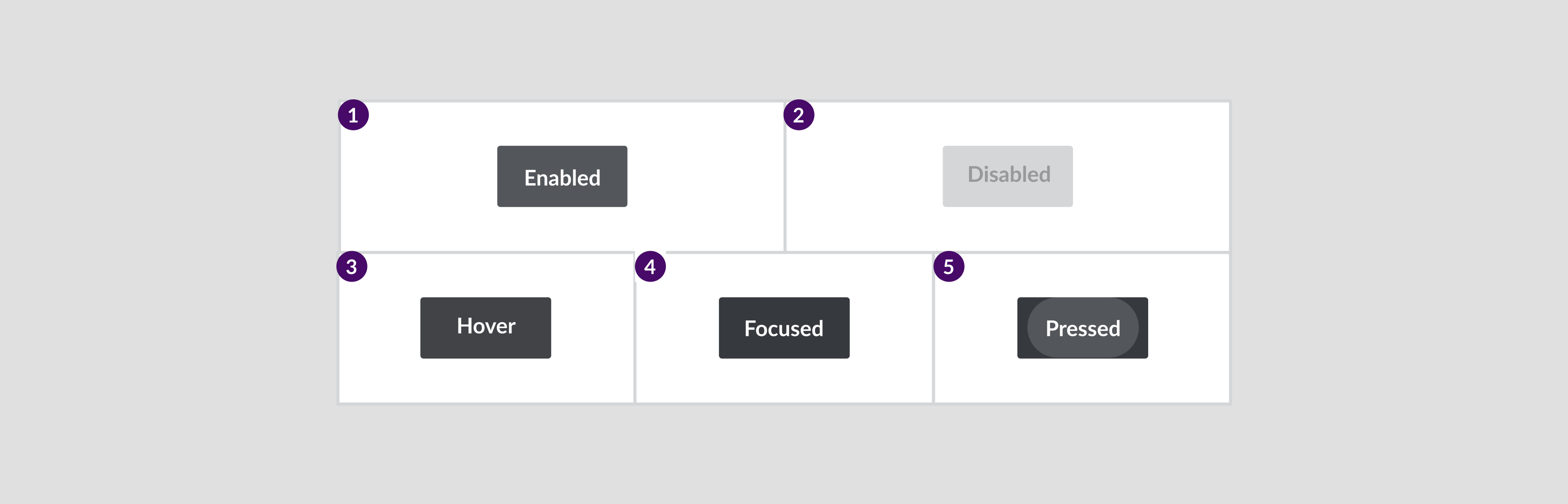
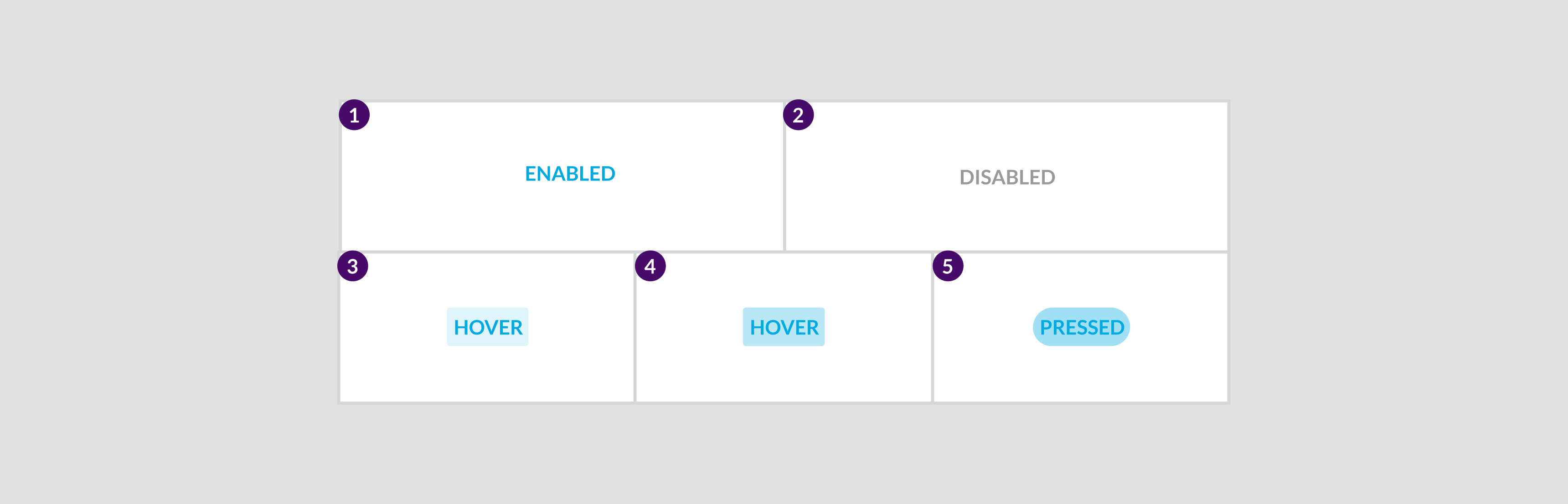
States
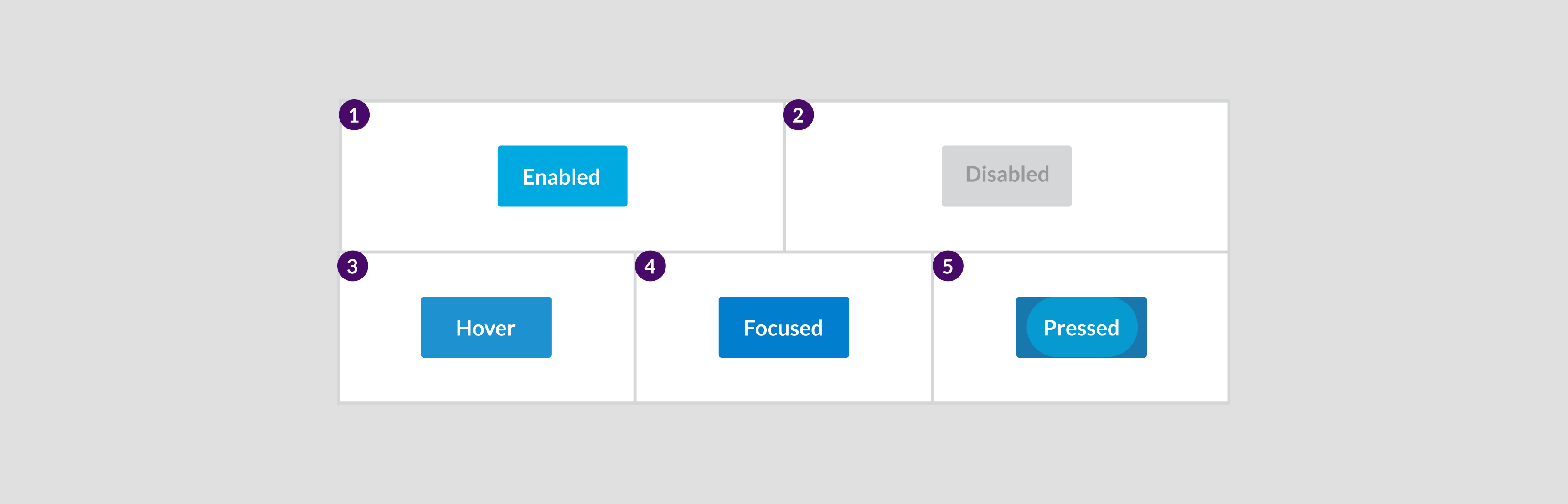
Specs

- The minimum width should be 85 pixels.
- The maximum height should be 40 pixels.
Primary Outline Button
It is a medium emphasis and often used in conjunction with the primary button. For more information about button emphasis, see the button emphasis chart.Component attribution is based on Material Design 2 with a Fluent theme.Anatomy

- Arrow icon
- Text label
- Container
Types

- Primary outline button
- Primary outline button with arrow icon
Usage Examples
To return to the previous screen when navigating through order in the pack screen.- Primary outline button
- Primary outline button with back icon
Recommended Practices
- Don’t use it for primary actions.
- Don’t include more than one per page.
Placement
These buttons are used only on the desktop.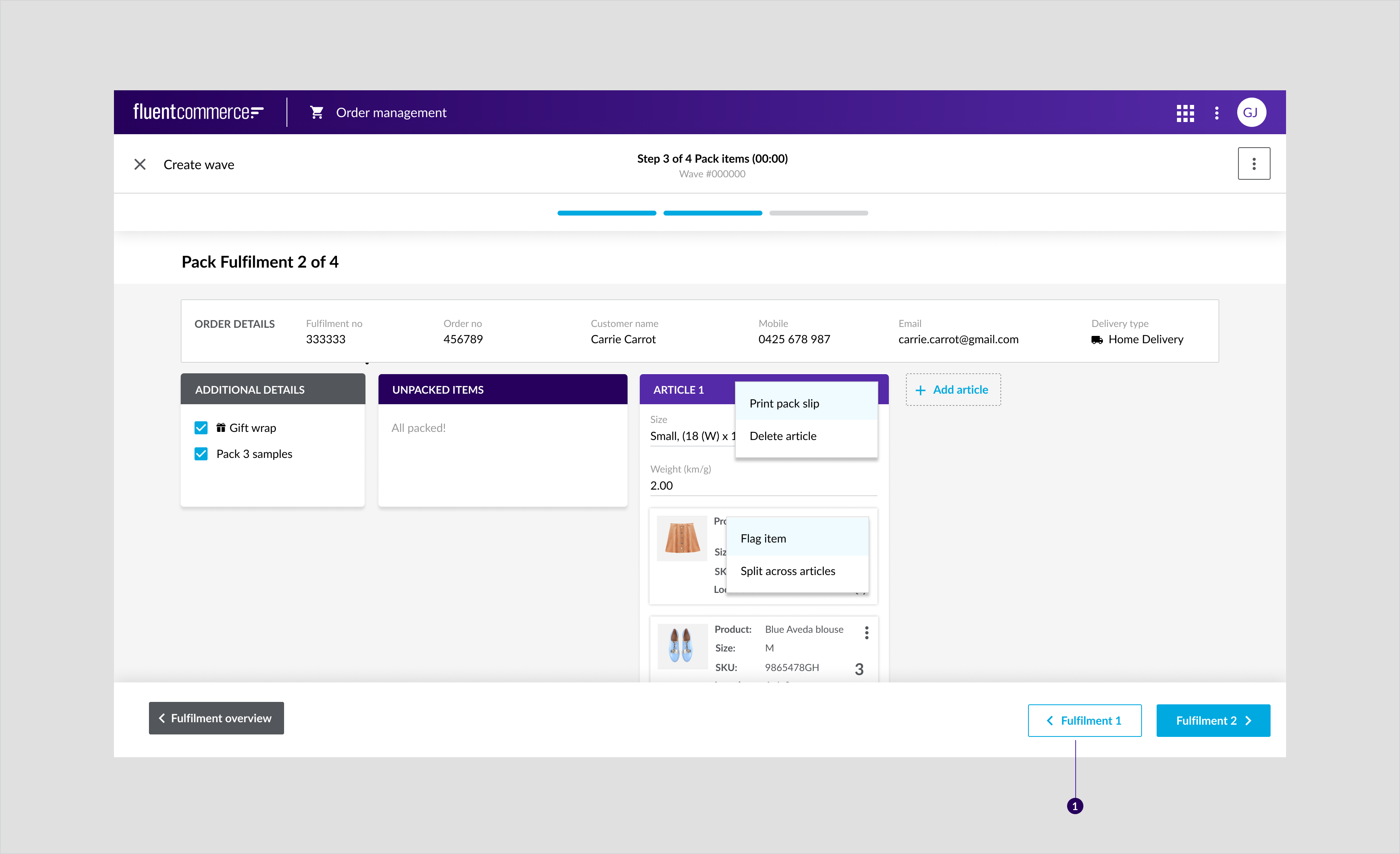 Above: Primary outline button on pack step in pick, pack ship wizard for desktop.Bottom wizard page navigation: Button for navigating through orders in the Pack stage.
States
Specs

Secondary Filled Button
It is a high emphasis button associated with the second most important action on a page. For more information about button emphasis, see the button emphasis chart.Component attribution is based on Material Design 2 with a Fluent theme.Anatomy

- Text label
- Container
Types
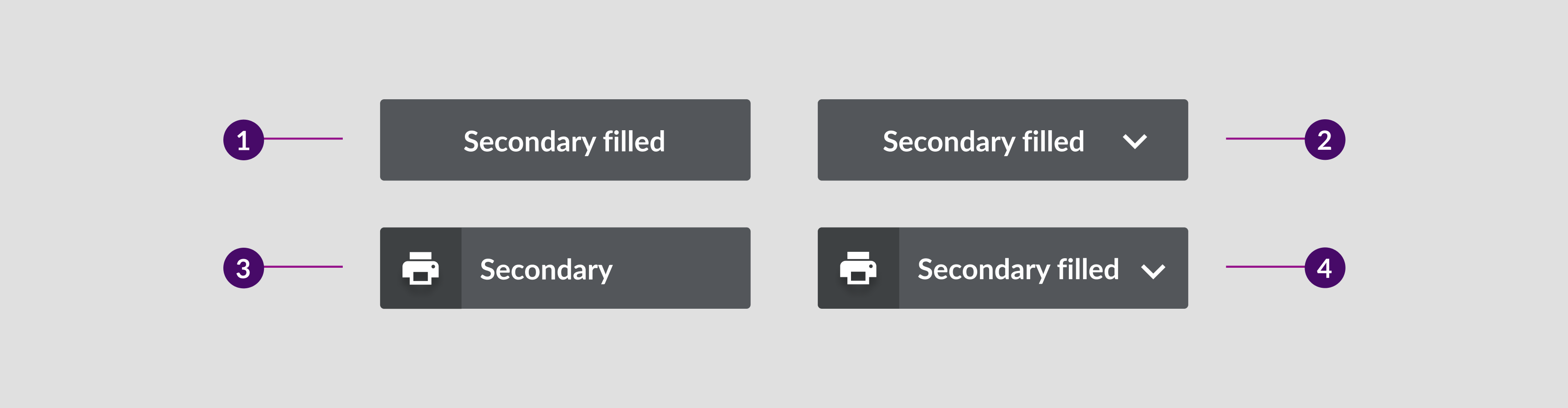
- Secondary filled button
- Secondary filled with dropdown icon
- Print button
- Print button with dropdown
Usage Examples
- For Print actions.
- For the Scan button. The button is part of the Progress Footer component.
Recommended Practices
- Use contrasting colours to differentiate between secondary and primary buttons. The differences between the two should be obvious.
- Don't Include more than two grey secondary buttons as the in-store staff will not be able to visually distinguish between them.
Placement
Secondary filled buttons are used on all the devices for actions such as Scan and Print.Mobile
 Above: Secondary filled button mobile placement
Tablet
 Above: This example shows a secondary filled Print button.
Desktop
 Above: This example shows a secondary filled Print button.
States
Specs

Secondary Outline Button
A secondary outline button is a medium emphasis button used occasionally for actions. For more information about button emphasis, see the button emphasis chart.Component attribution is based on Material Design 2.Anatomy
 Above: Secondary Outline button with leading icon
- Leading icon (optional)
- Button container B. Secondary Outline Icon Button
Types
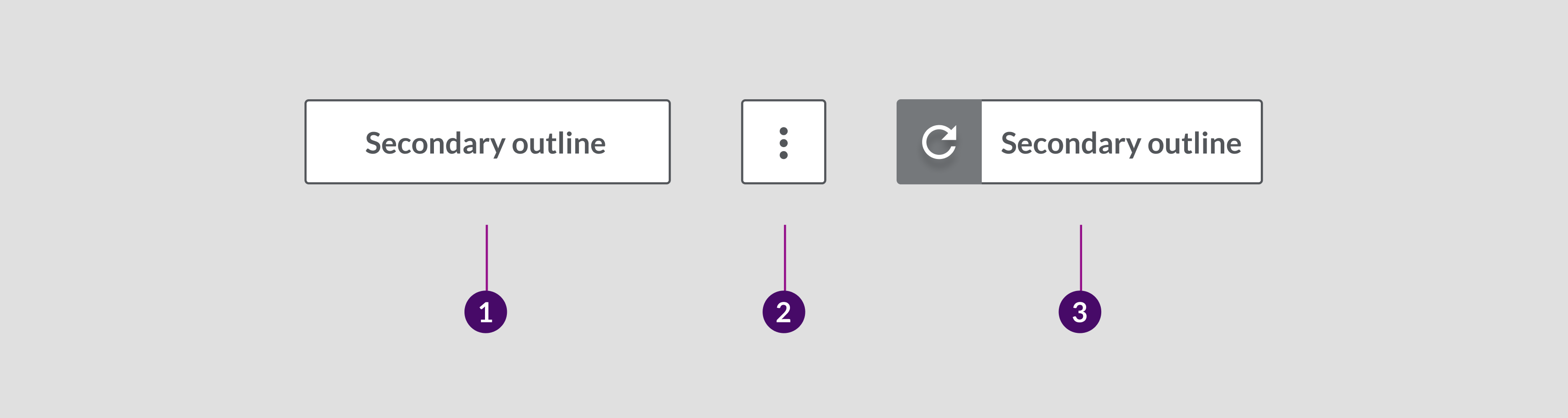 Above: Secondary outline button types
- Leading icon
- Button label
- Button container
Usage Examples
- To trigger the Retry Carrier action.
- For the MORE button.
Recommended Practices
- Don’t use it for primary actions.
- Don’t include more than one per page.
- Use when a button next to a secondary filled button is required.
Placement
Used on tablet and desktop only.Tablet
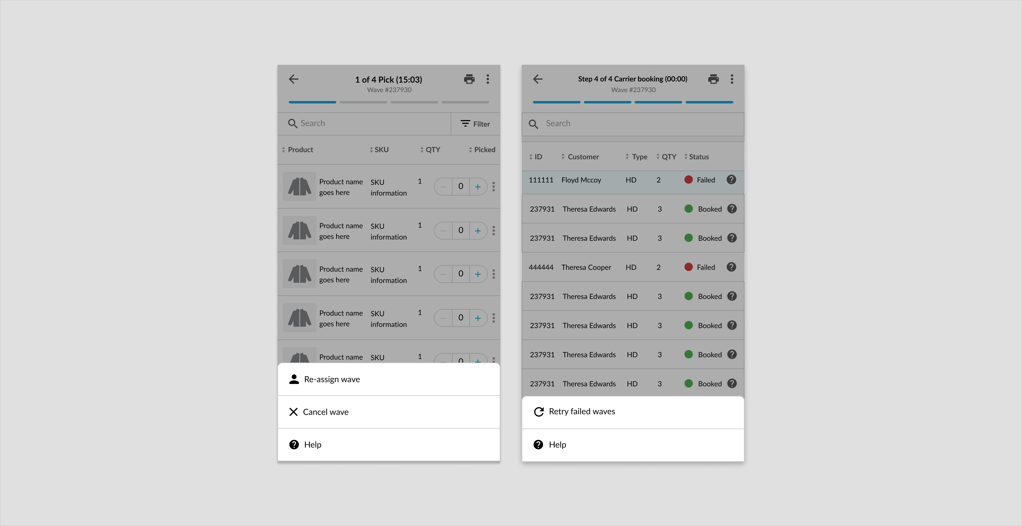
 Above: Secondary filled button for "retry carrier" on carrier booking step in pick, pack ship wizard for tablet.
Desktop
 Above: Secondary filled button for "retry carrier" on carrier booking step in pick, pack ship wizard for desktop.
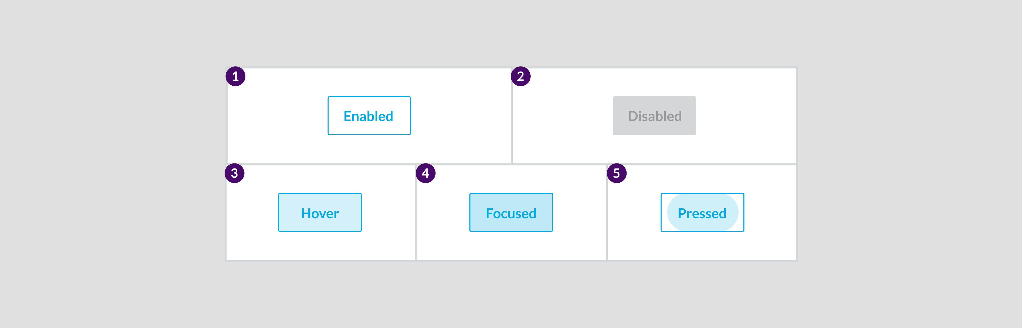
States
Specs

Floating Action Button
A Floating Action Button (FAB) opens a list of options and then triggers a new process. This button is most commonly for the Create Wave action.Component attribution is based on Material Design 2.Anatomy

- Container
- Icon
Usage Examples
Creative actions on mobile and tablet only, for example, Create Wave.Recommended Practices
- Don’t use floating action buttons on desktop. Instead use primary button to create the wave.
- Include FAB on dashboards screens with creative actions. For example Create Wave
- Don't include more than one full sized floating action buttons per page.
Mobile
- Don’t include more than one floating action button per page
- Include a single floating action button
- Keep positioning consistent.
Desktop
- Don’t use the Floating Action Button on desktop screens instead, use a primary button.
Placement
Floating action buttons are used on mobile and tablet only.Mobile
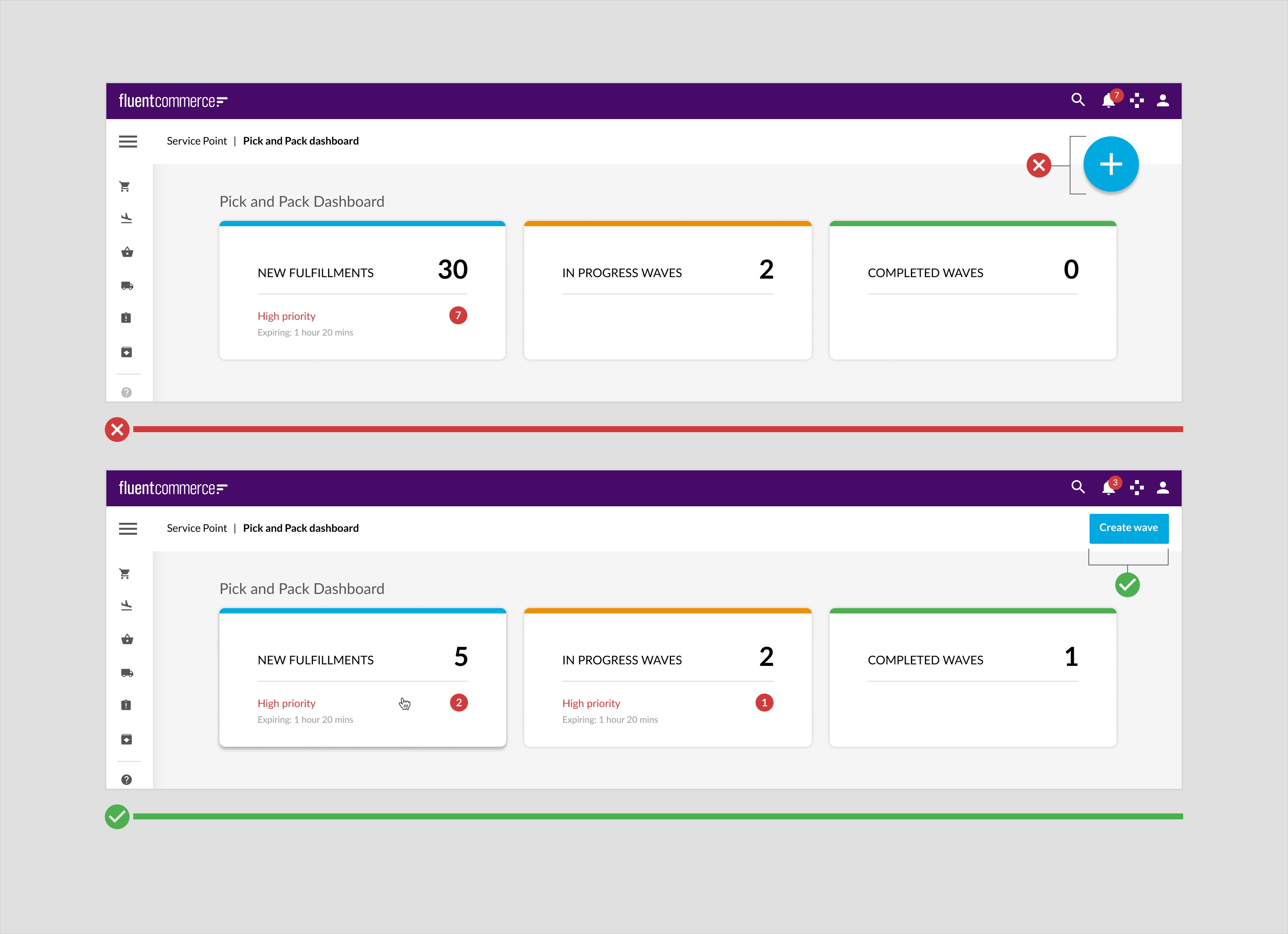
 Floating action button on pick and pack dashboard for mobile
Tablet
 Floating action button on pick and pack dashboard for tablet
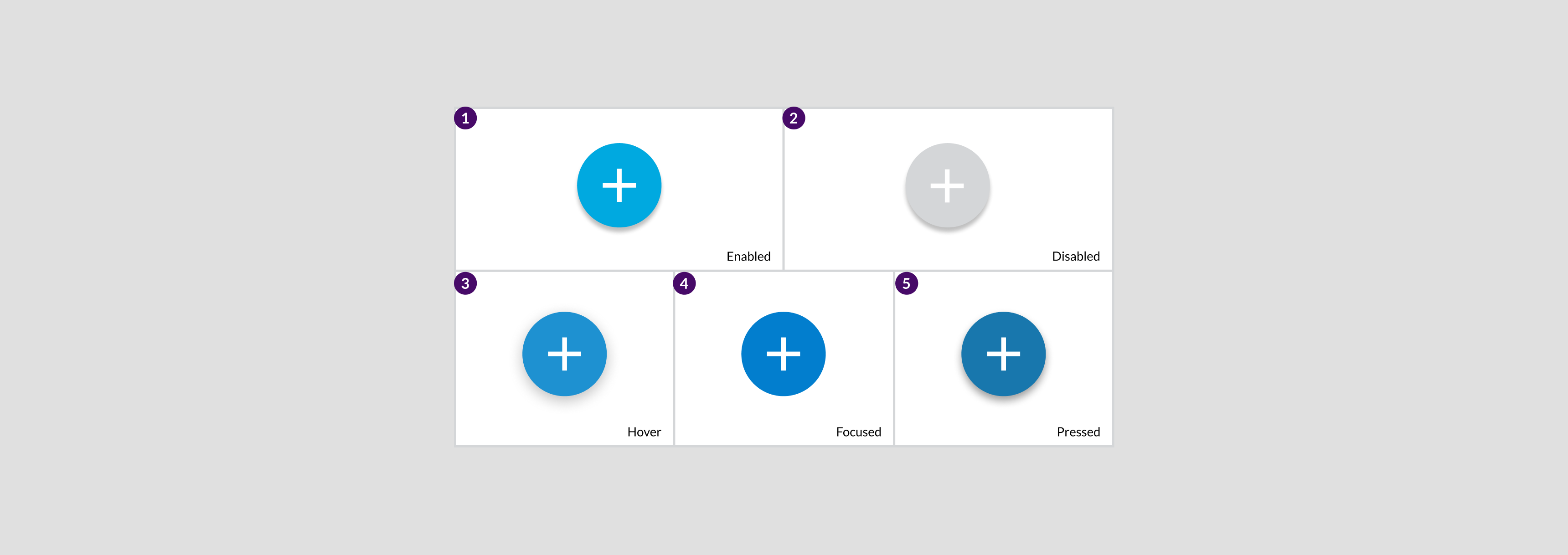
States
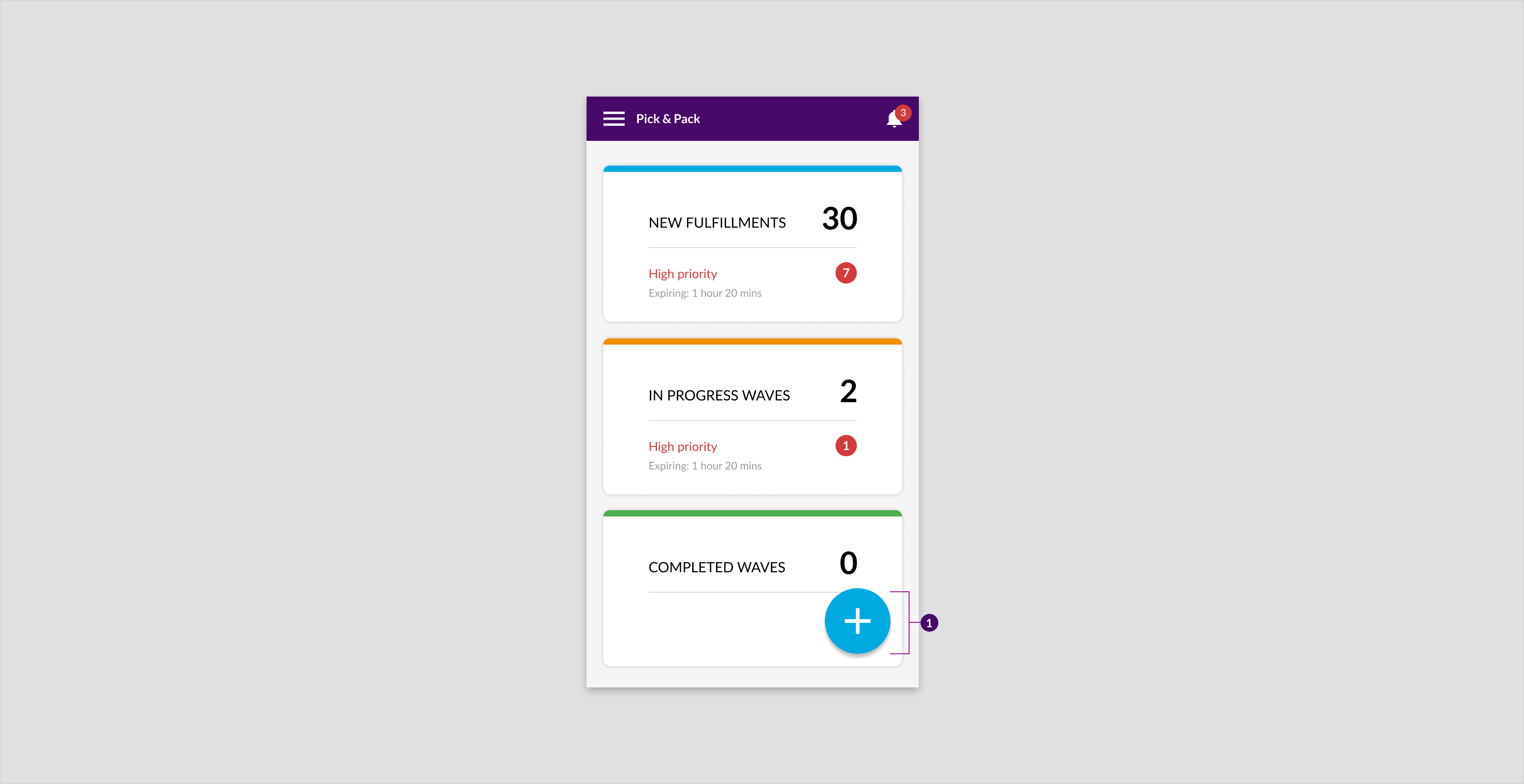
State Patterns
 When a user taps on the floating action button (screen A) a menu with related options is displayed over the top of a modal overlay (screen B).
Specs

Text Link Buttons (Primary and secondary)
Text link buttons are low emphasis buttons. They are used for uncommon actions. For more information about button emphasis, see the button emphasis chart.Component attribution is based on Material Design 2.Anatomy

- Secondary text button
- Primary text button
Usage Examples
- Primary and secondary actions in confirmation modal dialogs.
- Primary text in tables. For example, Add flag
Recommended Practices
- Don’t use link-style buttons for primary actions. The text-link buttons do not provide enough emphasis. Primary actions should be primary buttons, not link-style buttons.
- Don’t use for actions that require high to medium emphasis.
Placement
Text-link buttons are used on mobile, desktop, and tablet.Desktop
 Text link buttons for "CANCEL" and "CONFIRM" on confirmation dialog for desktop.
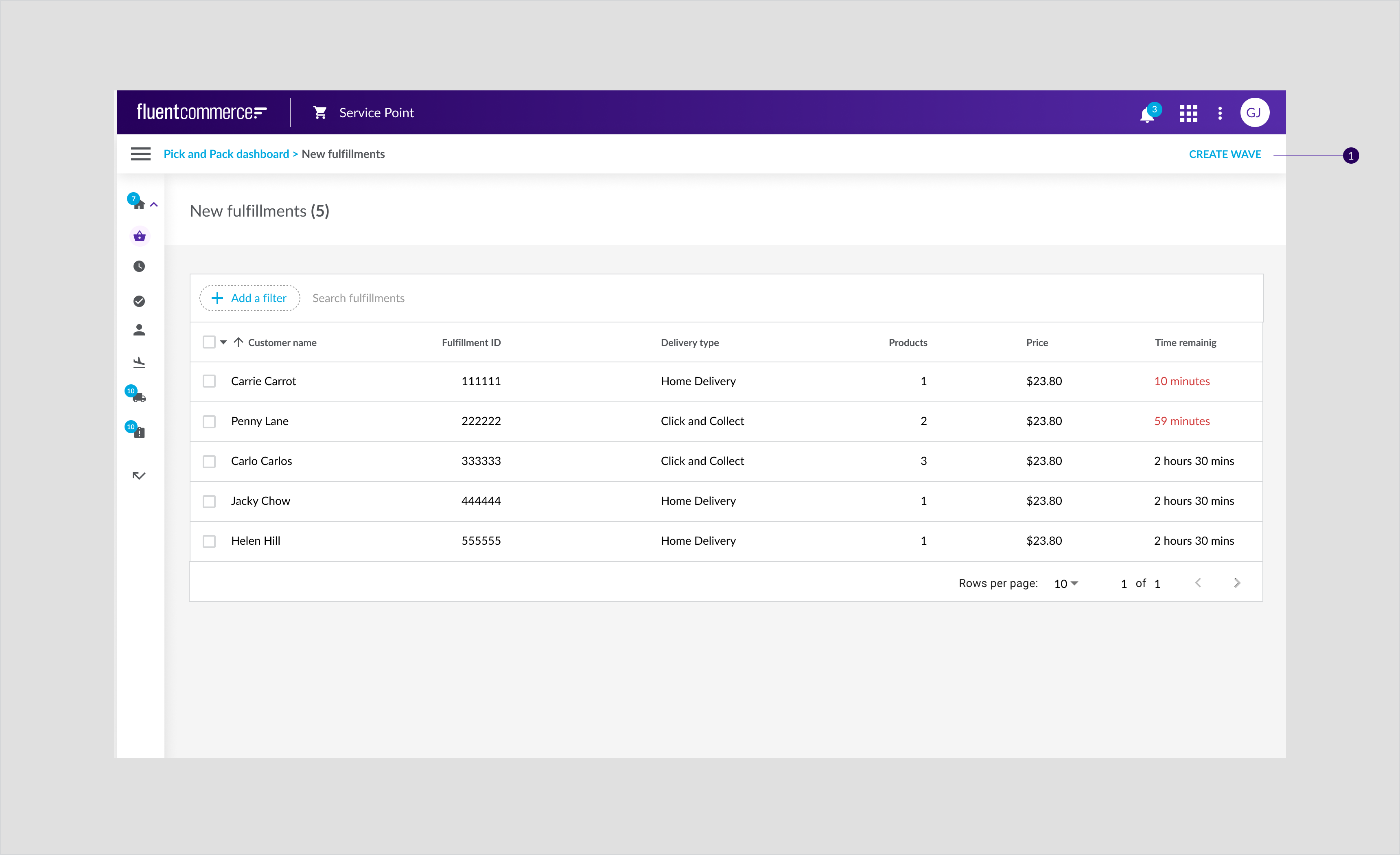 Text link button for "CREATE WAVE" in the secondary navigation on the order page for desktop.
States
Specs

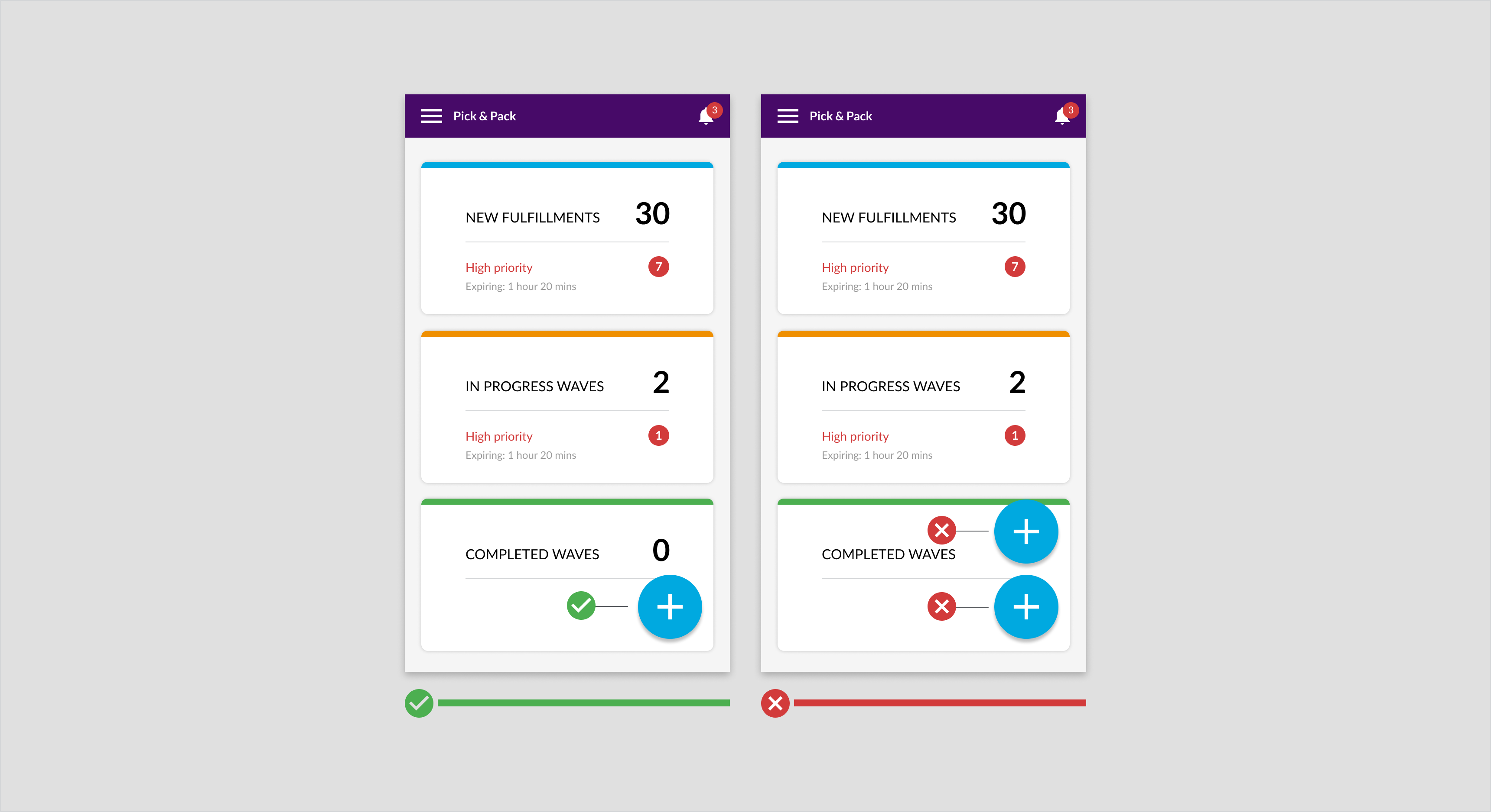
Cards
Cards are versatile Components that enable a user to view alerts, data, and statistics crucial for business . The user can view the dashboard summary on a card and drill down further for details.| Type | Name | Usage Examples |
 | Interactive card | - Pick and pack dashboard- Landing pages |
 | Interactive card narrow | Complex dashboards |
 | Summary card (Desktop/Tablet) | - Detail pages- Carrier booking summary |
 | Dashboard summary card desktop and tablet | |
 | Summary details card mobile | Dashboard summary |
Recommended Practices
- Adhere to the one card per concept rule. A card is designed to a key idea so all the elements contained in the card should be related to the key concept
- Limit content length. You still have the option to provide long-form or additional information on the subject
- Include large amounts of whitespace between card outlines and graphic elements for improved readability For more than 10 list items, use a standard vertical list as it is easy to scan
Interactive Card
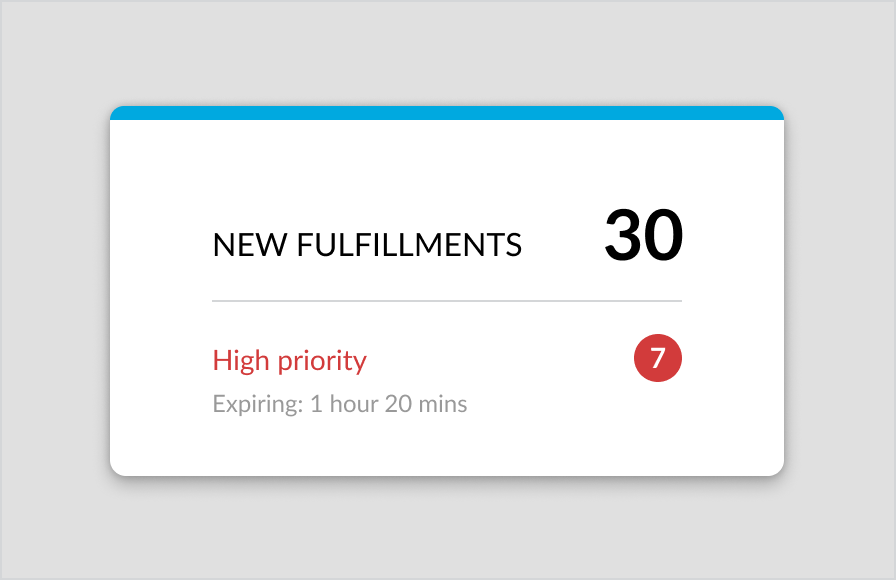
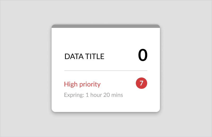
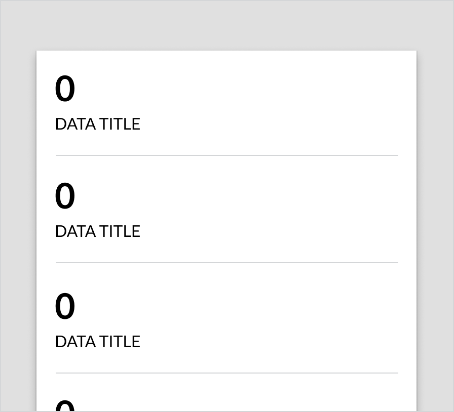
Interactive card provides an overview of information that a user can drill down further.Component Attribution .... Fluent OMX component.Anatomy

- Container
- Data Title
- Metric
- Divider
- Data Subtitle/status
- Supporting text
- Alert metric
Usage Example
Use this card on dashboards when a user needs live updates. For example, on the pick and pack dashboard, the cards give in-store staff a simplified snapshot of the priority of tasks. So, they have an understanding of what needs to be done. Based on priority, the In-progress items are grouped by status (one status per card) with high priority items highlighted using high priority indicators.Recommended Practices
- Display a minimum of two cards
- Keep card titles clear and concise
- Make cards clickable by displaying a slight drop shadow under each card. This drop shadow should increase on cursor hover.
- Utilize color to:
- Highlight the status of a card
- Emphasize high priority waves
- Use Type in contrasting sizes to convey hierarchy
- Keep card size (width and height) consistent across the layout
- Only display alerts on cards if orders or the in-progress waves are either high priority or expiring soon
- Display only one card per row on mobile for a better readability experience
- Don’t display more than five cards in a row as it distracts the user
- Don’t repeat the same colors for cards to convey different information
Placement
The same design can be used across mobile, tablet and desktop however the layout differs. On a mobile, cards are stacked whereas on tablet and desktop, they are laid out in a row.Mobile
On landing pages, Cards are stacked one on top of each other with one card per row. In the case of the pick and pack wave dash/landing page the stat cards show waves based on status. “Create wave” button may be positioned over the top of the last card. All of these cards are clickable and will take you to the relevant page.Pick and pack dashboard for mobile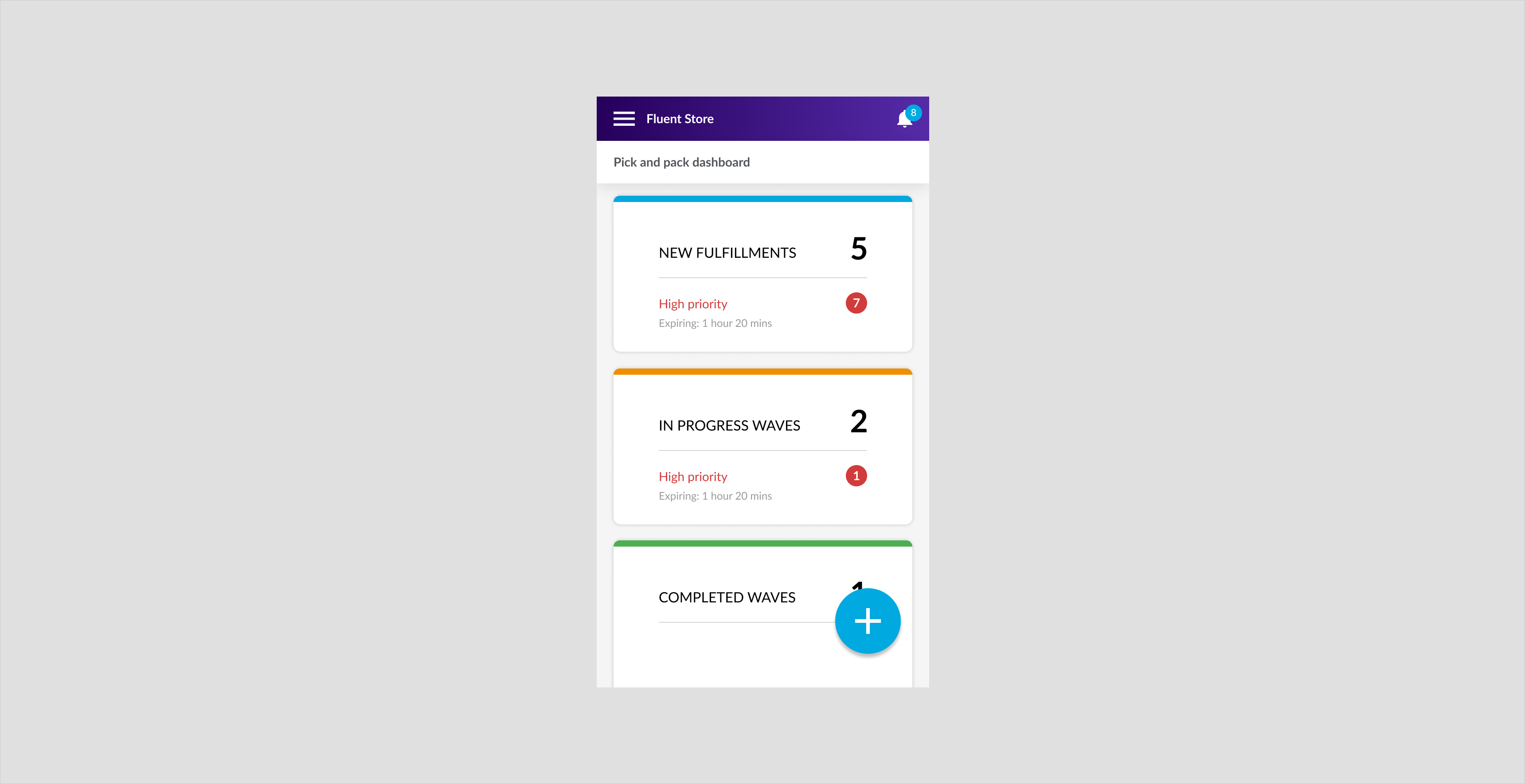
Desktop and Tablet
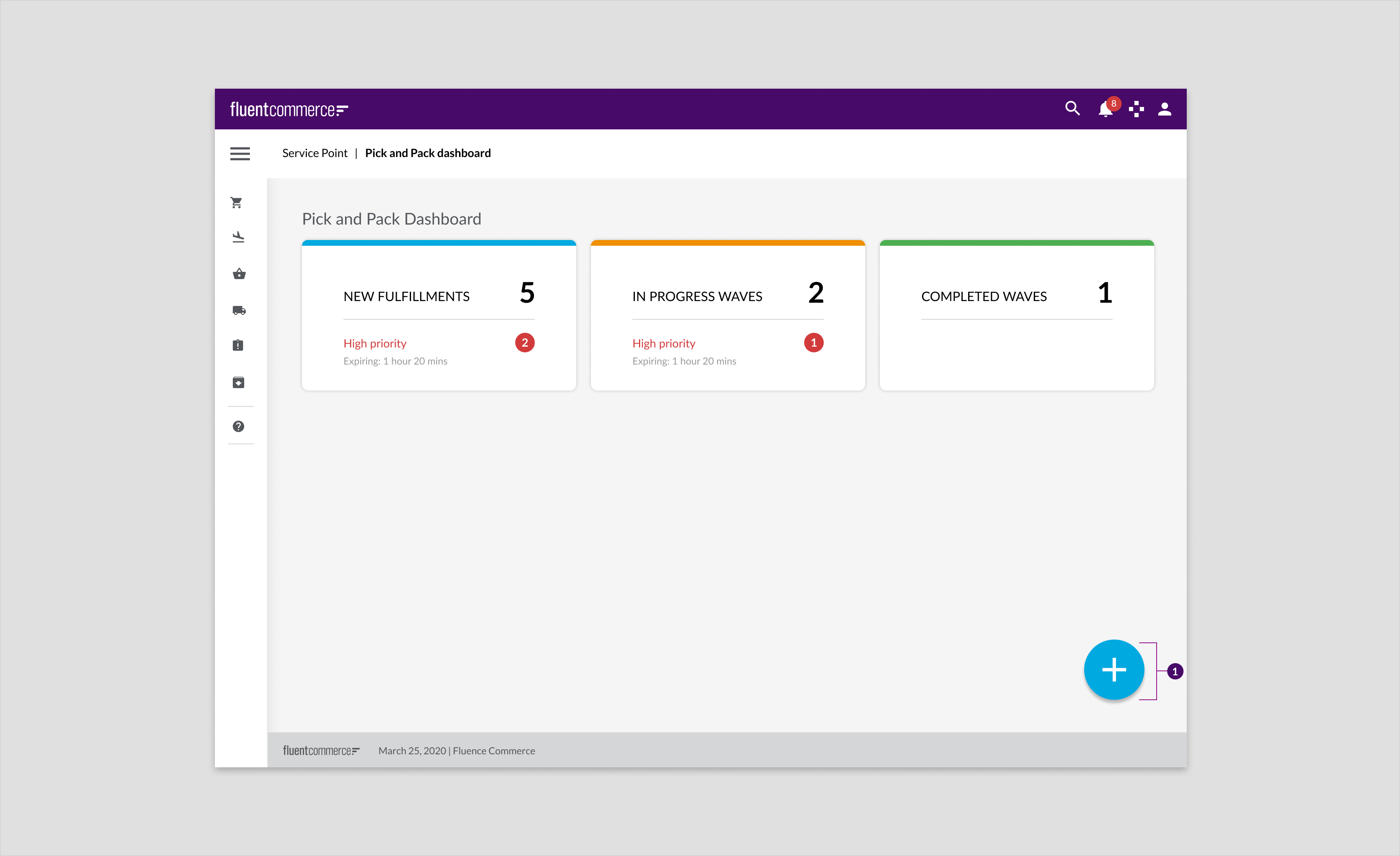
On landing pages, three cards are positioned in row. In the pick and pack dashboard the stat cards show waves based on their status.Pick and pack dashboard for desktop and tablet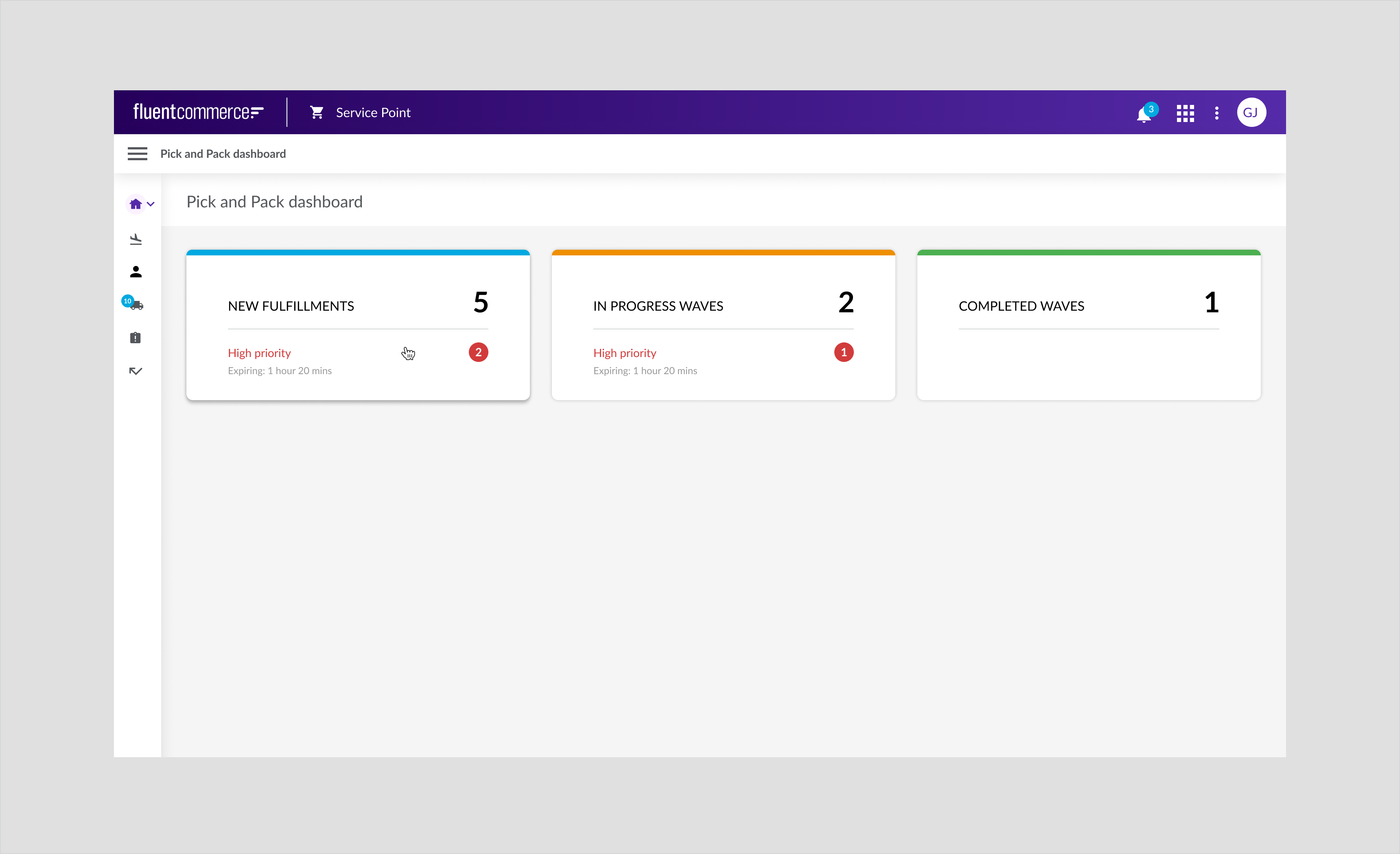
Specs

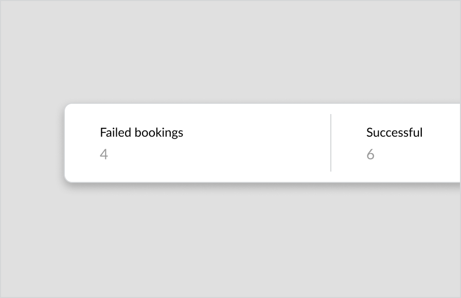
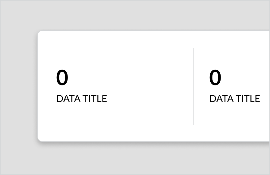
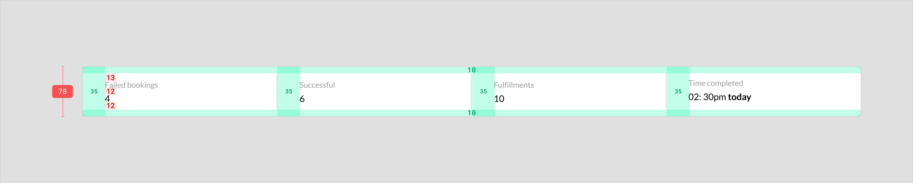
Summary Card
A summary card highlights key information relating to a particular page that the user is on. Summary cards are not used on mobile devices because the information is stacked.Component attribution .... Is a Fluent OMX componentAnatomy
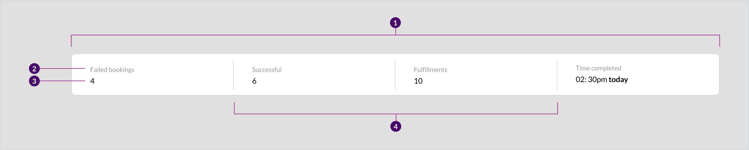
- Container
- Data title
- Data
- Divider
Usage Examples
- To summarize data about an area relevant to the page.
- Used on a details page to summarize key data.
Recommended Practices
- Display a minimum of two columns
- Keep card titles clear and concise. What
- Use color to provide contrast on the cards. E.g. making the card stats black and headings grey. This contrast in color makes it easier to scan the data and give the stats more emphasis
- Display the data in evenly spaced columns so that it is easier to read.
- Don’t have a hover state summary card as it is not clickable
Placement
The summary card is positioned after the page title for tablet and desktop and above the rest of the page content and above tables.Tablet and Desktop
Order details page for tablet and desktop.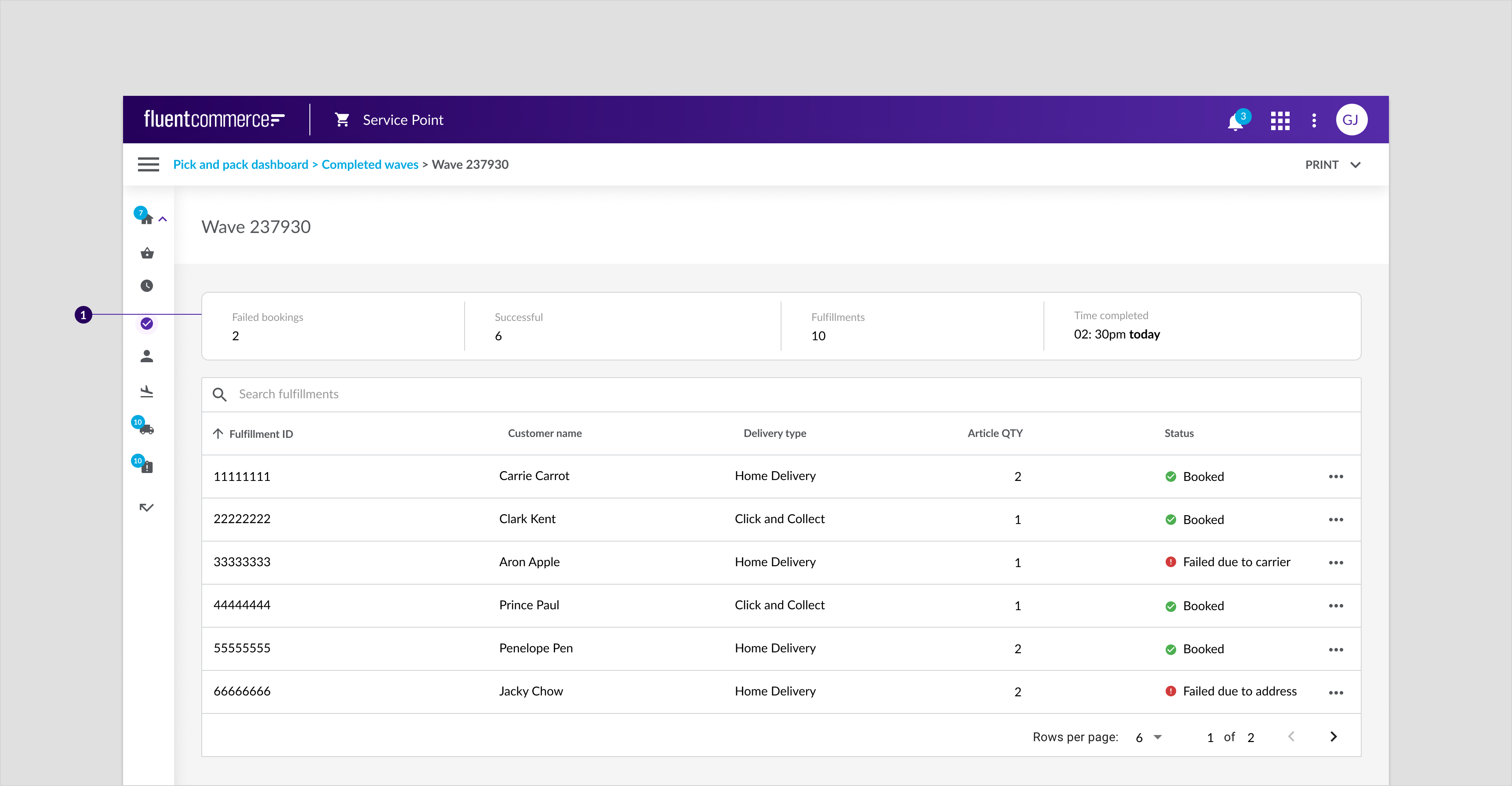 Order details page for customer collections, tablet and desktop.
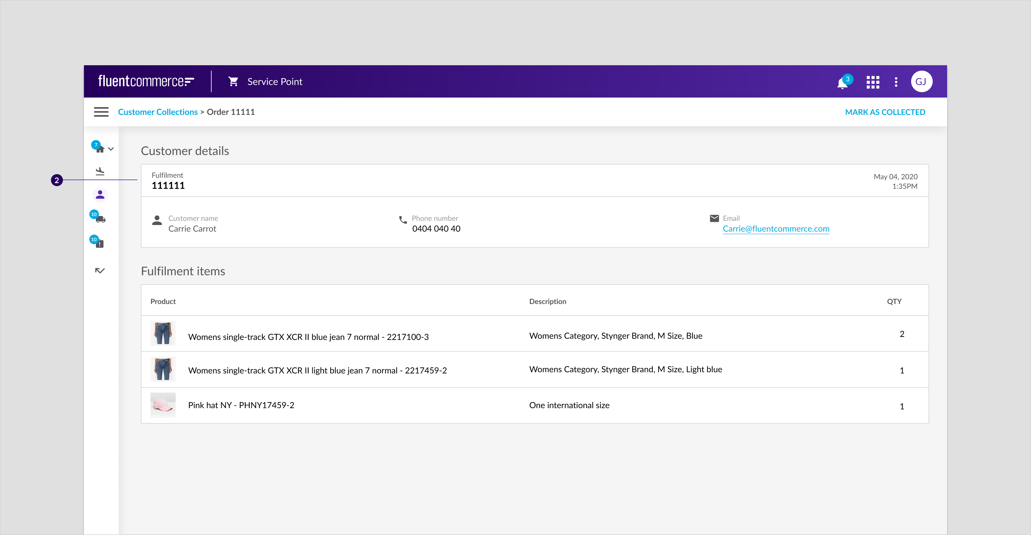 Order details page for customer collections, tablet and desktop
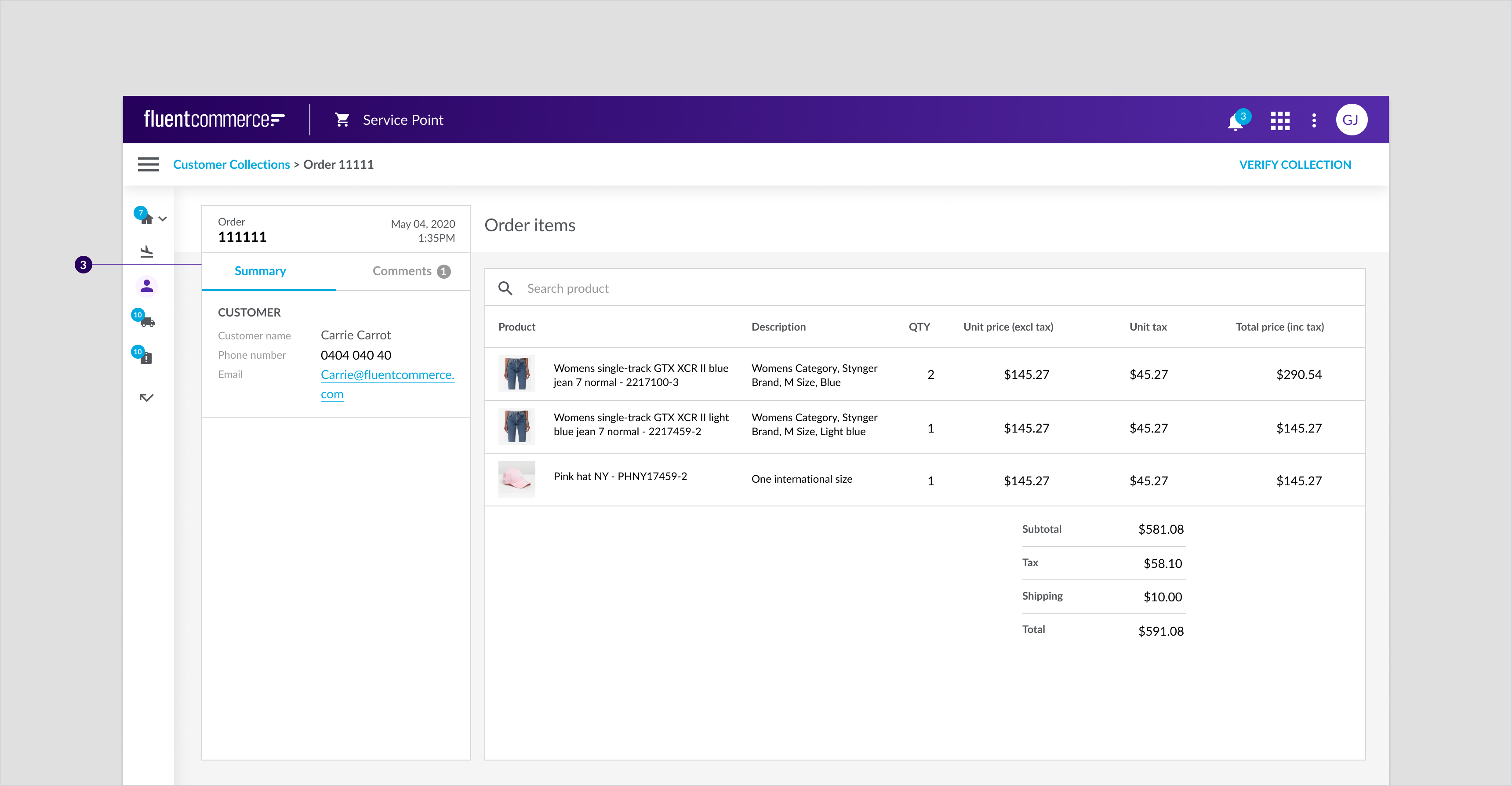
Mobile
Summary details card is stacked for mobile devices. In addition, tables in desktop and tablet become cards for mobile devices.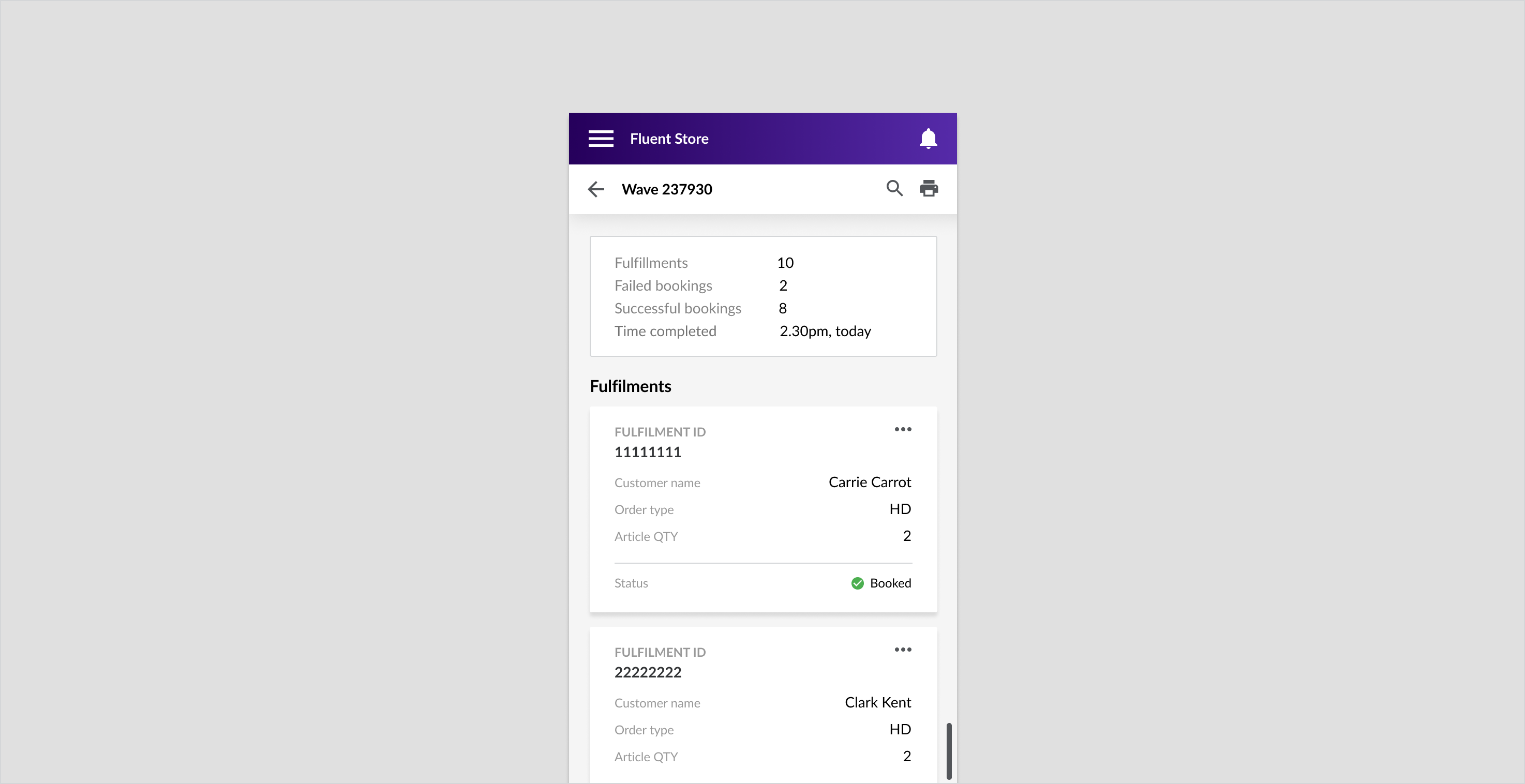
Specs
Tablet and Desktop
Mobile
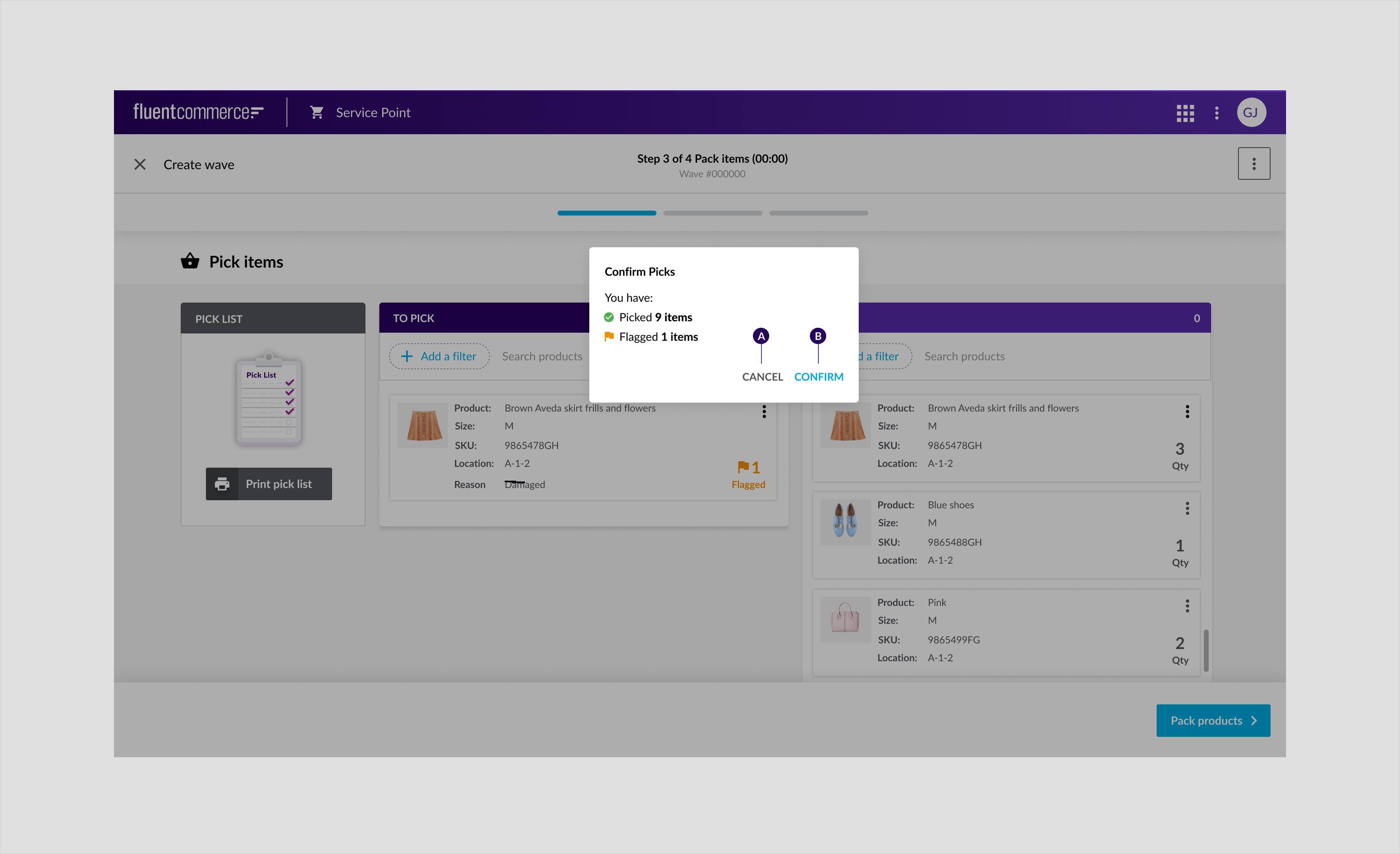
Confirmation Dialog
Confirmation dialog is the most prominent component which should only be used to convey critical messages or to make a decision. It requires direct action and divert the user’s attention away from the journey.Component Attribution is Material Design 2 ... .Anatomy
Dialog confirming whether the user would like to proceed from pick to pack incase if they have missed an item or flagged an item as missing.
- Container
- Title
- Supporting text
- Primary text Button
- Secondary text Button
- Overlay
Usage Examples
- To display important information users need to respond to. For example, confirming or making decisions and providing additional information.
- Modal dialogs are not timed the way Snackbar notifications are.
- The user will continue to see them unless they close the modal or select one of the text links or buttons.
- For example, in the Pick, Pack, and Ship flow, we display a dialog confirming whether the user would like to proceed from pick to pack if they have missed an item or flagged an item as missing.
- This is an important dialog because once the user confirms to proceed to the next step, they cannot return to the previous step.
Recommended Practices
- Have a cancel button to dismiss the dialog
- The primary text button should have a confirming action and the secondary text button should have the dismissive action on the secondary text button
- Enable the user to close the dialog via the keyboard
- For example, close/move out of the dialog by hitting escape
- Give the dialog a descriptive title
- Keep dialog messaging short, only include information that is relevant to the user’s journey
- Avoid using this component when the messaging is not critical or urgent. Consider a less invasive notification such as a snackbar or banner (these are temporary, appear and time out when relevant)
- Include a maximum of two actions (in the dialog)
- Don't use it for complex cases that require a lot of information or to complete a long-form. In these cases, consider using a wizard or a drawer
- Don't trigger a dialog window from another dialog window
- Don't allow users to dismiss the confirmation dialog by tapping or clicking the overlay
Placement
Center of a screen for all devices. In front of a dark background overlay (50% transparency) in order to focus the user’s attention directly on the modal itself.Mobile
Pick confirmation modal that appears prior to the pack step of the pick, pack and ship flow for mobile.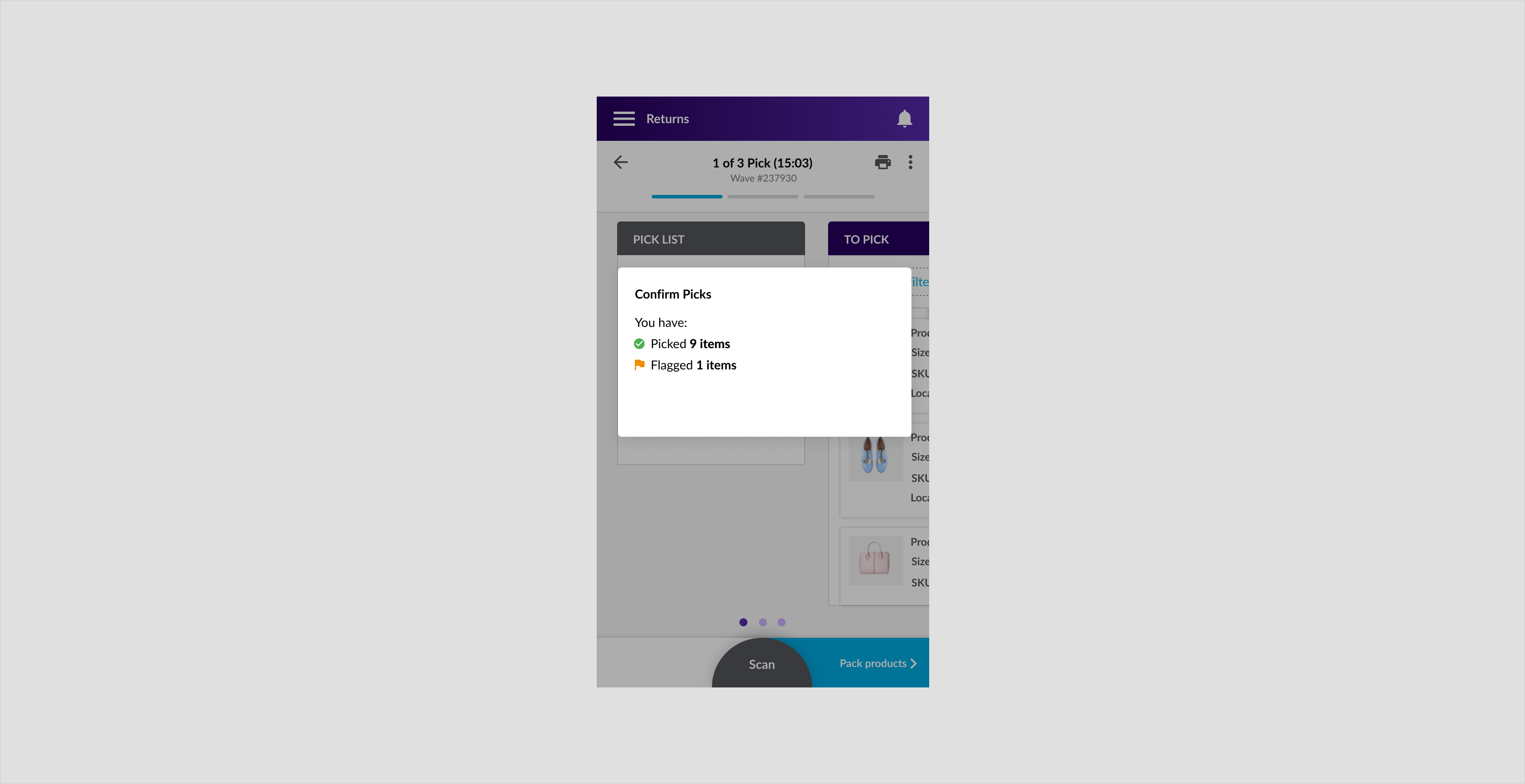
Desktop and tablet
Pick confirmation modal that appears prior to the pack step of the pick, pack and ship flow for tablet and desktop.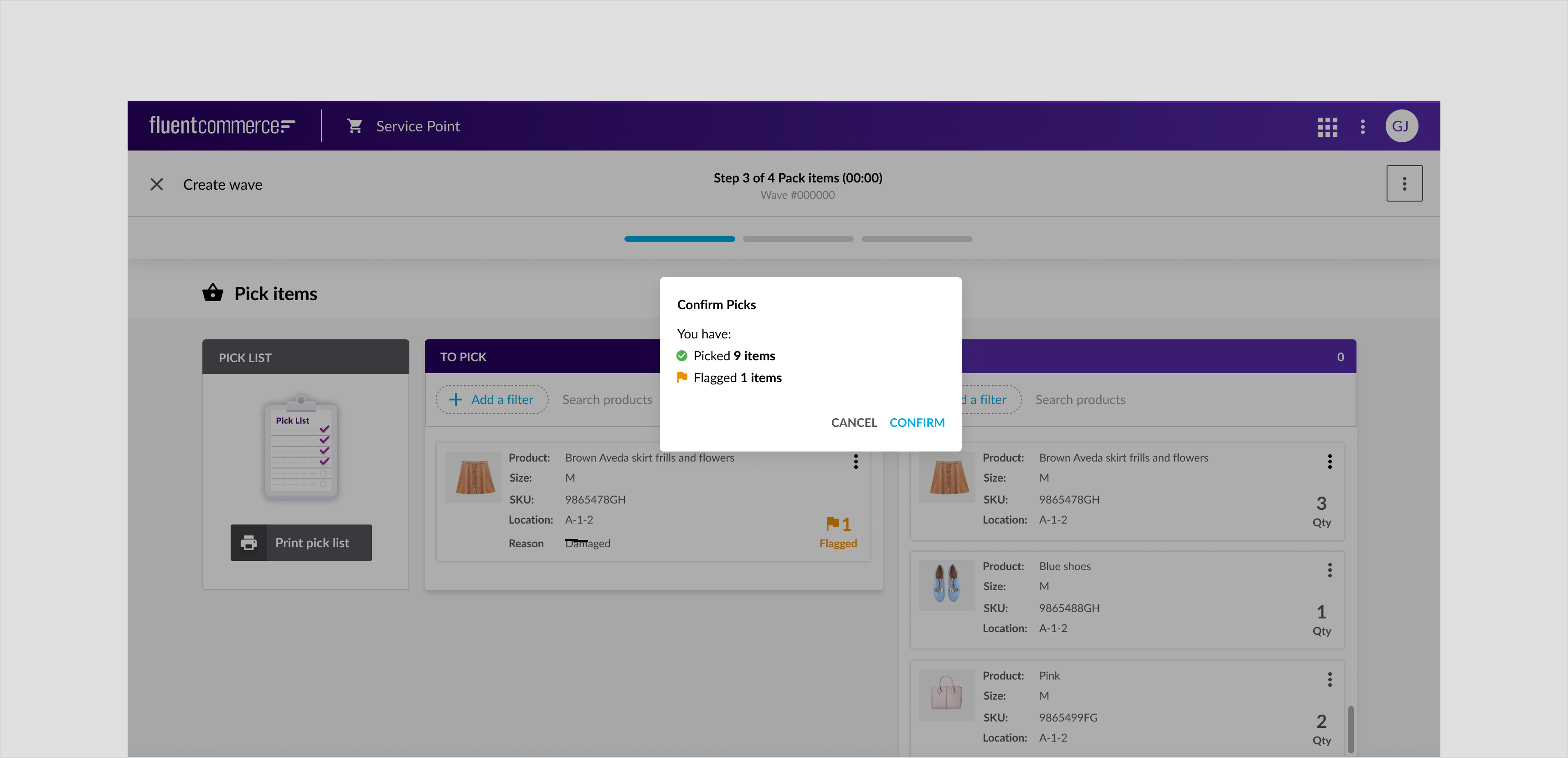
Specs

Full-Screen Dialog
Full-screen dialog displays a series of tasks and take up a whole screen. Full-screen dialog can open on top of confirmation modals.Component Attribution .... is a Material Design 2 component.Anatomy
Creating a wave for the pick and pack flow: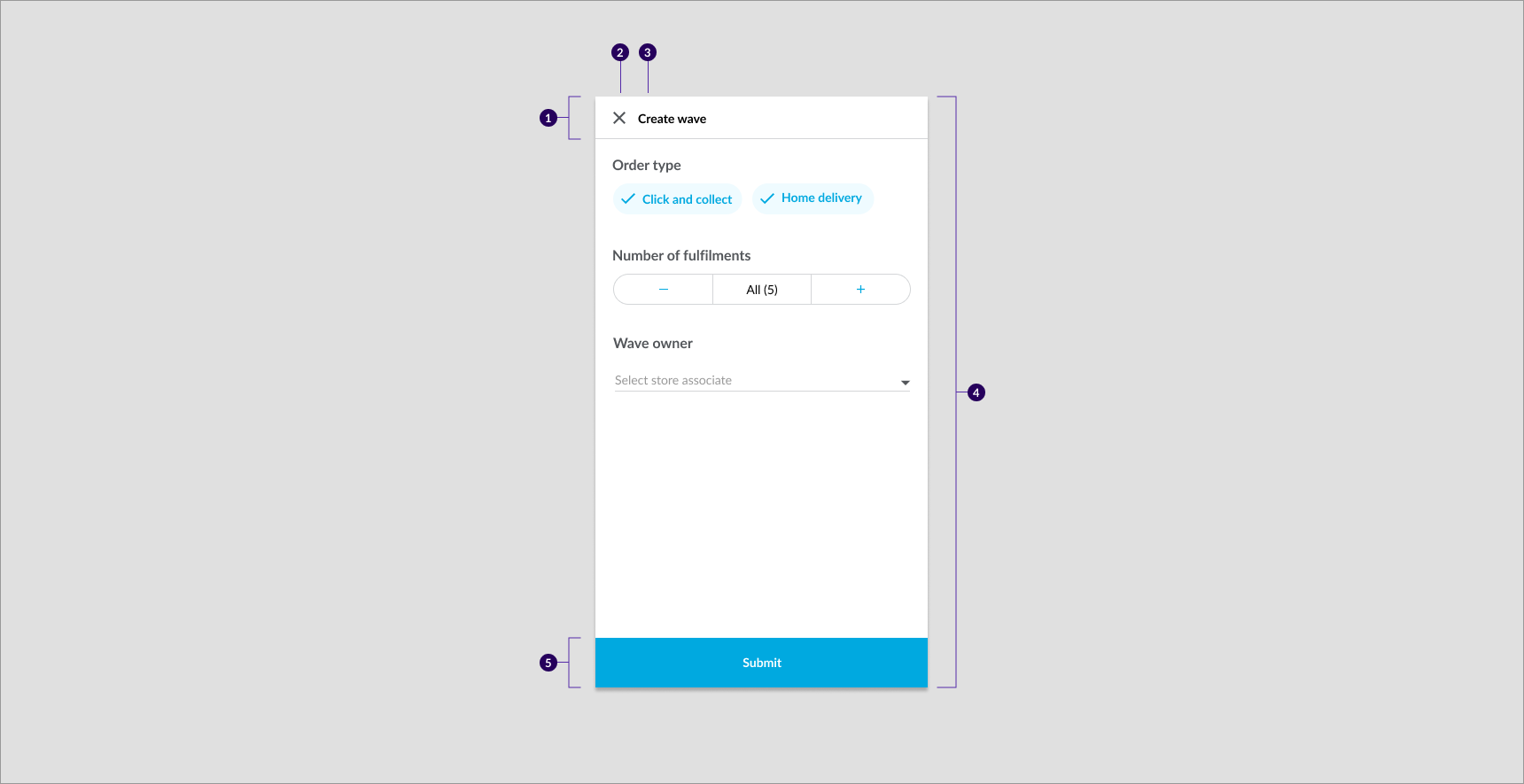
- Dialog Header
- Close button
- Dialog Heading
- Full screen dialog container
- Dialog button
Usage Examples
Full-screen dialogs are only displayed on mobile devices and are the drawer equivalent. They are used when tasks need to be grouped together, such as form fields, and when a user wants to view more information or edit a particular element.For example, in the Pick, Pack, Ship flow, display full screen dialogs when the user wants to create a custom wave or when the user is editing information.Recommended Practices
- The dialog box should have a descriptive title
- Ensure there is always a dismissive "X" icon button included and accessible at the top left
- Place a primary filled confirming button at the bottom that is full width and sticky on scroll
- Provide users with the ability to dismiss dialog through both, the confirmation and the "X" buttons
- Use it for complex cases to display a lot of information or to complete a form.
- Trigger a confirmation dialog from a full-screen dialog
- Aim for a maximum of two actions
- Don’t use the ← back icon to dismiss the dialog. This gives users the false perception that their inputs are saved
Placement
The Full-screen dialog should maximize to full screen with a dismissive action on the top left and a full-width confirmation button at the bottom.Specs
Drawers
A drawer is a side panel that slides in and out from the right, allowing users to quickly complete tasks which are in context to the current screen.Drawers can be used for: * Editing small amounts of content * Viewing additional order details * Completing short tasks that can be accomplished on a single screenComponent Attribution ... Is a Fluent OMX component.Anatomy
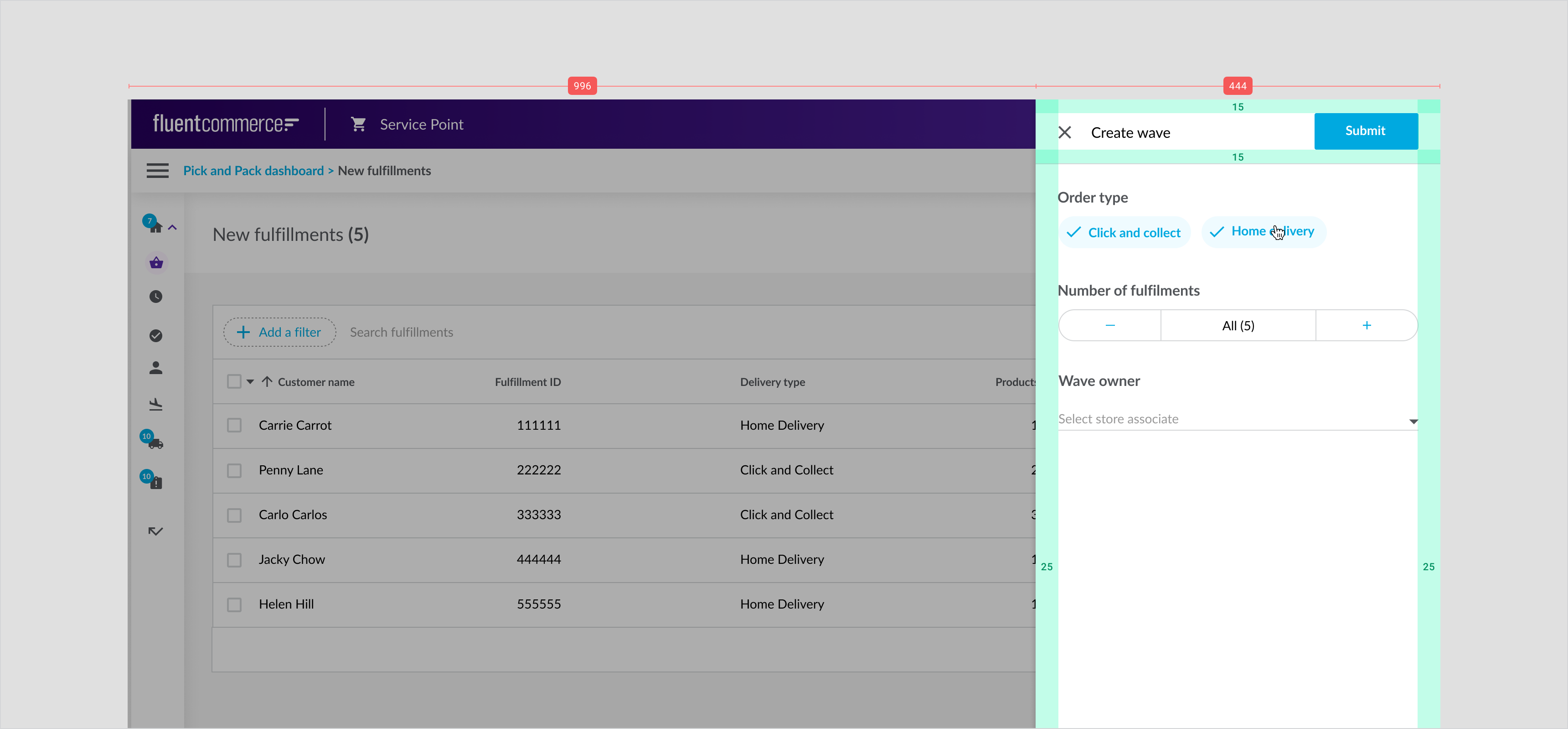
Example: Create wave drawer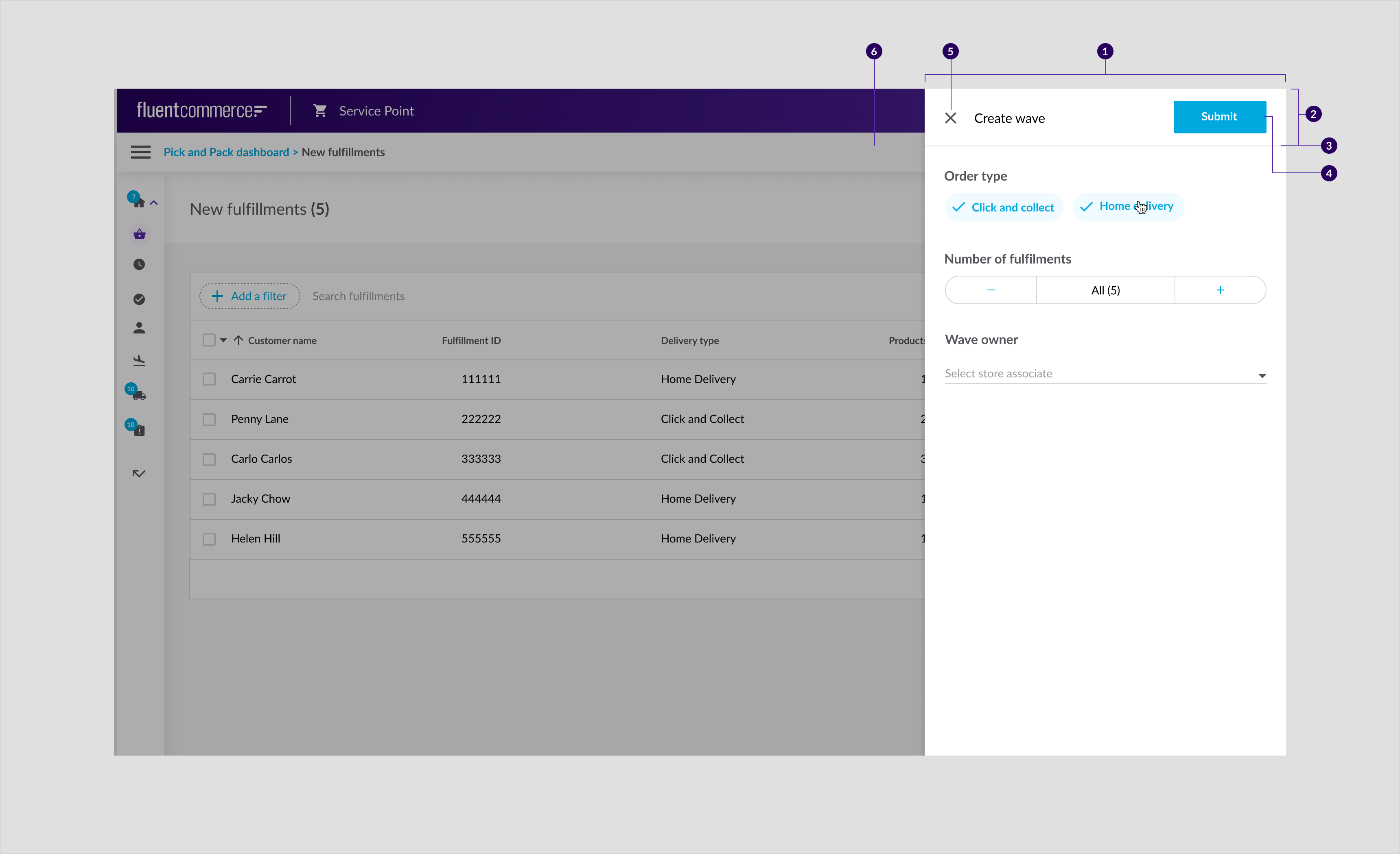
- Container
- Header
- Divider
- Primary filled button
- Dismissive button
- Overlay
- Dropdown
Recommended Practices
- Give the drawer a descriptive title
- Ensure that there is always a dismissive X icon button included and accessible at the top left
- Place a primary filled confirmation button such as Save or Create at the top right
- Ensure that the header that contains the dismissive actions and title, remains sticky
- Ensure that the user can dismiss the drawer through the confirmation button, "X" button or by clicking anywhere on the overlay that is outside of the drawer
- Don’t include a large number of actions, aim for a maximum of two actions.
- Don't use the ← back icon to dismiss the drawer. As this action gives the impression that the input is saved
Placement
- Drawers are only displayed on tablet and desktop devices. For mobile devices a drawer should be a full screen modal
- Placement should always be anchored to the right of the screen in front of a dark background overlay to focus the user's attention directly on the drawer
Tablet and Desktop
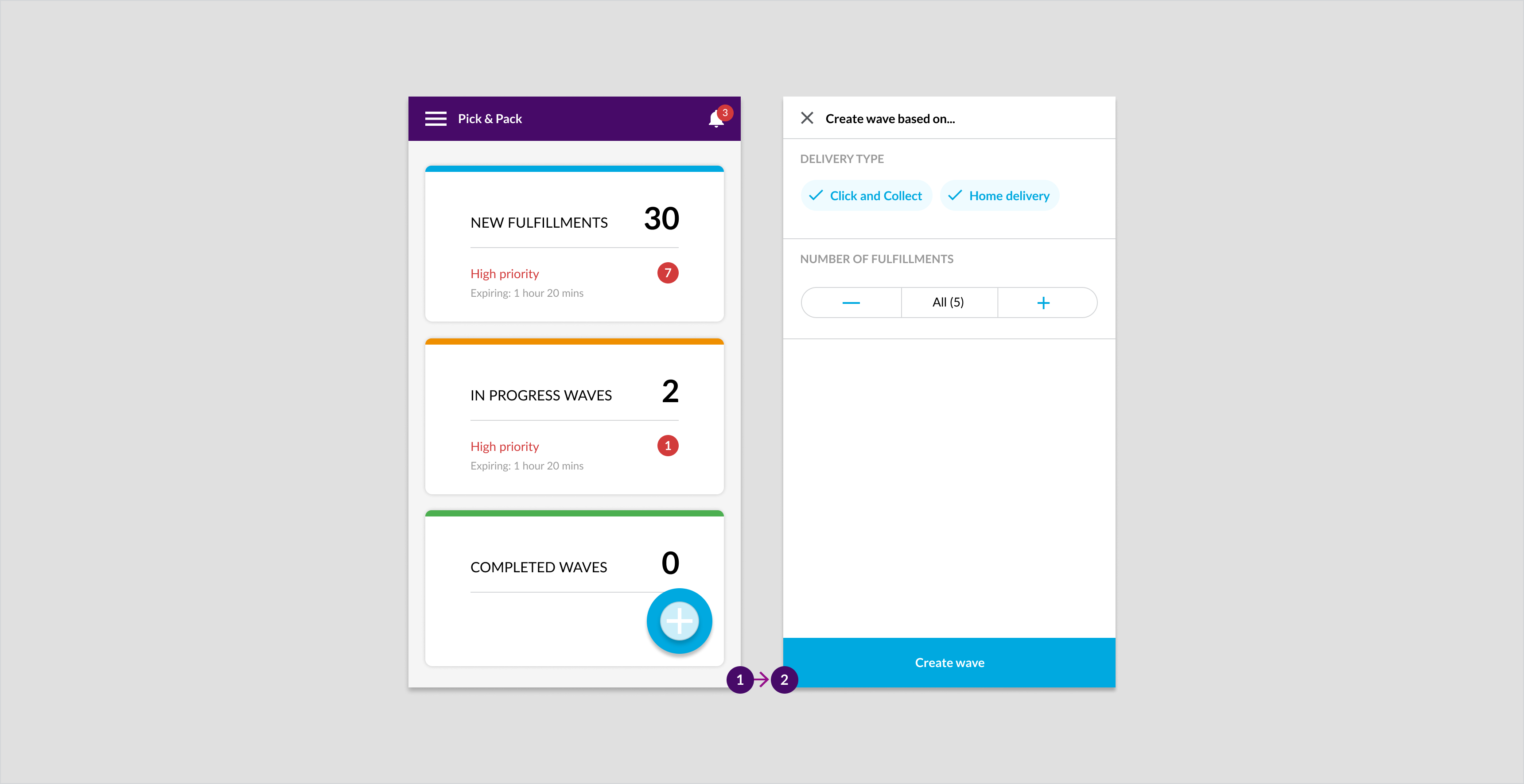
Example: Create wave drawer for new order for tablet and desktop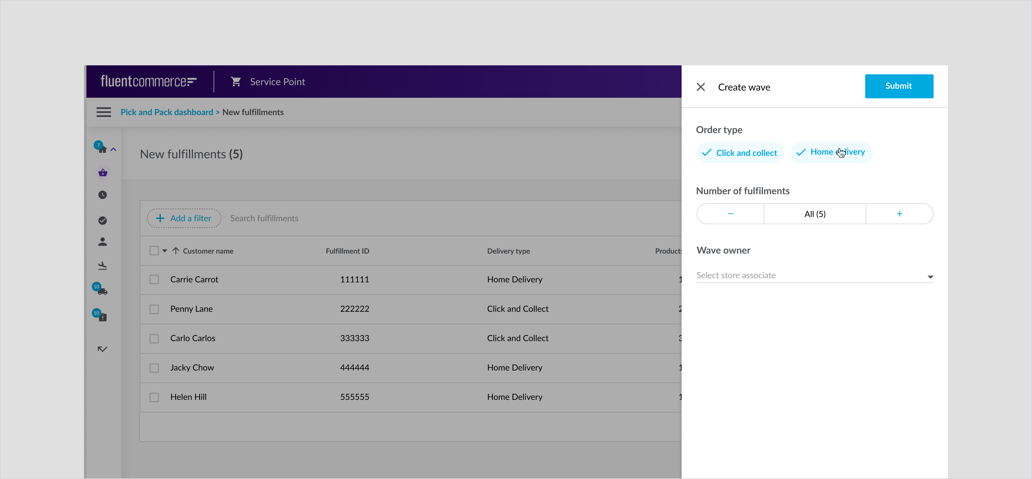
Optional Configurations
- Add/remove text fields
- Add/remove chips
- Title of drawer
- Add/remove quantity counter
- Placement of confirmation button. For example, to display two buttons, place them at the bottom of the drawer
Specs
Dropdown
A dropdown menu displays options that are relevant to the context of the screen. For example, Print on the wave summary screen displays options to print carrier labels and manifest. Manifest is a summary of all orders that retailers have to give to the carrier.Component attribution: The desktop version is based on Material Design 2 with a Fluent theme, whereas the dropdown on handheld devices is based on Material UI native bottom drawer component.Anatomy
Example: Three item dropdown (for text fields) anatomy
- Label text
- Input Text
- Dropdown icon
- Selection highlight
- Text
- Container
Usage Examples
- Buttons with drop-downs : For a button with multiple options. For example More button or print button with dropdown
- Form fields : To enter delivery size when editing a order.
Recommended Practices
- Don’t create long drop-downs, especially in forms. When a dropdown has more than 5 options consider making the menu searchable and including the auto-complete functionality
- Support keyboard input to navigate the dropdown and make selections. For example, Up and Down arrows should enable the user to move through the options and pressing Enter should finalize selections
- Don’t use generic labels for the drop-down list. Concise labels help a user understand the context of the options displayed in the drop-down list
- Multiple drop-downs are not recommended on mobile because the user has to tap multiple times in small fields to select
- Consider other selection controls for mobile.
- Limit using drop-downs for only two options. Instead, consider radio buttons, checkboxes or switches, where applicable
Types
- Action Button with multi action dropdown
- Text field with dropdown
- 'More' button with multi action dropdown

Placement
Drop-downs are frequently used on a desktop because it is easy to interact with drop-downs with a mouse. Use drop-downs on mobile sparingly as it is easier for the user to interact with the optional actions when they are displayed in a sheet (bottom).Tablet and desktop
Example: The handburger icon dropdown in the pack step of the pick, pack, and dispatch flow.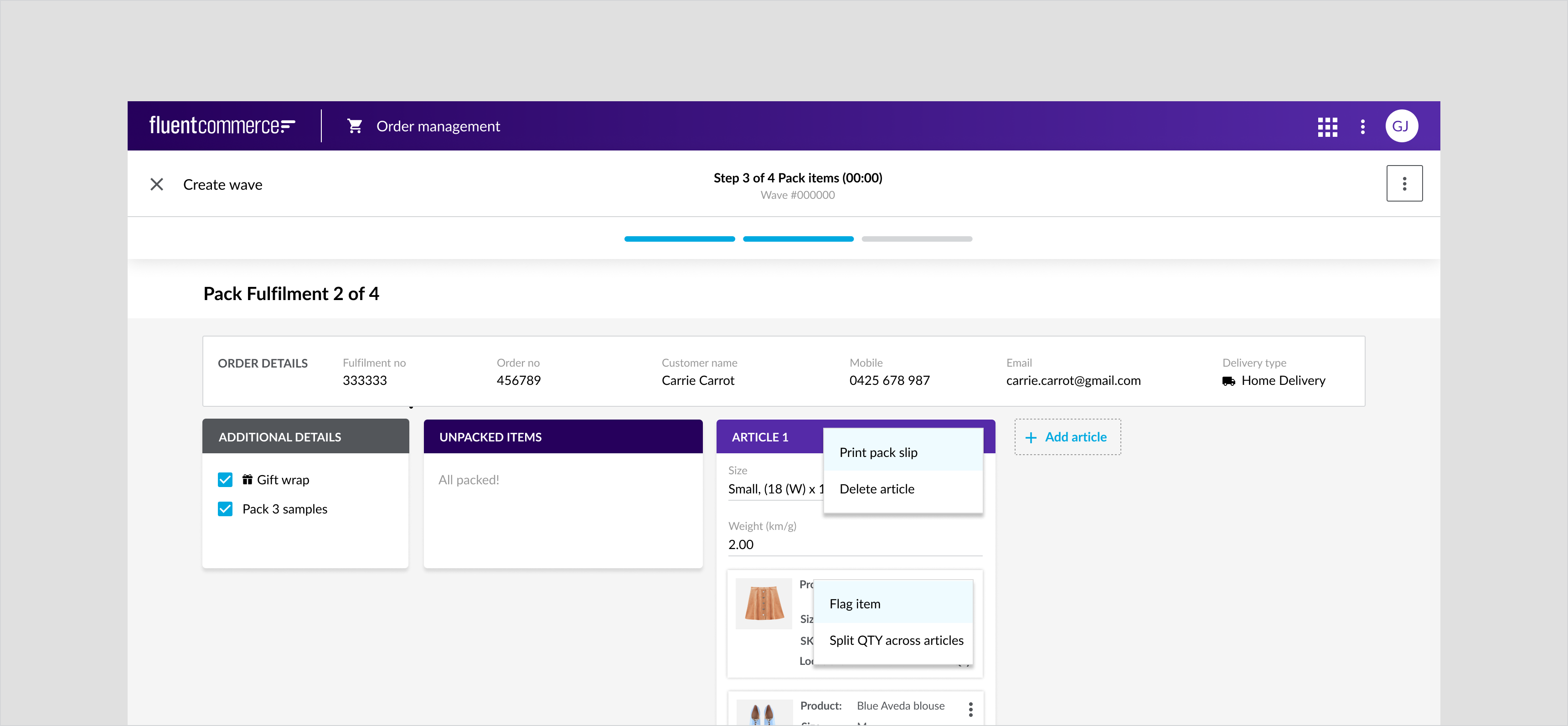
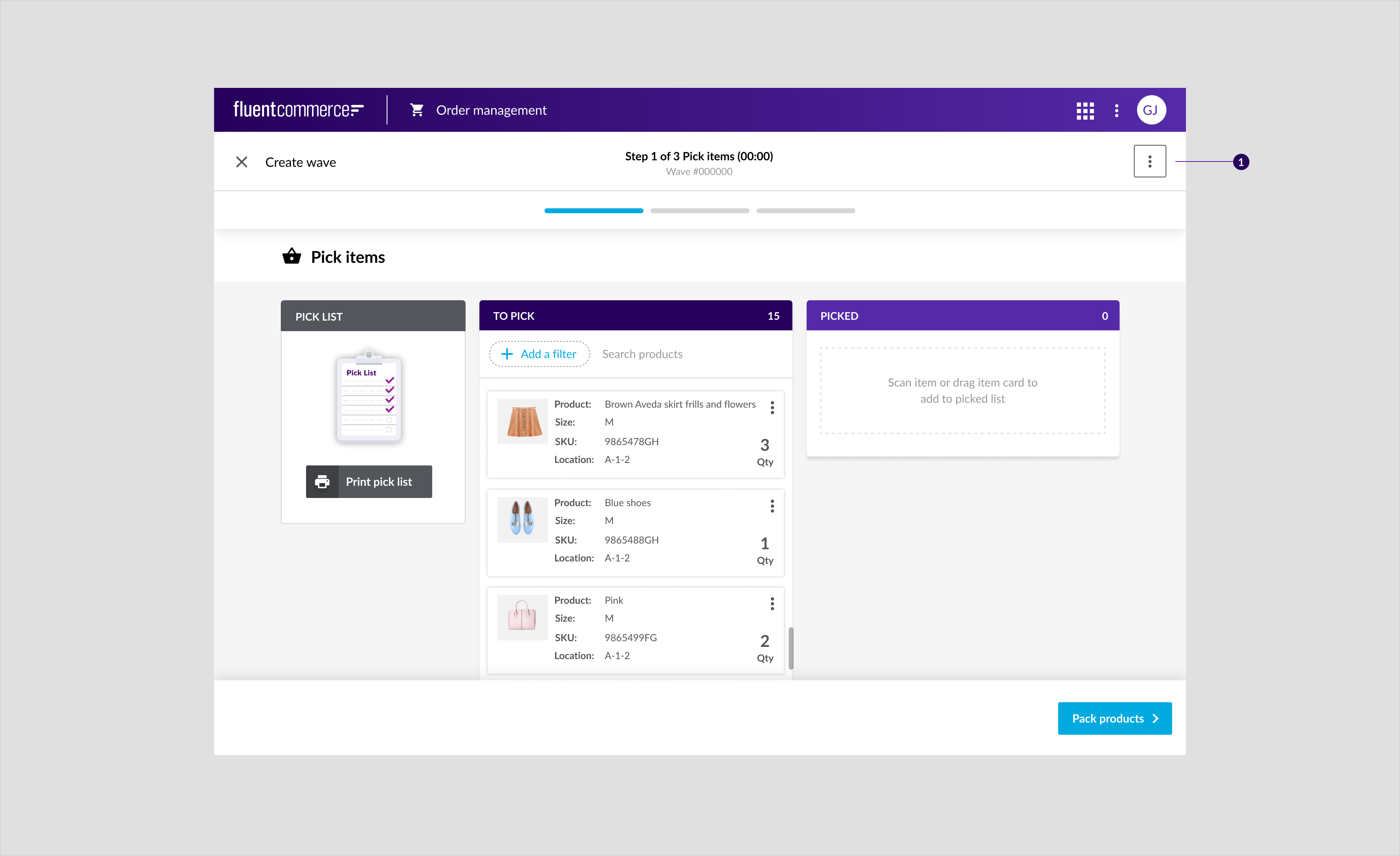
Filter
Filter allows users to find the data they need by selecting a field and specifying the requirement for the search. Filter should be used whenever the experience requires users to conduct a quick look up for a specific piece of information across the data. Filters are usually implemented for a query.Component Attribution: Are based on multiple components from Material Design 2 with a Fluent themeAnatomy
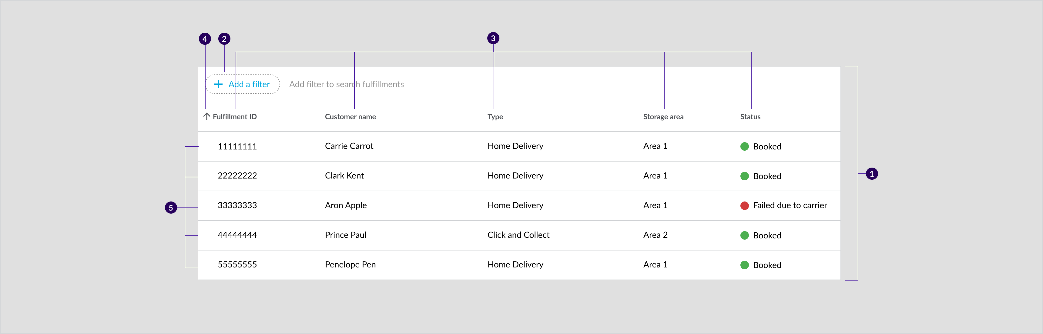
Example: Dialog confirming whether the user would like to proceed from pick to pack incase if they have missed an item or flagged an item as missing.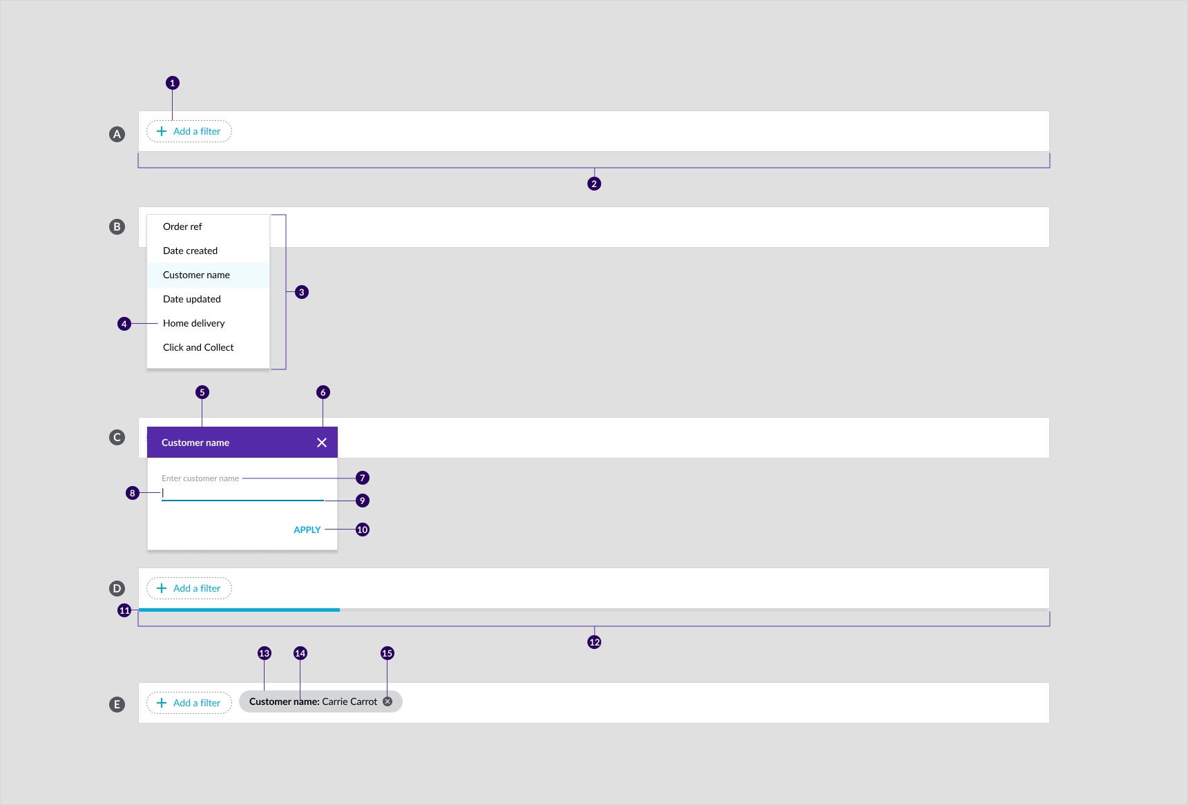 A. Filter bar
- Add a filter text button
- Search bar container
- Filter options menus
- Text
- Title
- Close icon
- Label
- Text field
- Activation indicator
- Button
- Indicator
- Track
- Container
- Text
- Remove icon
Usage Examples
Apply filter when users are required to:- Narrow down the content displayed on a table by specifying requirement(s) on one or multiple field
- Search a particular information, ie Order Details, Fulfillment Details
- In the Pick and Pack dashboard, Filter is implemented for users to narrow down fulfillments displayed on the table, so that users can perform a specific search such as customer name, created date
- When performing items return, users are required to search for an order first by using a filter to input a specific search requirement, ie, Order Reference Number
Recommended Practices
- Apply filter only on a query or table
- Filter bar is also act as a search bar in Fluent OMS
- Keep search result on a table
- Avoid applying more than one filter per page
- Provide instruction or title bar to explain why users need to use the filter
- Avoid applying too many filter options, all filter options must related to the purpose of the search
- All filter options should able to generate a filter chip on the filter bar when displaying search result
- All filter options must be based on the query’s field. However, it can be renamed on the filter
- Provide title and label to specify the text field input after user selected the filter option
- Use the primary text button for confirming action and the secondary colour for the title bar in the dialog
- Give the dialog a descriptive title
Placement
Filters should always be above a table. However, if the filter is implemented as a search bar, the table may not be displayed at the beginning when no filter has been added.Mobile
Example: Dialog confirming whether the user would like to proceed from pick to pack incase if they have missed an item or flagged an item as missing.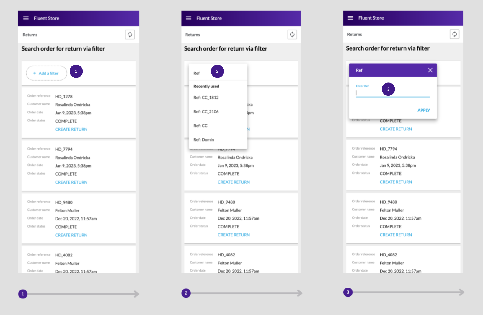
Desktop and tablet
Example: Filter used to find a customers order on desktop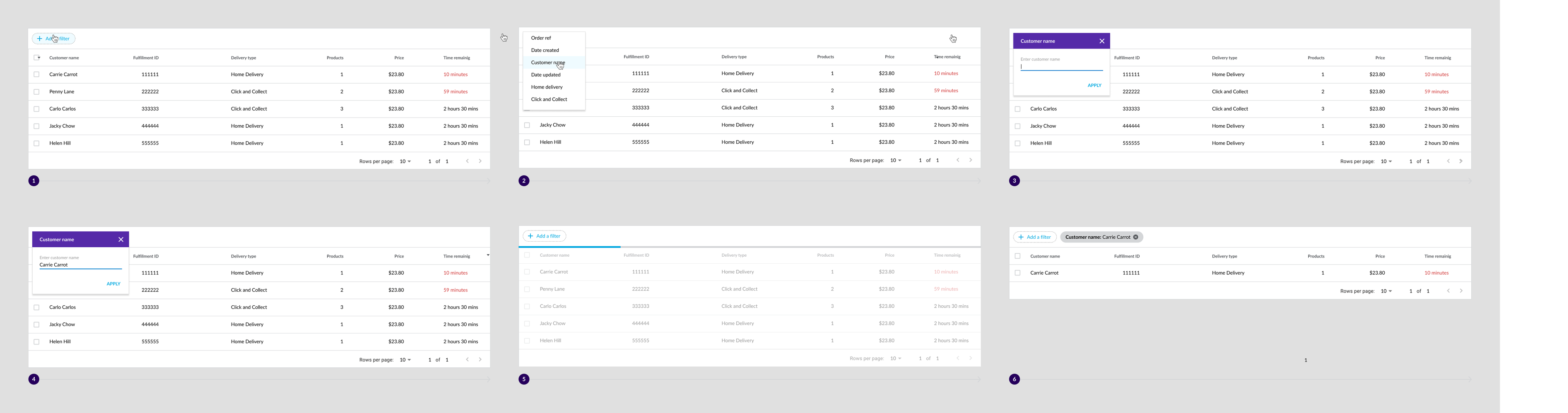
Quantity Counter
Product quantity counters enable in-store staff to indicate whether products have been picked and packed, or flagged. Component attributionIs a Fluent OMX componentComponent attribution: Is a Fluent OMX component.Anatomy

- Container
- Increase button
- Decrease button
- Numerical input field
Types
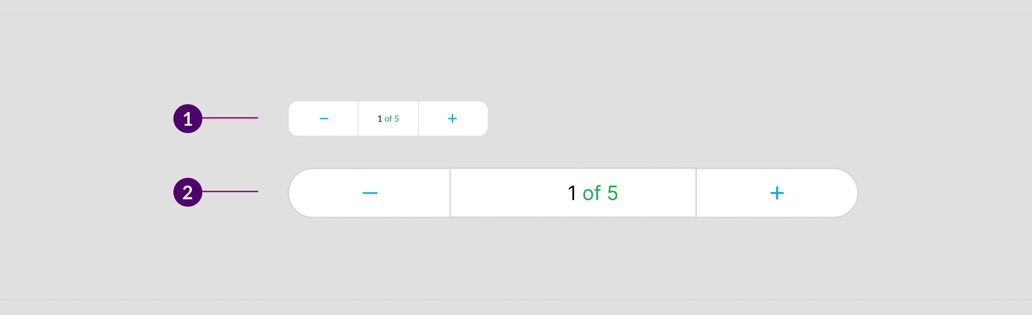
- Quantity Counter
- Full width counter
Usage Example
The quantity counter can be used to select: * The quantity of picked items. Quantity can be entered manually or with a scanning device for this use case. * The quantity of orders to pick, pack and ship * The products that were were short pickedRecommended Practices
- Make the input field editable so that the user can enter large numerical quantities without having to manually increase the quantity.
- Disable the increase and decrease button when the user cannot decrease or increase the field any further.
- Display a state change when the in-store staff decrease or increase the quantity.
Placement
All counters are used across mobile, desktop and tablet. Quantity counters are placed in table rows either in the last or second last column of the row. Full width counters are only placed in drawers and dialogs.Full width counter placement
Mobile
Example: Full width counter in a "create wave" full screen modal, used for the selection of the number of orders to go into a wave.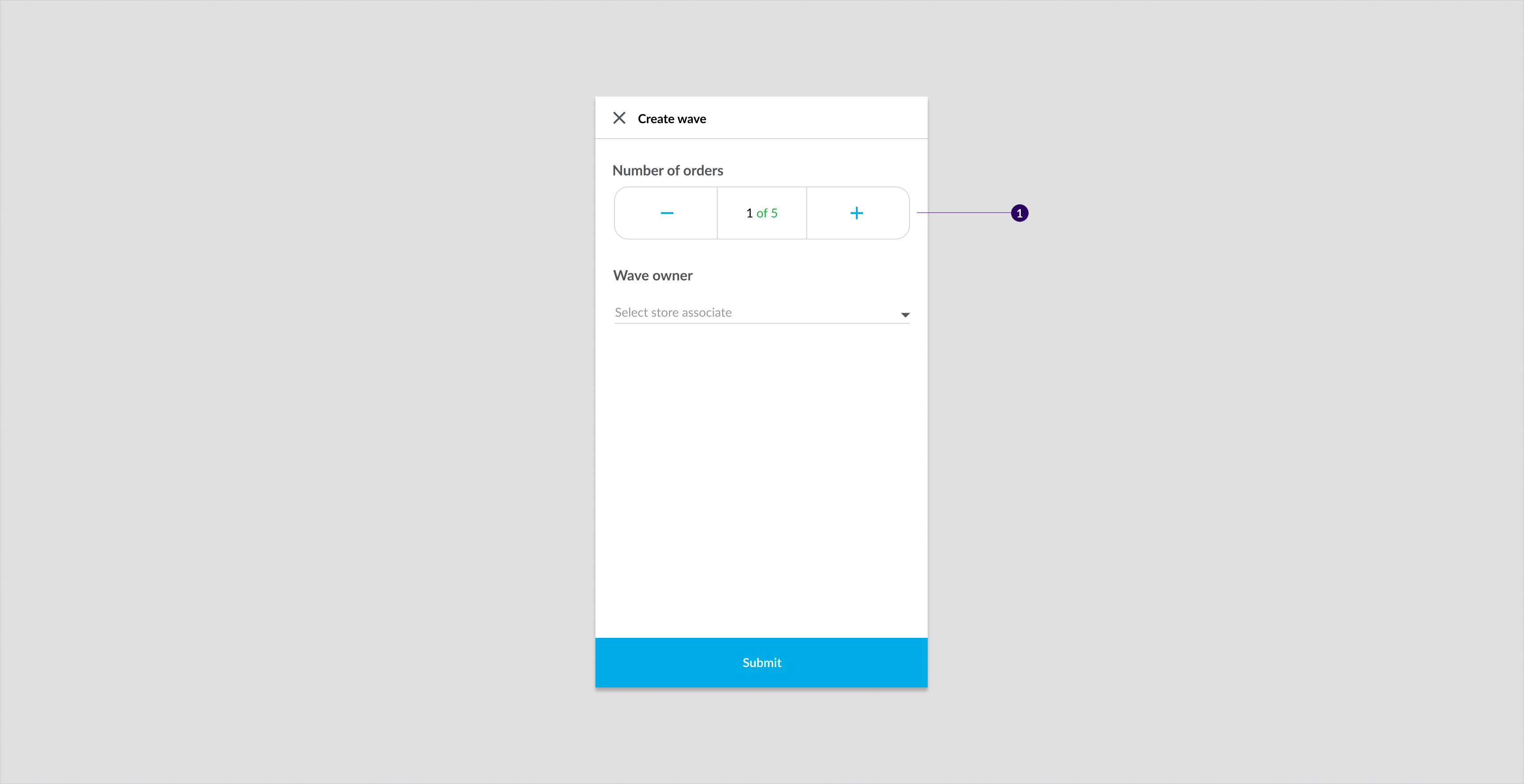
Tablet and desktop
Example: Full width counter in a "create wave" drawer, used for the selection of the number of orders to go into a wave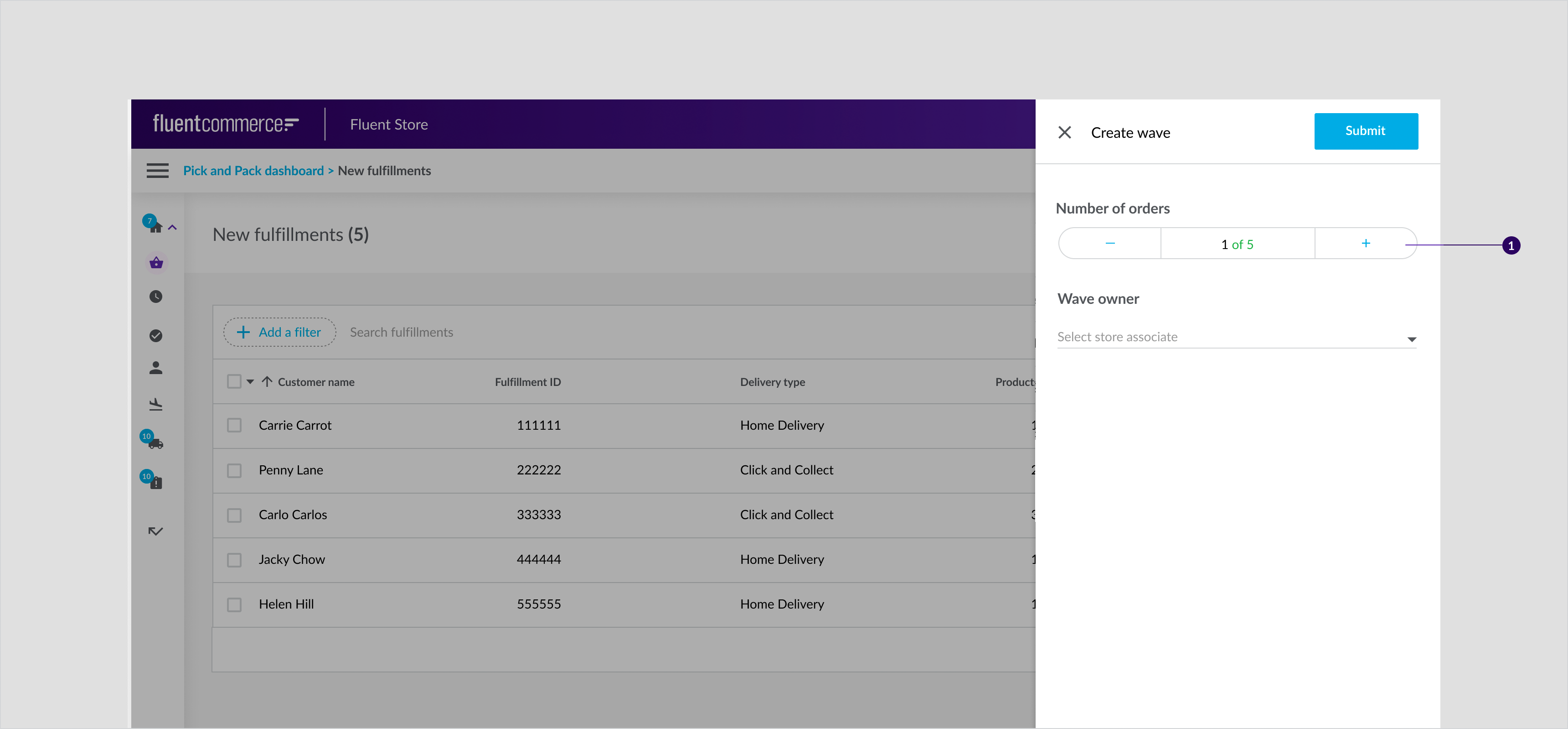
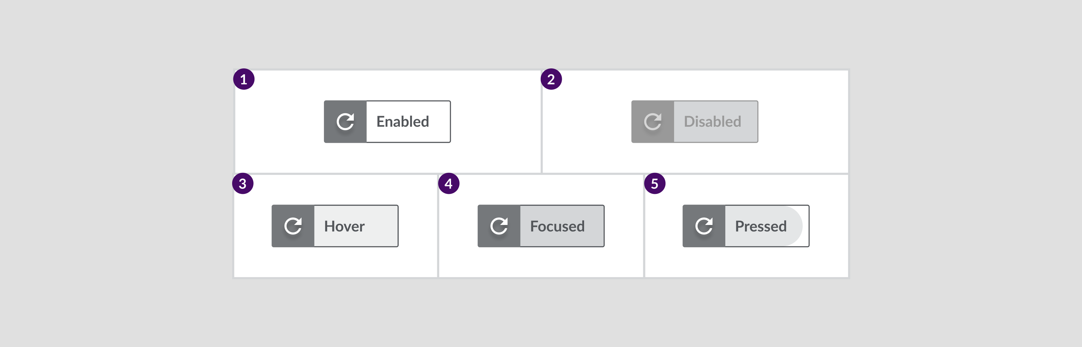
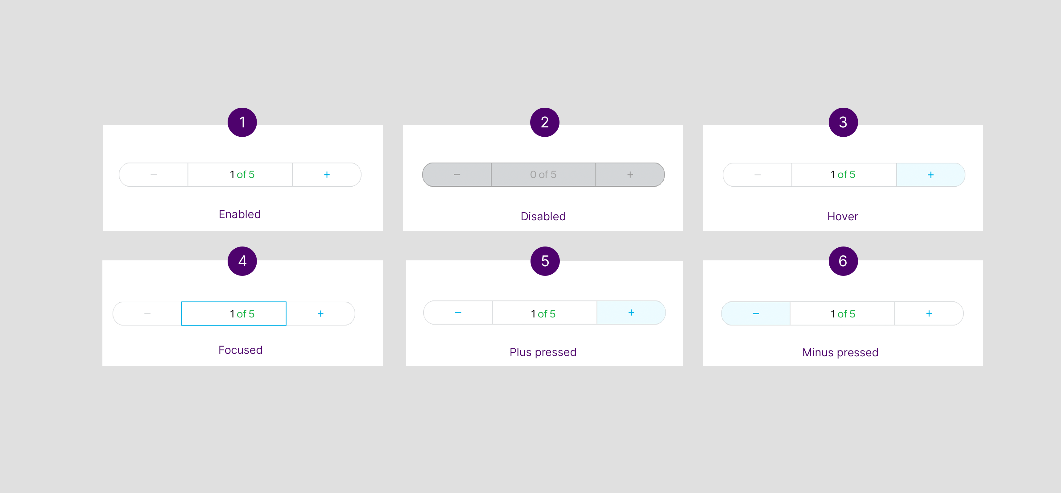
States
Quantity Counter
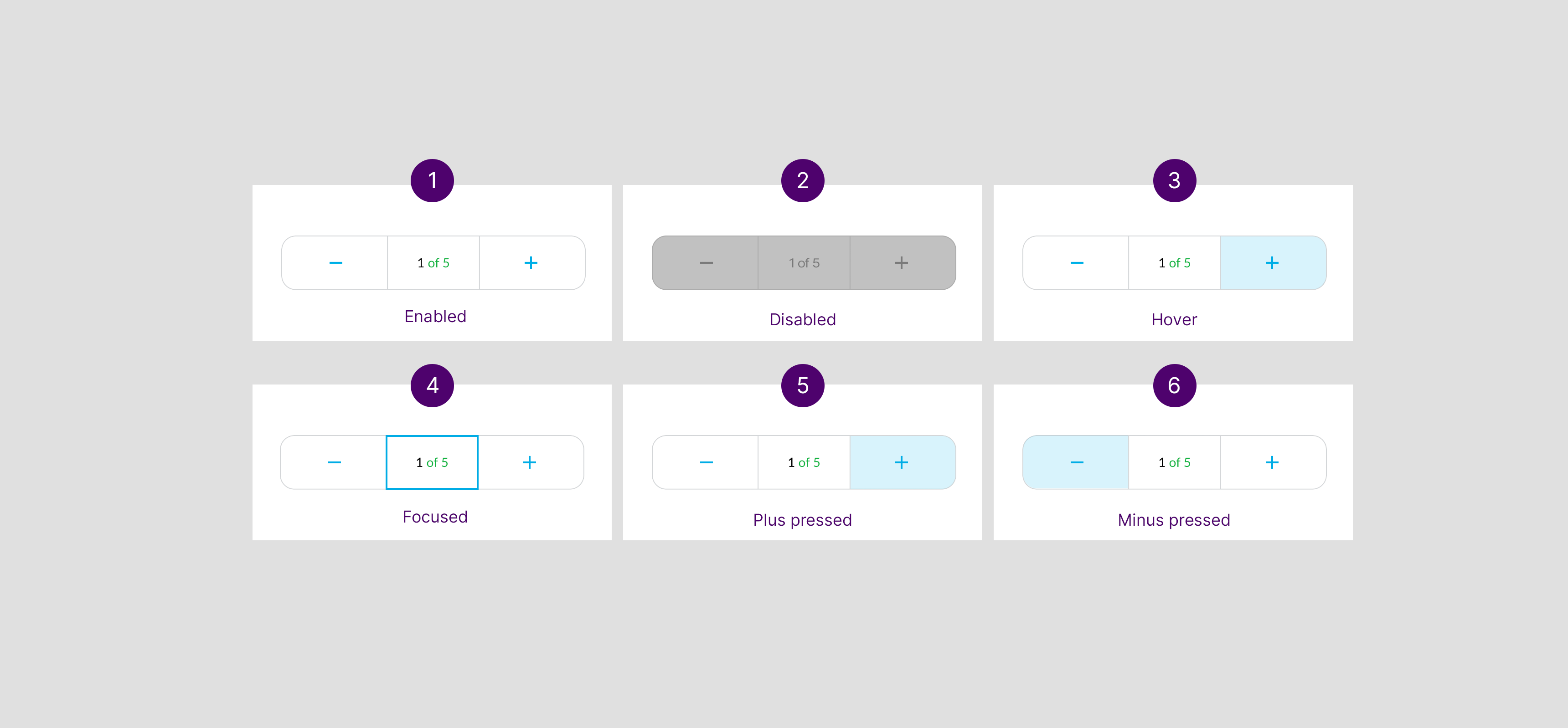
Full Width Counter
Optional Configurations
The default pick number can be configured to suite your business use case. For example, the count can either start at 0 or at the number of products that need to be picked.Sheets
This is an experience for mobile devices. When in-store staff selects a button, a dialog sheet is activated and slides in from the bottom of the screen where the relevant user actions are placed.Component Attribution: ... Is based on Material Design 2 with a Fluent theme.Anatomy
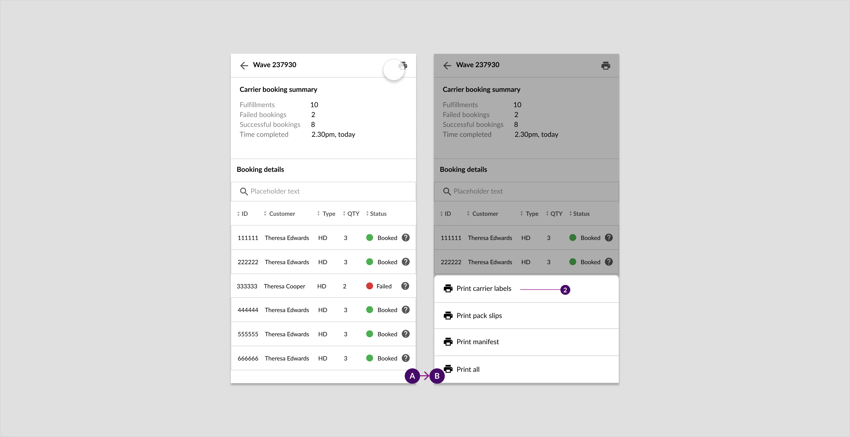
Example: A sheet showing print actions that has been actioned from a completed waves' carrier booking summary page.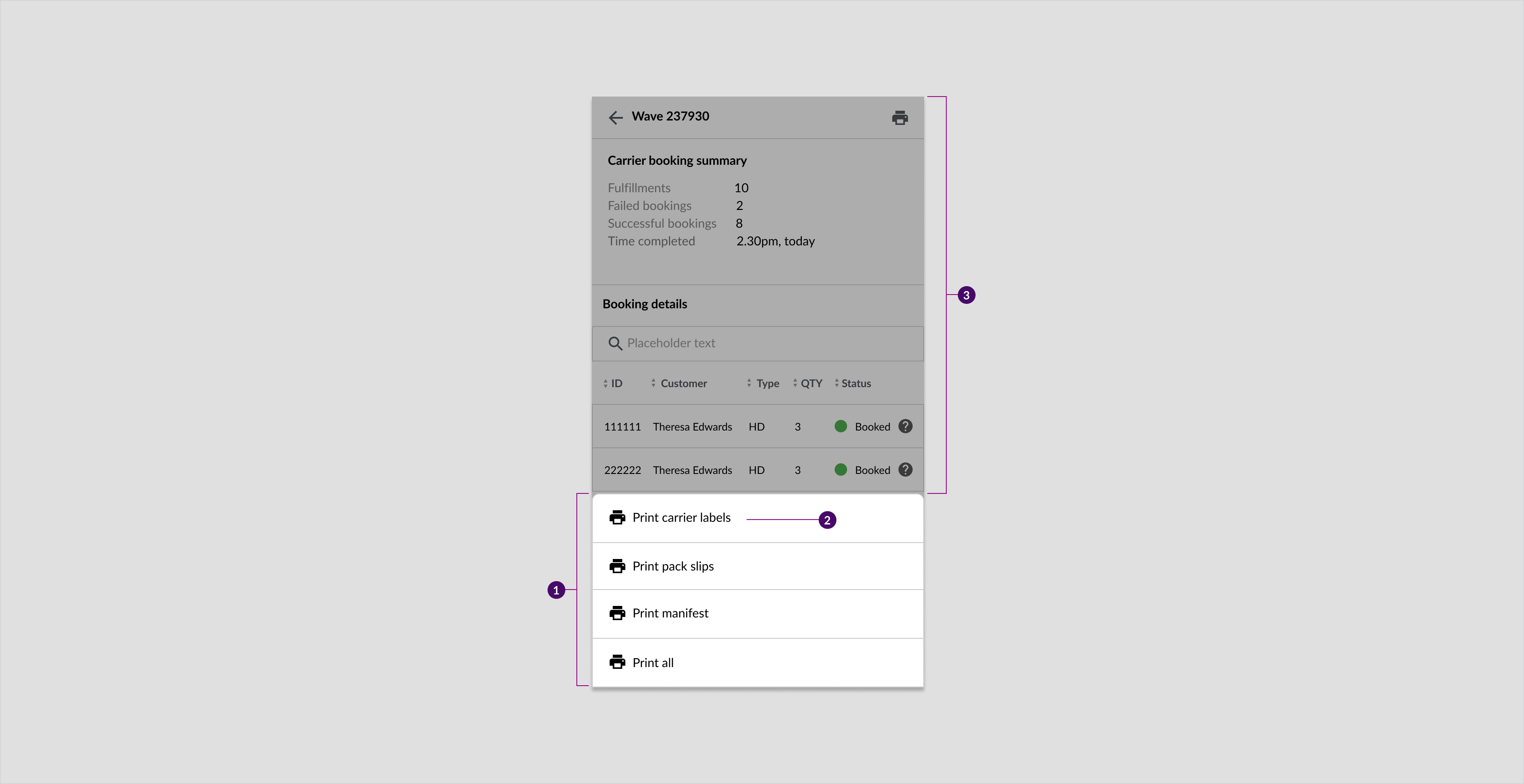
- Sheet
- Supplementary action
- Scrim (Modal only)
Usage Examples
- To provide the user with a list of actions that do not have a place/space on the parent page
- To give users a way to access a list of relevant actions that are related to a specific task
- To provide the user with additional actions on mobile
- Sometimes used in place of menus as a way to provide additional screen actions
Recommended Practices
- Allow users to dismiss the sheet by clicking on the overlay (outside the actions).
- Include a scrim/overlay as part of the modal sheet to help the users focus on the actions.
- Do not use it on the desktop.
States
Placement
- Modal bottom sheets are anchored to the bottom of the screen. This placement makes it easier for the user to access or click the relevant links while using Service Point.
- Used only on a mobile.
Specs

Snackbar Alerting
Snackbar alerts provide users with non-invasive, direct, and timed feedback on the actions performed. The messages are contextual and in some cases timed.Component attribution: ... Is a Material Design 2 component.Anatomy
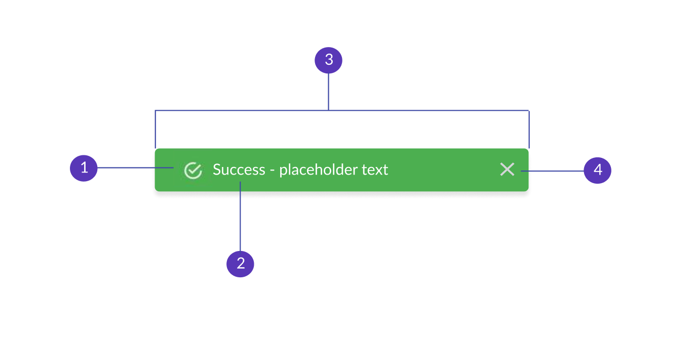
- Icon
- Text label
- Container
- Action (optional)
Usage Examples
Snackbars can be used for the following types of alert messaging:- Information
- Success
- Warning
- Failure
Recommended Practices
- Ensure that timed snackbars stay up long enough for the user to read it
- Centre the snackbar at the bottom of the screen
- Don't show more than one snackbar at a time
- Don't place snack bars in front of the Components that are used for navigation
Optional Configurations
- Alert icons
- Alert messaging content
- Alert colours
Placement
Snackbars are used on mobile, tablet and desktop. The positioning of snackbars does depend on the type of message but they are generally positioned near the bottom.Mobile
Example: Snackbar response for completing a wave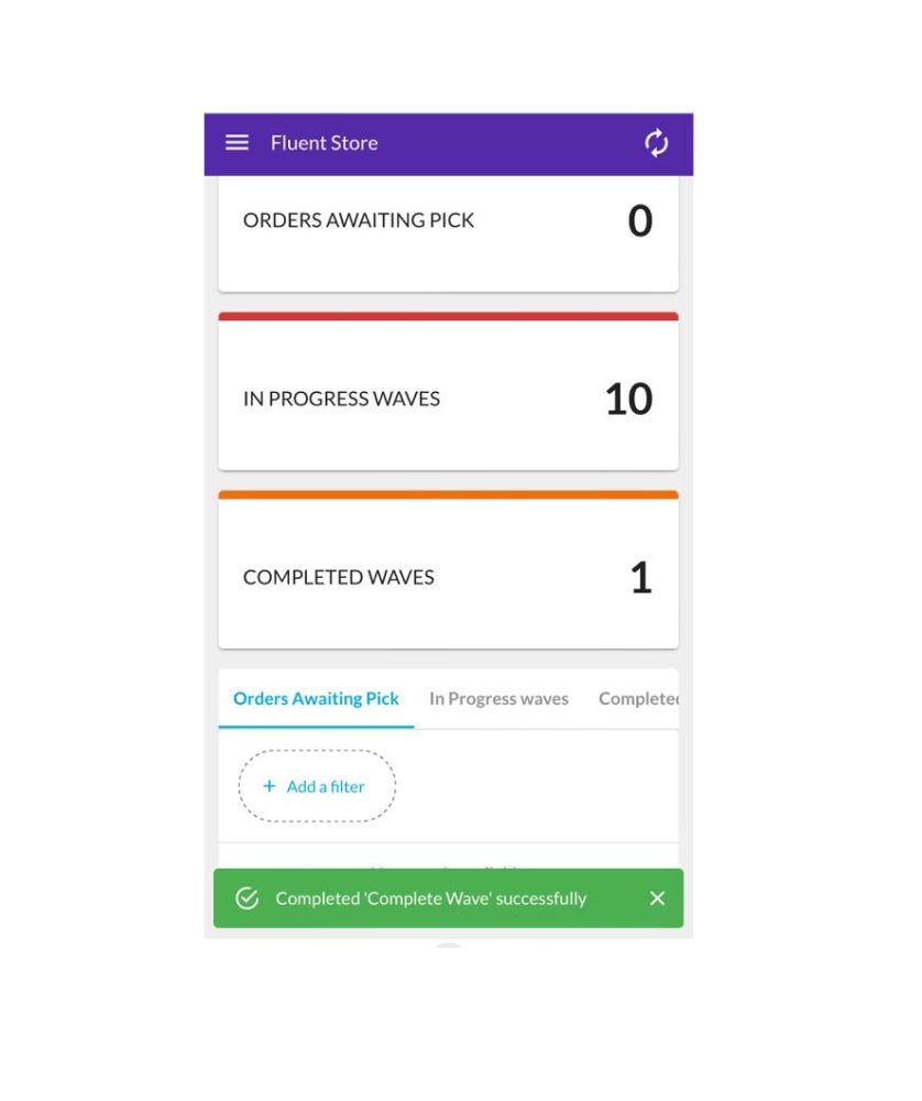
Desktop
Example: Snackbar response for completing a wave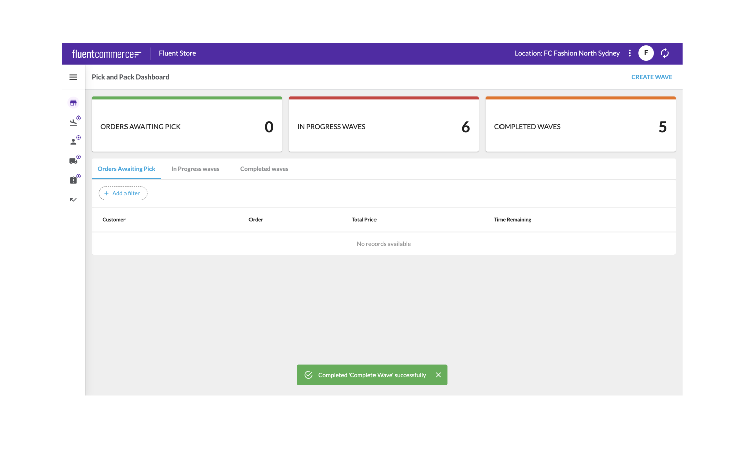
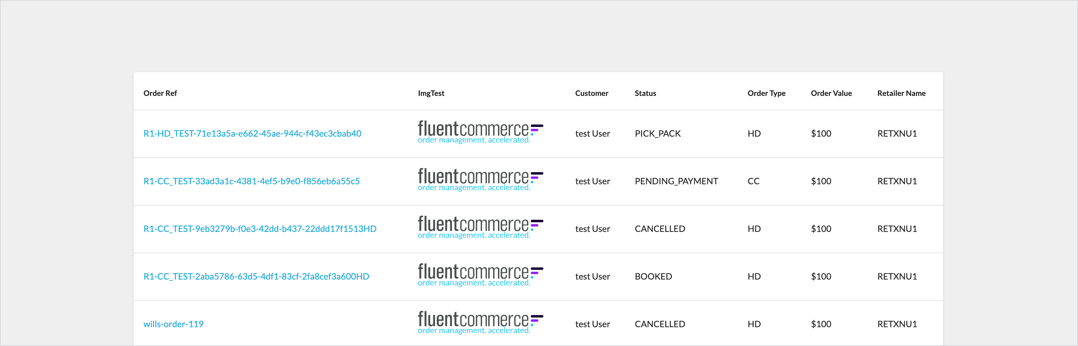
Tables
Table displays information into rows and columns, which makes the data clear and easy to read.Component Attribution: Is a Fluent OMX component.Anatomy
- Container
- Search filter
- Column header names
- Sort button
- Rows
Usage Examples
- Tables should be used when certain data needs to be sorted, analyzed, compared or actioned.
- Use drag and drop table rows only if list items need to be moved or added to a new folder For example, drag and drop table rows are used to move orders to different storage areas and for adding articles at the pack stage
- For tablet and desktop, drawers are overlaid on top of tables for list items that need to be actioned or viewed. For more information see drawers.
Recommended Practices - Desktop and Tablet
- When more than 8 columns displayed, add table scroll and make the first and last column sticky
- Display a a minimum of 2 columns in the table for tablet and desktop
- Table rows should be full-width but WITH a margin on either side of the table.
- Allow the user to click into rows to view more information
- Have a light background Color when the user hovers over the rows
- Allow a user to sort information alphabetically or numerically by including a sort filter for each title in the table header
- When an icon is dragged and dropped to the table row, it is placed as the first item in the row
- Product images in the table rows should be placed in the first column of the row
- Product quantity counters should be in either the last or second last column of the row
Recommended Practices - Mobile
For mobile devices, it is recommended that table rows are transformed into stacked summary cards as shown below: If tables need to be used for mobile, see the following recommended practices:
 - Display a maximum of 5 columns
- Table rows should be full-width with NO margin on either side of the table
- There is less space available for tables on mobile as compared to tablet and desktops. Therefore, speak to the clients before deciding where to display critical information
Types
- Standard table - Use only if data is displayed.
- Multi-select - When you want to apply bulk actions to selected rows.
- Product table - To display images and/or counters in table rows.
Optional configurations
- Number of columns
- Add links to items
- Add/remove images to rows
- Adding/removing drag and drop
- Add/remove search
- Add/remove checkboxes
- Add/remove status column
- Sorting of columns
- Add/remove a counter to rows
- Column title names
- Actions on line items (edit, flag)
Standard Tables
Usage Example
Use only if data is displayed.Placement
Desktop and Tablet standard table with image
Desktop and Tablet standard table without image
Specs
Multi-Select Tables
Usage Example
When you want to apply bulk actions to selected rows.Placement
Mobile
Example: Carrier collections table for mobile.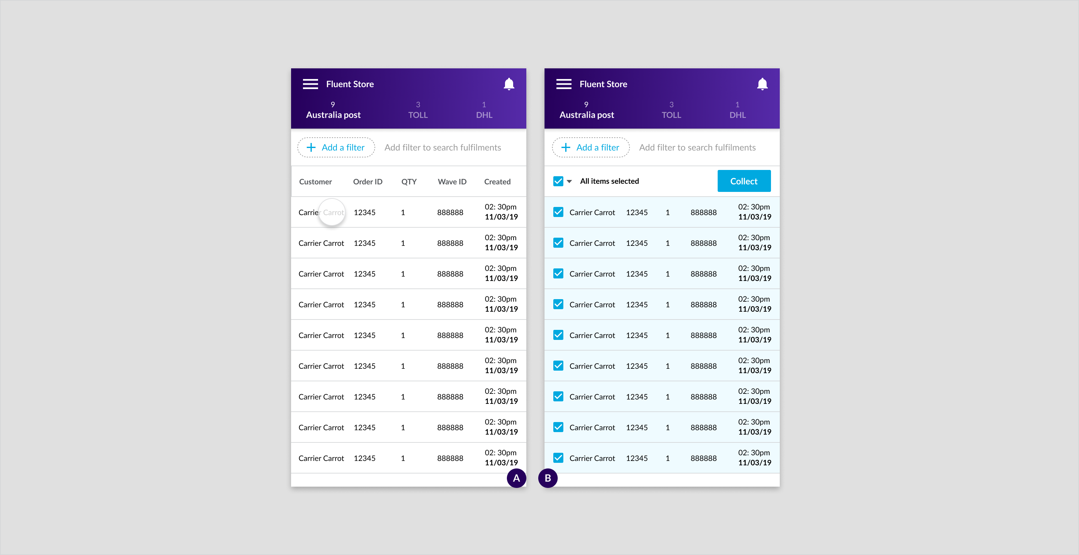
Tablet and desktop
Example: Carrier collections table for tablet and desktop.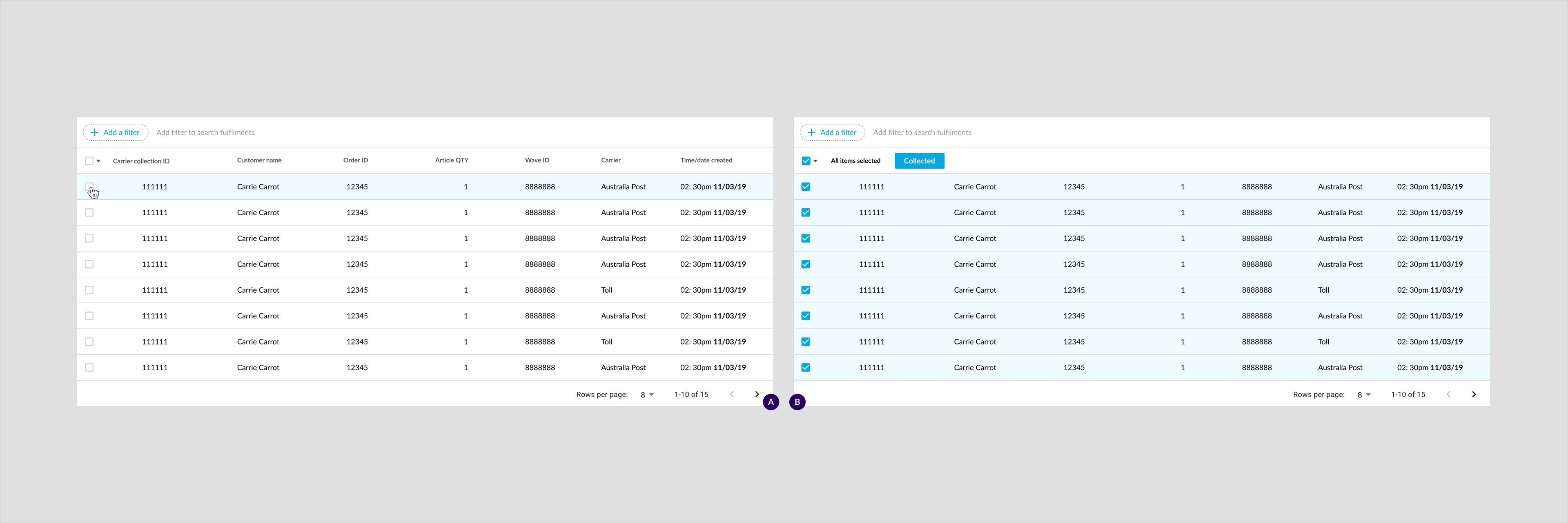
Specs
Mobile
Tablet and desktop
Product Tables
Usage Example
To display images and/or counters in table rows.Placement
Mobile
Example: Product pick list table for mobile.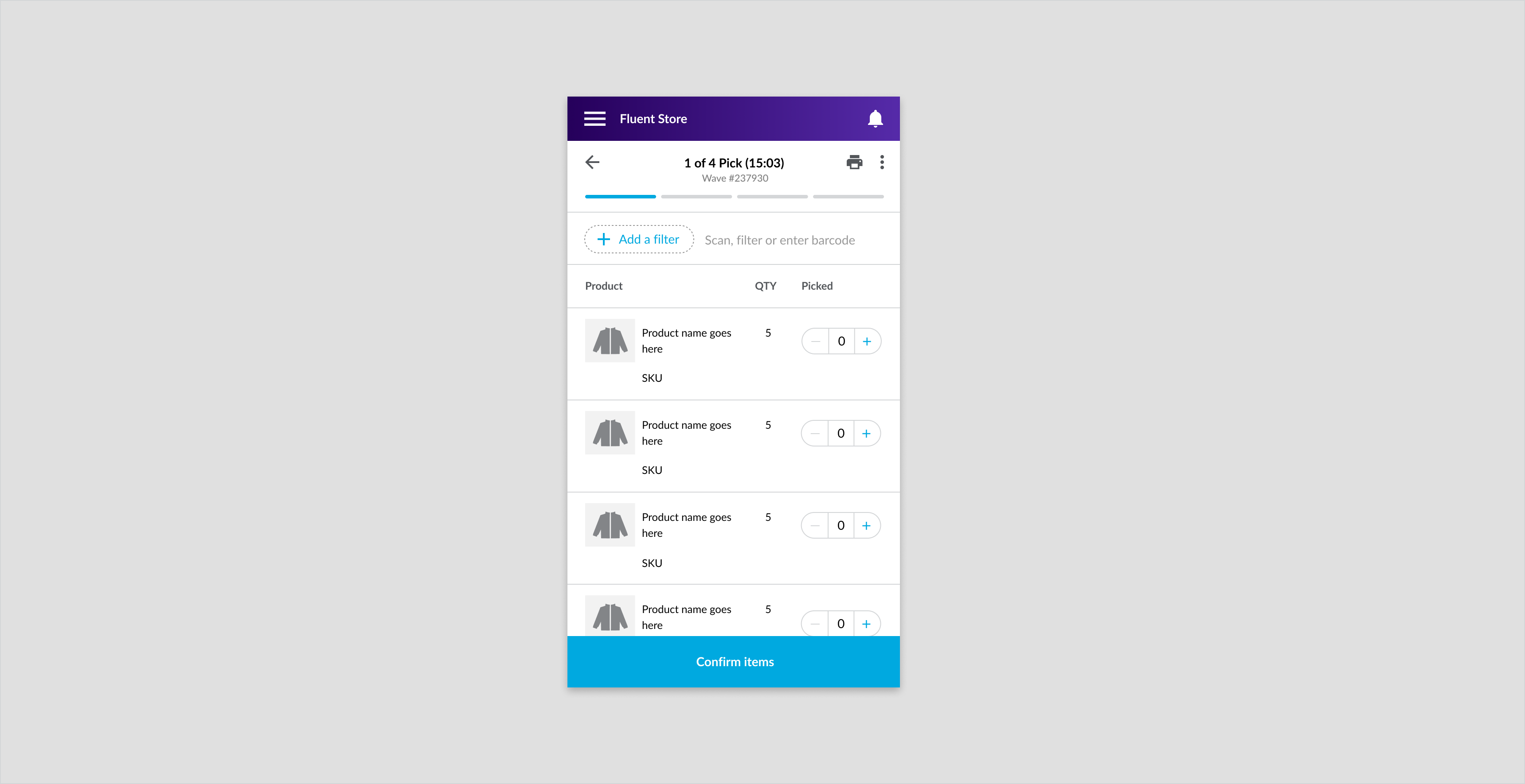
Tablet and desktop
Example: Product pick list table for tablet and desktop.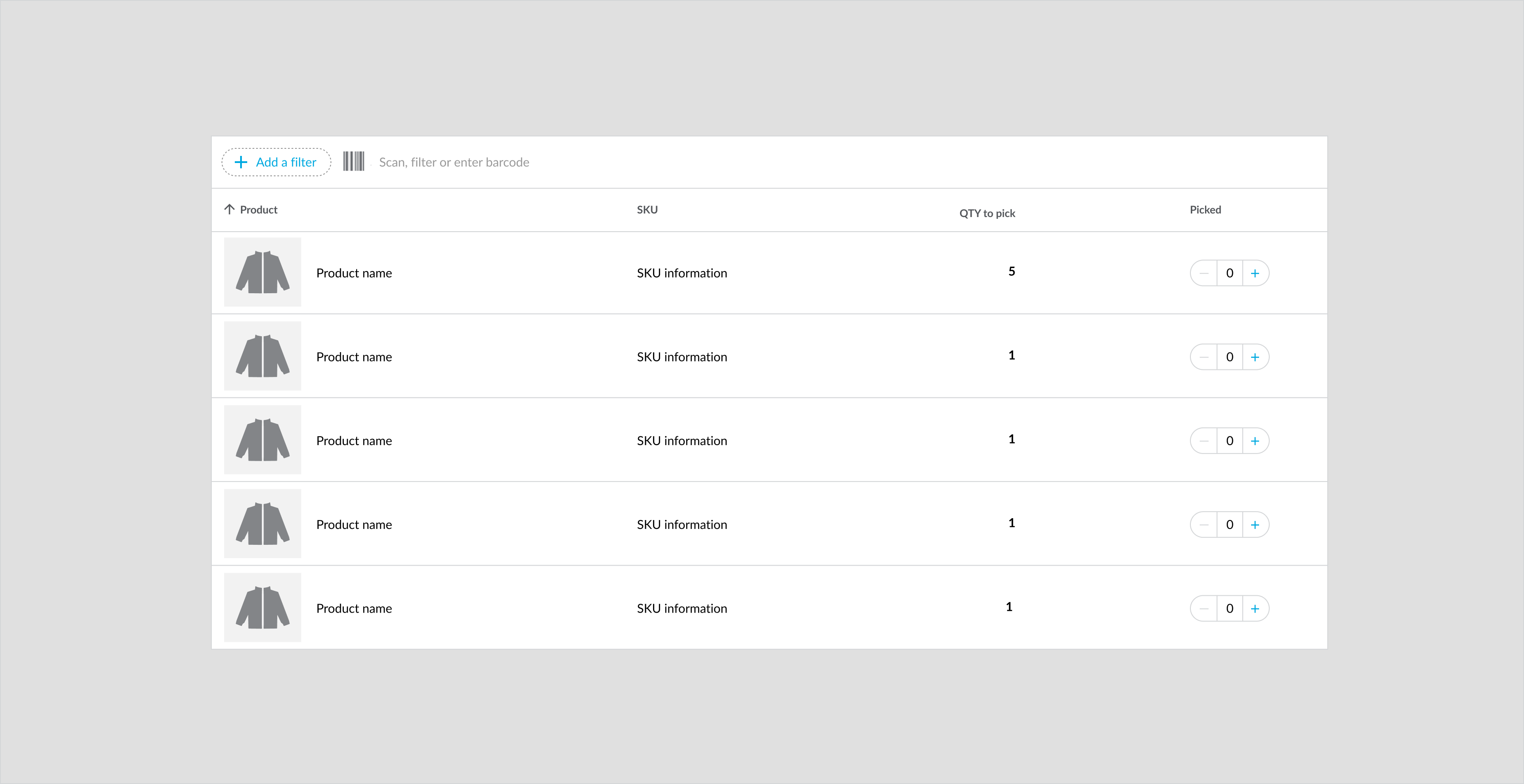
Specs
Mobile
Tablet and desktop
Tabs
Overview
Tabs organize related content across screens, tables, data sets and other interactions. They are a way to switch contexts and access the required information. Content inside tabs are always related and allow users to apply relevant user flow within a page.Component Attribution: Are based on Material Design 2 with a Fluent theme.Anatomy
Example: Dialog confirming whether the user would like to proceed from pick to pack incase if they have missed an item or flagged an item as missing.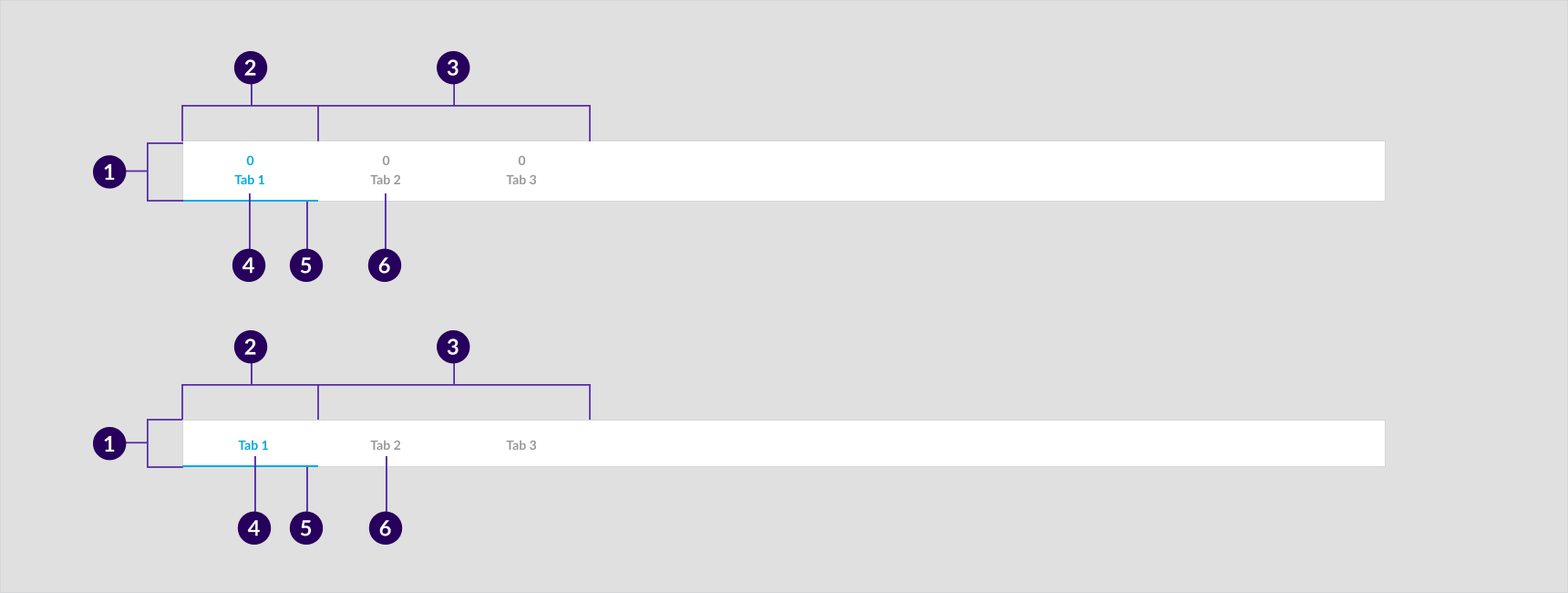
- Container
- Active tab item
- Inactive tab items
- Active text label
- Active tab indicator
- Inactive text label
Usage Example
Used when there is critical but relevant secondary information that a user needs as part of the flow. For example in the desktop and tablet, Pick and Pack Dashboard will need to demonstrate the list of Awaiting pick, In progress wave and completed waves in order to let users know the latest update for Pick and Pack.Use tabs sparingly on mobile. In some cases, it is more beneficial for the user to scroll than to open a new page.Example: In the Pick and Pack dashboard, Filter is implemented for users to narrow down fulfillments displayed on the table, so that users can perform a specific search such as customer name, created date.- When performing items return, users are required to search for an order first by using a filter to input a specific search requirement, ie, Order Reference Number
Recommended Practices
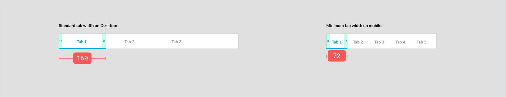
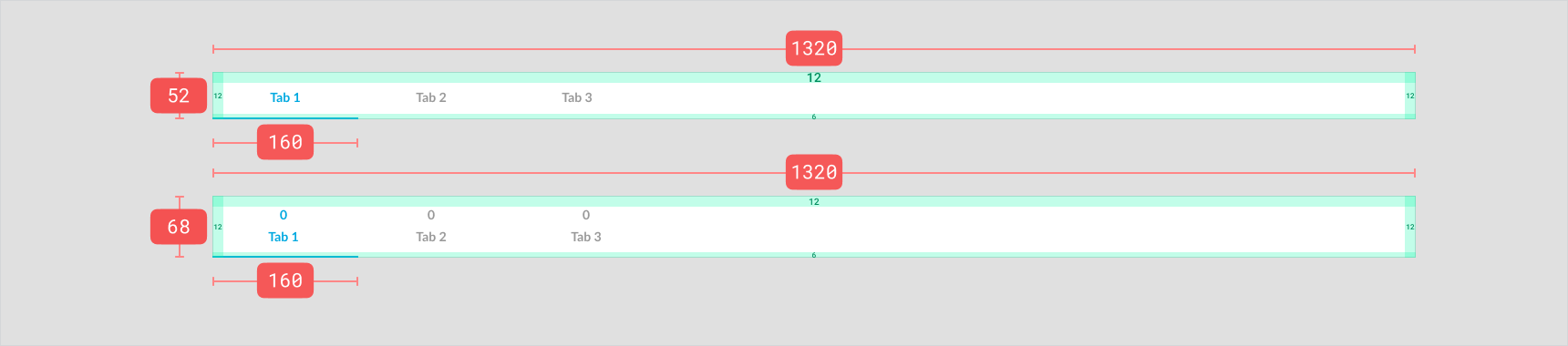
Desktop:- Standard width of each tab should be 160px on the Desktop layout. If only two tabs, split the width equally within the container on mobile layout.
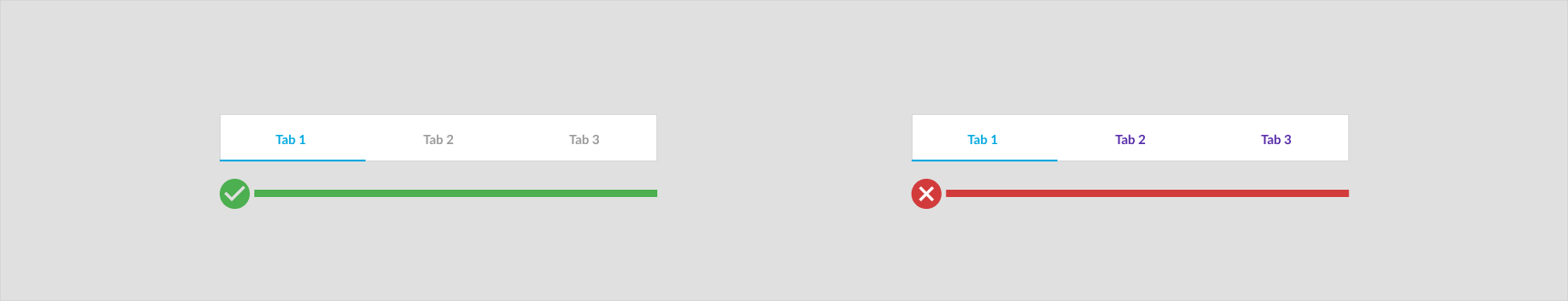
- Ensure the active tab item is in primary color and contrasts with the inactive tab items
- Keep inactive tabs readable and make sure they apply a neutral color (for example, grey)
- Tab title should be a short that summarizes the content, try to limited within 16 characters
- Minimum width of each tab should be 72px (with 12 px padding on both side)
 Tab Color:
- Avoid similar information in multiple tabs
- Don't use tabs when the content is small and sequential
- Don't use tabs when the content cannot be grouped
- Don't use more than 6 tabs. If a flow requires more than 6 tabs, consider changing the navigation between the content or layout of the page.
Placement
- Mobile tabs should always be positioned at the top of table, interaction or content.
- Desktop and Tablet tabs should be positioned above any table and search components.
- Always position tabs below the top navigational elements of a given page/screen.
- Ensure tabs are positioned directly above the content
Mobile
Tabs mobile styled: (Left mobile screen): Tabs to separate the different carriers on the Carrier Collections page. (Right mobile screen): Tabs to separate new and in progress fulfillments on the high priority fulfillments page.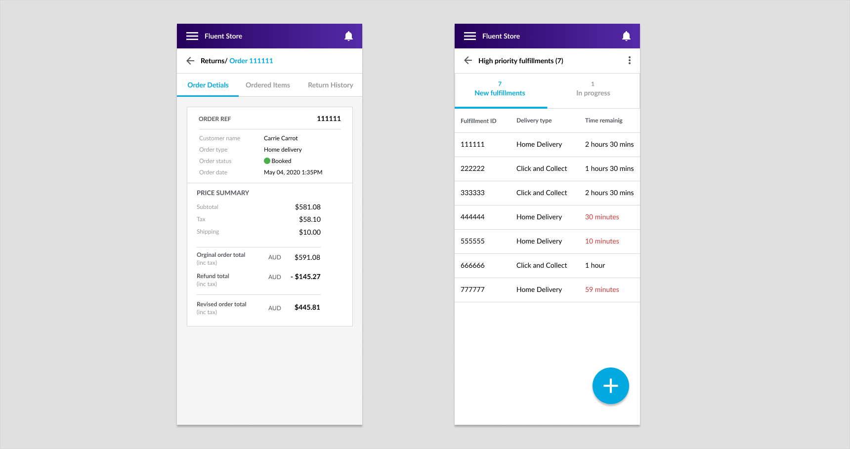
Desktop and tablet
Tabs desktop Above: Tabs to separate the different carriers on the Carrier Collections page for tablet and desktop.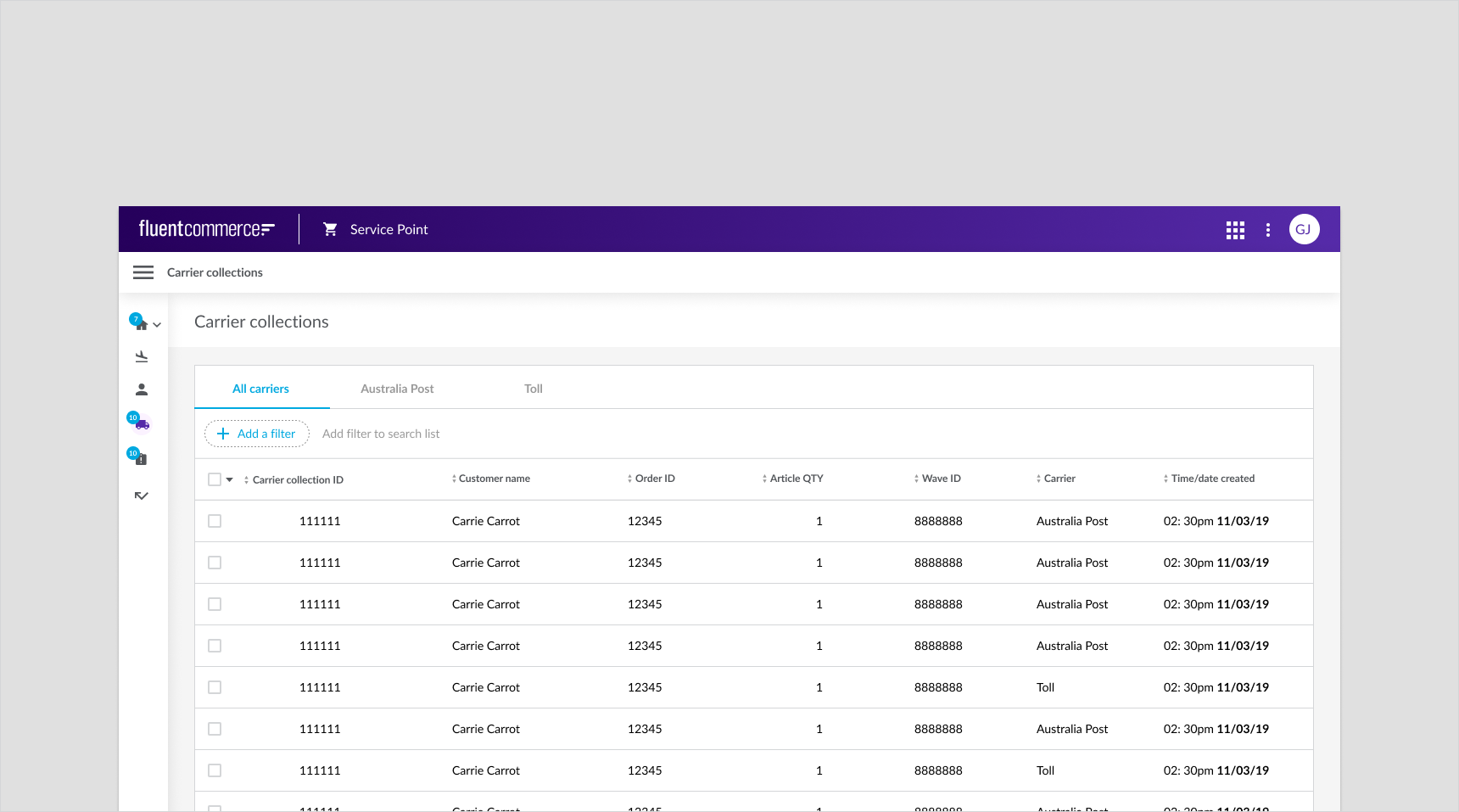
Optional configurations
- Tabs in scrollable format
- Tab with/without data or icons above title
- Tab titles
Specs
Mobile

Desktop
Text Fields
Overview
Text field allows users to enter text and data into the user interface.Component attribution: Is based on Material Design 2 with a Fluent theme.Anatomy
 A. Active text field
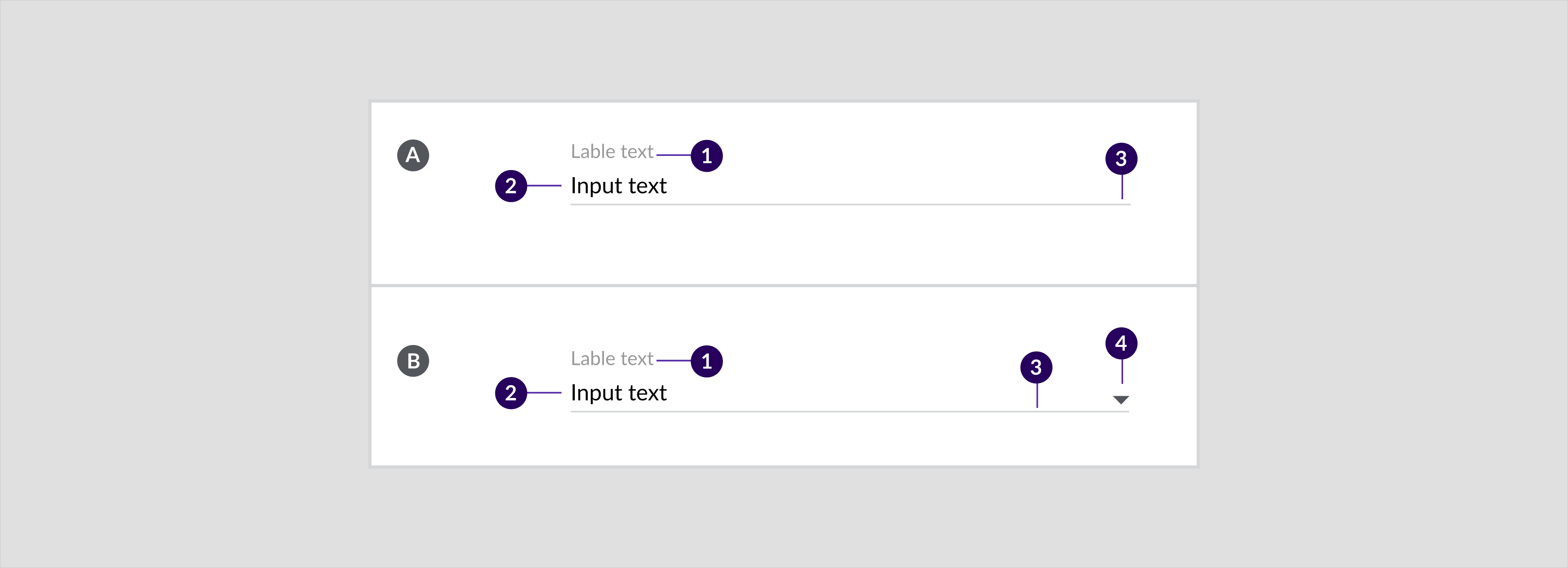
- Label text
- Input text
- Activation indicator
- Label text
- Input text
- Activation indicator
- Dropdown icon
Usage Examples
- To store data that can be referenced later. For example, order or customer details
- To enter details into form. For example, customer details (address, name etc)
Recommended Practices
- Configure the text field to fit the input. For example, make the length shorter for names and longer for addresses
- Keep labels concise but descriptive. For example, Email address and not enter email address
- Include descriptive input helper. For example, Enter email address
- Keep text fields stacked in a single column and not parallel on mobile devices
- Text fields can be placed next to each other if the width of the page content allows it for tablet and desktop devices. In drawers, text fields are full-width and stacked on top of one another
- When information is in a single column it is quicker for the user to scan. Exceptions can be made on shorter fields such as Postcode or State.
- Keep styling of text fields consistent
- Differentiate the fields using headings and titles rather than changing their styling
- Use text-fields sparingly in modals
Placement
Mobile
Example: Dropdown field for the wave creation owner.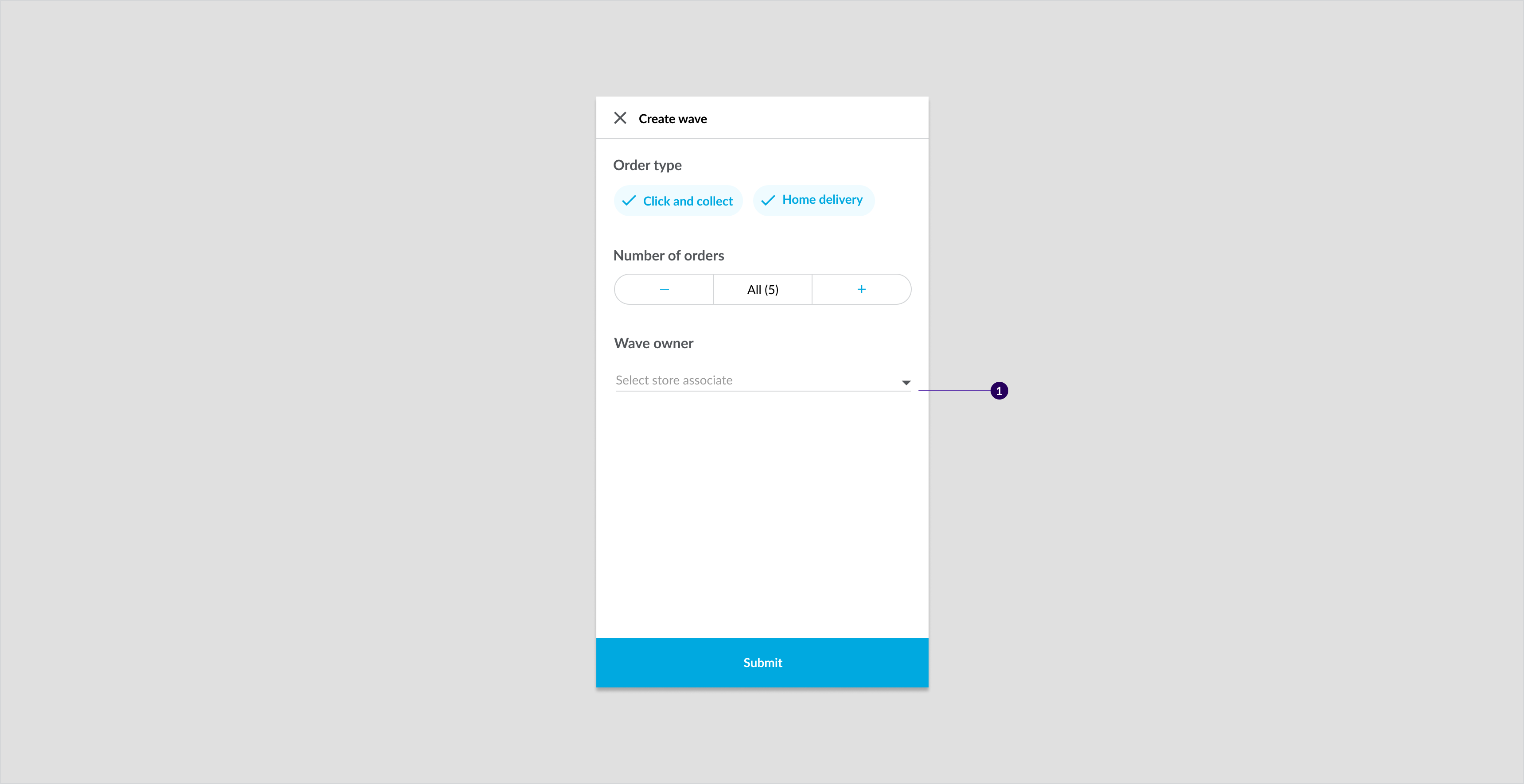
Desktop and tablet
Example: Dropdown field for the wave creation owner.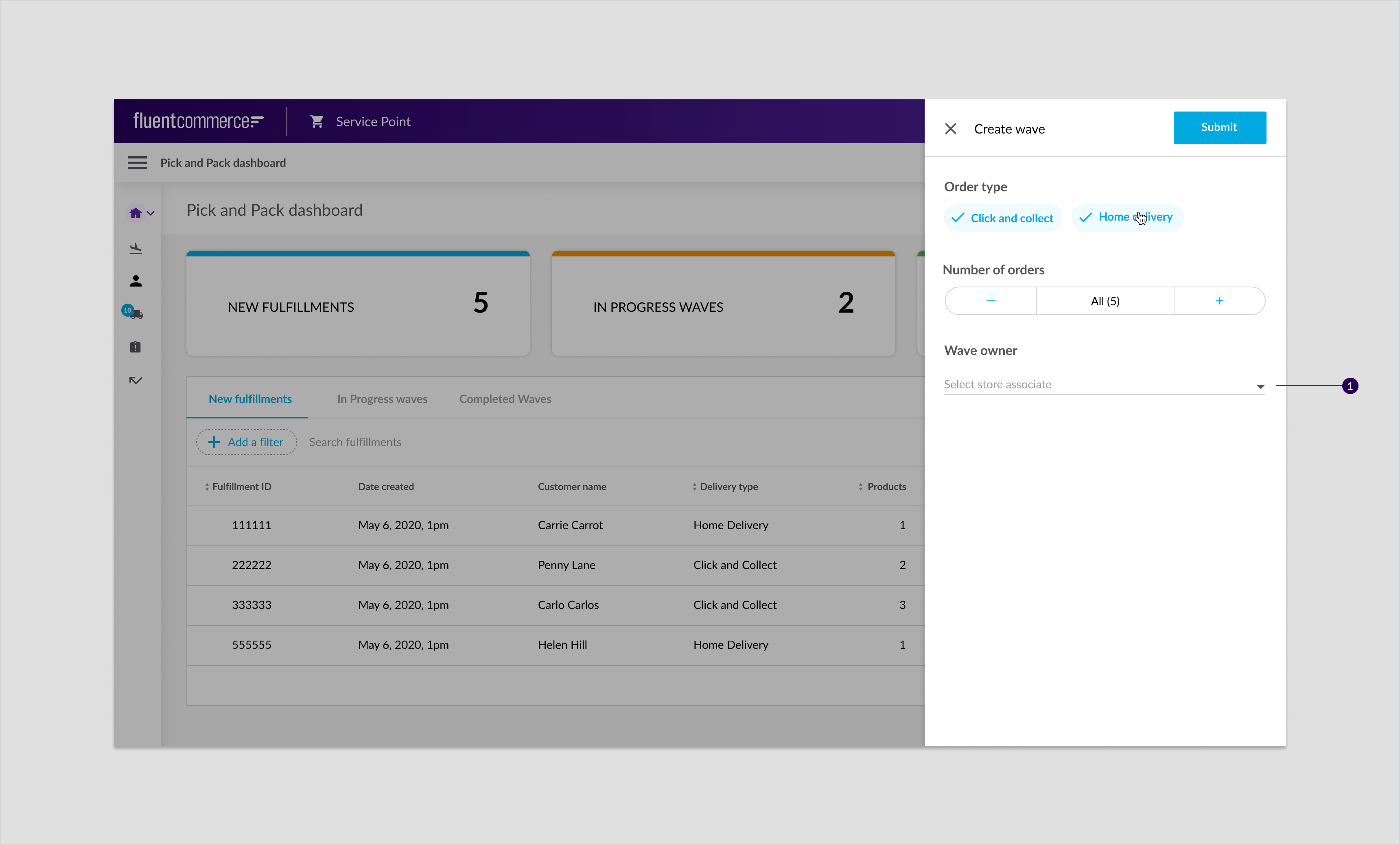
States
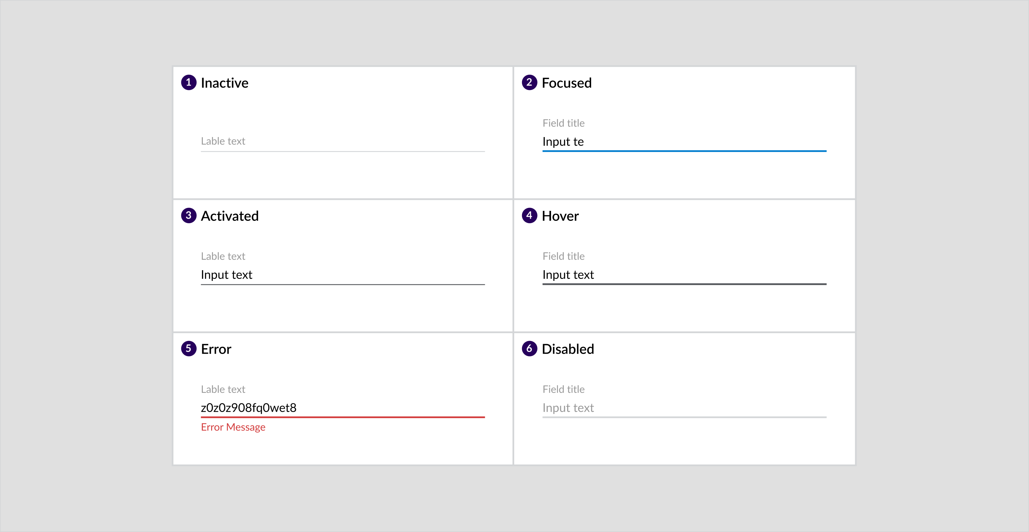
- Inactive
- Focused
- Activated
- Hover
- Error
- Disabled
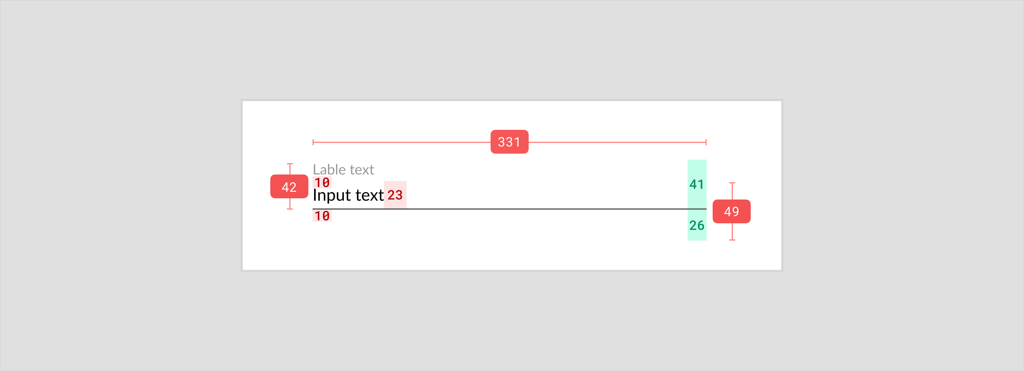
Specs
Wizard
Overview
Wizards are used for step-by-step workflows. Mostly used when users need to perform tasks in a set order in which subsequent steps depend on information entered in previous steps. They inform the user about the completed step, the current step, and the number of remaining steps.Component Attribution: Is a Fluent OMX component.Anatomy
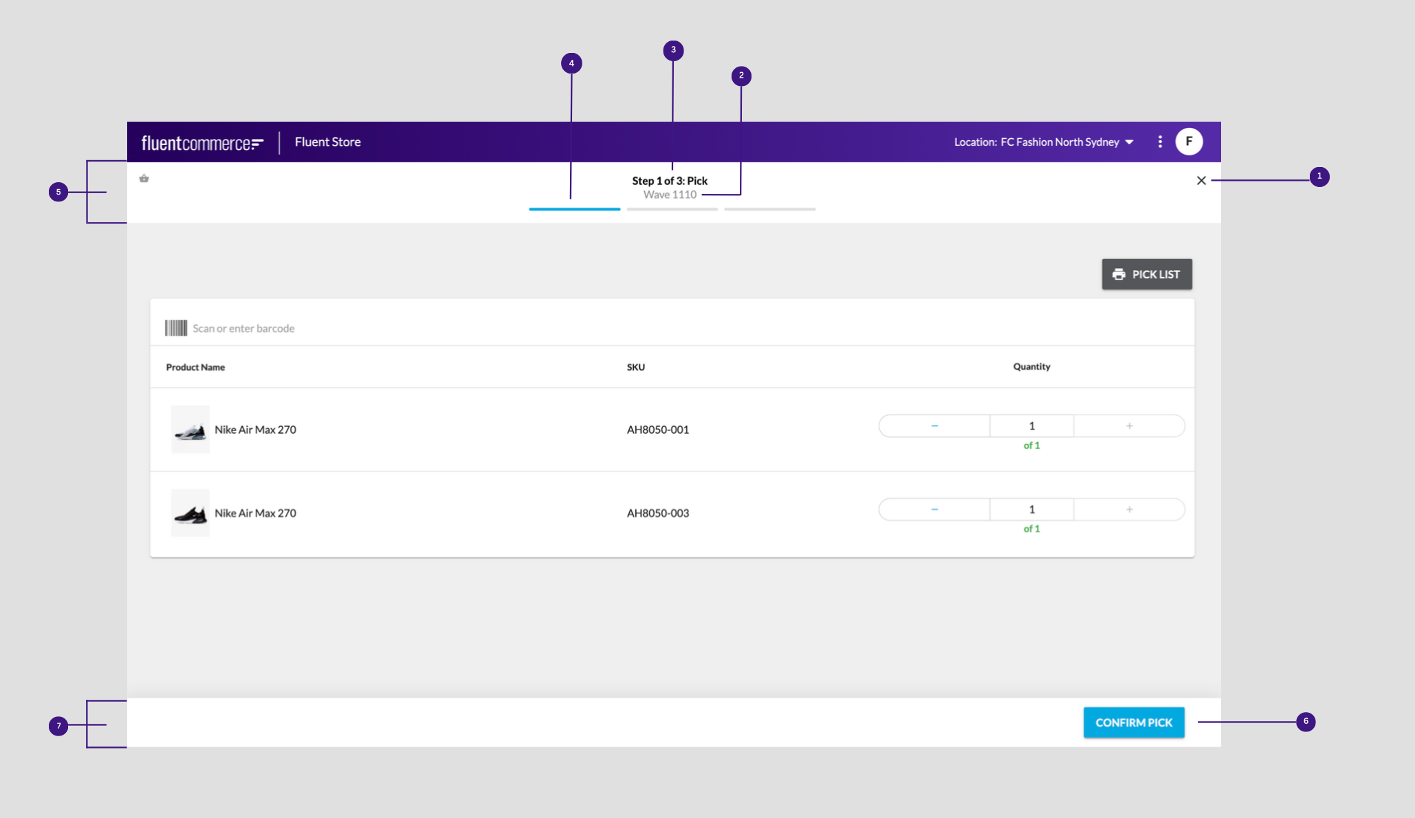
- Close icon to exit
- Wave number
- Step title
- Progress tracker
- Wizard header
- User actions
- Progress footer
Usage Examples
- Wizards are shown to reduce user errors because they clearly break tasks out into sequential steps. The following experiences are an example of where wizards can be used:
- Picking, packing and shipping products
- In-store order returns
- Order item exchanges
Recommended Practices
- Progress tracker visually indicates the number of steps a user needs to take to complete a complicated task. Indicate the current step through a prominent color in conjunction with the title of the step. Ensure the step is highlighted with strong color and contrasts with the de-selected state of the step.
- Use numbers in the title to describe how many steps remain to complete the task. For example, Step 2 of 3.
- Don’t make the process too long. Have a minimum of 3 and a maximum of 6 steps.
- Allow users to exit the wizard at any step and automatically save the wizard to a draft state. This will allow the them to resume the process at a later time.
- Make the progress footer sticky for all devices.
- Don’t use a button to navigate to the previous page unless the user is allowed to make changes on the previous page.
Optional configurations
- The number of steps
- Title of steps
- Color of the progress tracker
- Titles of the "Next" and "Previous" buttons
Placement
Mobile
Example: Pick step of the pick, pack and ship wizard for mobile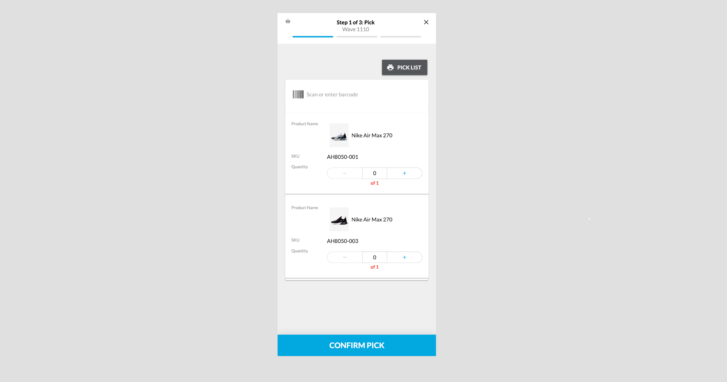
Desktop
Example: Pick step of the pick, pack and ship wizard for desktop