UserAction button in OMX UI
Essential knowledgeCore knowledge to understand Fluent Commerce
Author:
Randy Chan
Changed on:
17 May 2024
Overview
This article gives a better understanding of how to configure and display user actions on the UI.Key points
- How to configure
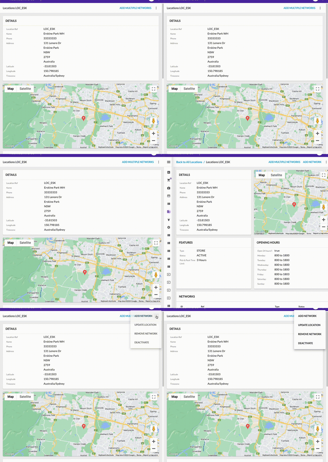
`userAction` `userAction`Types`userAction`display sequence (appearance)
Configure userAction
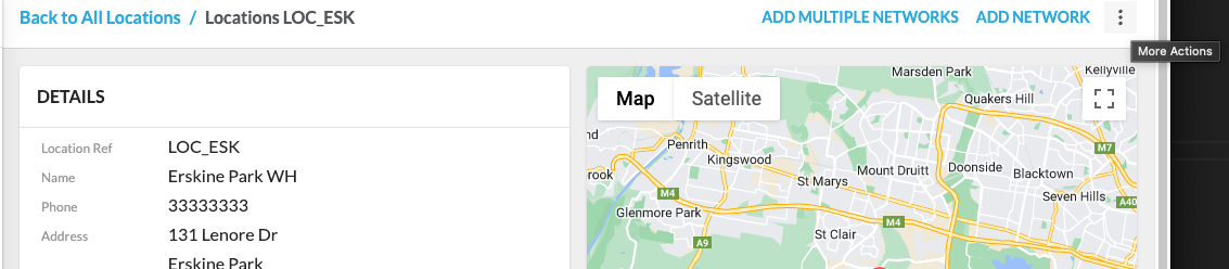
userAction is defined in the workflow. When the OMX is loading a page, it will check and see if there are any rulesets that contain userAction that satisfy the manifest module and trigger status criteria; if so, display the userAction button on the top right-hand corner of the page.userAction Type
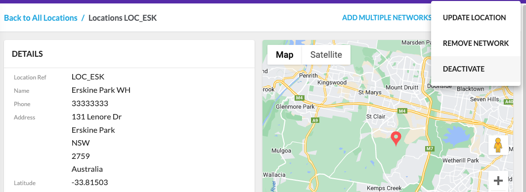
The userActionType is defined in the workflow context. There are two userAction types:- PRIMARY - The userAction button will be displayed in the top right-hand corner.
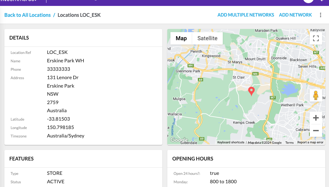
- SECONDARY - The userAction button will be displayed inside the ellipsis icon (vertical three dots)